As a developer who has spent the majority of his years working on the back end of website projects, my front end skills have not always been very developed, to put it mildly. At those times when I did need to do theming work, I would rely on tools like Bootstrap, Bulma, or Vuetify to handle the bulk of it for me. However, over the last year, after hearing so much about the features that have been added to HMTL and CSS over the past few years, I decided to start learning about CSS.
In particular, CSS Grid and Flexbox intrigued me, because layout has always been fairly difficult, so I started out by taking the free courses from Wes Bos on Grid and Flexbox. I also want to be able to learn to design my own layouts, so I got Adam Wathan’s Refactoring UI (although I haven’t been able to get started on it yet).
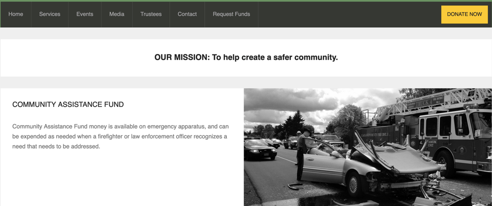
I was starting to look around for a project to work on, when I was presented with an opportunity to do a website for a local non-profit. Still not feeling comfortable with designing my own theme, I went browsing on the internets and came across the iCare theme on Theme Forest. After getting approval from the organization, I purchased the theme.
Selecting the Site Toolset
In this particular case, SEO was very important to the organization, and being familiar with the Vue ecosystem (I work with Vue in my day job), I decided to go with Nuxt, because of its server side rendering capabilities. For the back end, I looked at a couple of different options. I knew I wanted to use a headless CMS. I worked with Drupal for a number of years, so I’m very familiar with content modeling and structure, but I wanted something that I didn’t have to set up myself. I considered a GitHub pages-type structure where I write in markdown files and commit directly to a repository, but there were a couple problems with that. First, that would work great for me, but I am the only technical person in the organization, and if I were to get hit by the proverbial bus (or fire engine, in my case) I wanted a non-technical person to be able to manage site content in my absence. I really like ButterCMS (the CMS I use for this site), because it has a very flexible data modeling and content management user interface, and the API is drop dead easy to use. However, in order to get the full data modeling capabilities, the cost is $99/month, and that was cost prohibitive for the organization. I started looking at the many hosted headless CMS options, and narrowed it down to Prismic, Sanity, Contentful, Zesty, and Strapi. After considering all the different pros and cons (cost, API ease of use, data modeling capabilities, etc) of each one, I decided to go with Prismic. The Content Query API takes a little getting used to, and the API docs can be a little confusing, but the UI is fairly intuitive and flexible, and it has good code documentation for various frameworks and languages (including VueJs and Nuxt). For just one user it is free, and adding two more users only costs $7/month, so that fit right in the organization’s budget.
From a hosting standpoint, my own site is hosted in Netlify, and it is a popular and flexible platform that I am already familiar with, so choosing it was a no-brainer.
Implementing the Theme
My initial plan with the iCare theme was to just incorporate it into Nuxt, add the data, and be off and running. However, the theme contains multiple other dependencies (much custom JS, jQuery, PopperJS, FontAwesome, etc.) and although I tried and tried, I could never get everything to work without a bunch of re-work. After banging my head against that for a while, I decided to build my theme from scratch with CSS Grid. So I started from the front page, and built it out, doing my best to make it look exactly like the iCare theme, but only in appearance, not underlying structure. After a while, I got the header, the footer, and the central content area complete in a full page format. However, it wasn’t responsive at all (you couldn’t even scroll to the side on a smaller screen), and although I had read about media queries and flexbox, I wasn’t sure exactly how to implement them in my theme.
Instead of doing more head banging, I called on my friend Chris Bloom. Chris is the Director of Frontend Engineering at Phase2 Technology, and a real CSS guru. He and I go back to working in Drupal for Sony Music a few years ago, so I’ve known him for a while. He’s also a big proponent of Tailwind CSS, and I’d recently seen him present on using it in VueJS). I gave him access to my theme repo and said “can you make this responsive?”, and he said “sure!”, and a couple days later, sent me a merge request.
I studied it for a while, made some changes, and got stuck, so Chris took an hour and a half and on a video call, and walked me through everything he had done (if you want to someone who is passionate about CSS, get Chris talking about CSS. Just sayin’.). The two things I learned from what he showed me were 1) using media queries and 1) Tailwind-type utility classes.
Media Queries
According to MDN, media queries “are useful when you want to modify your site or app depending on a device's general type (such as print vs. screen) or specific characteristics and parameters (such as screen resolution or browser viewport width).” In this particular case, we just defined four queries that were minimum width sizes (borrowed from Tailwind’s breakpoints):
@media (min-width: 640px) {
  .container {
    max-width: 640px;
  }
}

@media (min-width: 768px) {
  .container {
    max-width: 768px;
  }
}

@media (min-width: 1024px) {
  .container {
    max-width: 1024px;
  }
}

@media (min-width: 1280px) {
  .container {
    max-width: 1280px;
  }
}
The thing that it took me a while to get my head around was that for any of these queries, because we were only using min-width, the styles used in that media query would apply for any size up to full screen size, unless overridden in another query of a higher size. For instance, in the example above, if there had been no .container selected in the query for min-width: 1024px or 1280px, the max-width for the .container class would be 768px. What this also means is that there are actually 5 sizes; the four sizes listed above, and anything below 640px wide; namely, phones.
A good example of where this comes into play is with the main nav bar. Typically, in order to get a row of menu items, you would create a list of items using <ul> and <li> tags, and then set display: inline-block (or even display:flex) on the <li> elements. However, in a mobile view, we want them stacked vertically, and since that is the default list structure, we don’t have to apply CSS to make that happen. Then, when the screen is wide enough that we do want them to be horizontal, we can use a media query to make them inline.
@media (min-width: 768px) {
  .flex {
    display: flex;
  }
}
I finally understood that this is what is meant by mobile first design; designing for the smaller screen, and then adding things as your screen gets wider.
Utility Classes
As I get it, the idea behind utility classes is that each class does only one thing, and the name reflects what it does. For instance, a simple example would be aligning text:
.text-left {
  text-align: left;
}
Then, you just apply the classes to a given element as needed. The downside is that you get a longer list of classes for a given element, but at the same time, you can also tell what that class is doing, as compared to a class with many attributes.
Combining Media Queries and Utility Classes
Now we can combine media queries with utility classes to easily modify section widths depending on screen sizes. As an example, on the events details page, we have these elements:
<div class="container">
  <div class="content-area sm:flex justify-between">
    <div class="event-content-left sm:w-2/3 md:w-770">
And here is the CSS to go along with them:
 @media (min-width: 640px) {
    .container {
      max-width: 640px
    }

  .sm\:flex {
    display: flex;
  }

  .sm\:w-1\/3 {
    width: 33%;
  }

  .sm\:w-2\/3 {
    width: 66%;
  }
}

@media (min-width: 768px) {
  .container {
    max-width: 768px;
  }

  .md\:w-1\/3 {
    width: 33%;
  }

  .md\:w-2\/3 {
    width: 66%;
  }

  .md\:w-770 {
    width: 770px;
  }
}
And here is what’s happening:
At a screen width of 640-767px:
- The width of
.containerhas amax-widthvalue of 640px. - The
display: flexproperty is added to the.content-areaelement. - The width of the
.content-areaelement is set to 33%. - The width of the
.event-content-leftelement is set to 66%.
At a screen width of 768-1023px:
- The width of the
.event-content-leftelement is set to 770px. -
.display:flexis still set. - The width of the
.content-areaelement is still set to 33%.
One interesting thing to note is the difference between the class declarations in CSS and applications in HTML for the sm: and md: classes; the : and / characters have to be escaped in the CSS (sm\:w-1\/3), but is not in the HTML (sm:w-1/3).
Forms
The one last feature I needed to implement was forms. Fortunately, Netlify has a solution for forms. The basic gist is that you create your form as you normally would (in this case, in a .vue single file component), and then create a .html file that has only the HTML form content (in my case, I created them under the /static/form_dummy directory), Netlify finds that file and automagically handles it, saving the submissions in your site dashboard. You can also set up email notifications when a form is submitted. On top of that, they even provide spam protection using Akismet, along with additional protection using a honeypot field.
Conclusion
The end result is a very fast, lightweight, static site that is cheap to host, and with an easy to manage content CMS. The primary benefit for me was that I was able to use the process of building the site to do a lot of learning about CSS Grid and Flexbox, media queries, utility classes, and how to put them all together. What added more satisfaction was that it wasn't just a learning project that I came up with; it was a very real website for a very real organization that does a lot of great things.


Top comments (0)