Having some understanding of Matplotlib from this post, we can delve deeper into other features that the library has to offer.
1.Scatter Plot
Scatter plots represent values in dots where each dot represents a data point.
We use the scatter() method to create scatterplots.
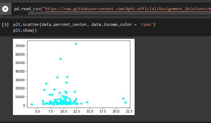
Scatterplots are useful in clustering and categorizing data into different groups.
The plots also show they how the data is distributed and how they cluster close together.
2.Line Plot
The plot connects data points. We use the plot() method to plot line plots.
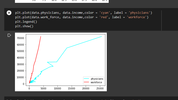
Line charts are useful in examining patterns of a dependent variable over time.
3.Histogram
Histograms represent data using bars of different heights.
We create histograms using the hist() method.
A histogram has a title, X-axis, Y-axis and the bars.
The x-axis shows the intervals represented in the plot. The intervals are also known as bins.
The y-axis shows the frequency of each interval in the x-axis.
The bars show the number of times values in an interval appear in the data.

Histograms are useful in showing the general distribution of features of a dataset.
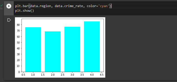
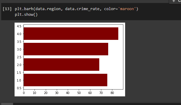
4.Bar Plots
Bar plots are used to represent data with categorical variables.
They can be vertical or horizontal.
We use the bar() method to create vertical bar plots and pass the categorical variables, and specify the color as the arguments.
We use the barh() method to create horizontal bar plots. We pass the categorical variables as the arguments.
5.Pie Charts
Pie charts are circular graphs divided into slices that represent numerical portions.
We use the pie() method to create pie charts.
We pass the piece sizes, labels, colors and autopct which controls how the labels are displayed in the wedges as the parameters.

Pie charts are useful in displaying categorical data.
We can now use these plots for data visualization.


Latest comments (0)