
Problem & Motivation
Recently I’ve faced a challenge of finding fully customizable and easy-to-integrate web components which can serve as embedded BI tools for analysis, reporting, and visualization in my application.
And even more difficult is to find solutions that are compatible with the Angular framework and doesn’t complicate the maintenance of the application.
I guess I’m not alone in that so I’ve decided to share my experience with other developers which might face the same problem.
Today I’ll cover briefly the features of Angular and leave out other theoretical details about its the most basic concepts - I’m sure you’ll find insightful articles here in the community of dev.to and on the pages of Angular documentation.
So, let me get straight to the purpose of this review - to show how to run the analytics in an Angular application and transform the way you are creating reports with the help of two tools: a JavaScript pivot grid and a charting library.
Besides, in the light of the recent framework’s updates, it may be useful to know which tools are worth to be a part of the project that is running on the latest version of Angular.
On top of this, we’ll create a simple yet powerful report which has all the potential to help in further analysis. I can’t wait to share a demo with you.
TL;DR: jump right to the section with useful links which should help you to get your hands dirty with practice.
Why Angular?

Let me start by sharing my thoughts on what I find the best in Angular and how it makes the development a quicker and easier process.
The process of building dynamic client-side applications (single or multi-page) with Angular is accompanied with various benefits. By choosing Angular, you take advantage of the following features:
- A modular design of code which makes the application’s components easy to manipulate. Consequently, the code is more organized and readable.
- Decoupled components
- Simplified MVC architecture
- A static typing of TypeScript under the hood which provides type safety and makes the code easier to maintain and refactor.
- Powerful CLI that automates the creation of an Angular application.
- An active and growing community of developers that share their knowledge about the framework and solutions to problems.
- Support for multiple platforms.
All the above-mentioned features lead to improved productivity in building the web, desktop, and mobile applications.
However, Angular has a high learning curve, especially when compared with React. But the efforts put into learning and mastering it are worth the results you will achieve.
Now let’s move further to the solution for web reporting in your project.
What is Flexmonster
Flexmonster is a pivot table component that is written in JavaScript. It’s suitable for web reporting and analysis of tabular and multidimensional data.
Its main advantage is compatibility with various client-side technologies including Angular and AngularJS.
To get started, you need to choose the type of data source that is used in your application. The most common one is an SQL/NoSQL database but JSON, CSV sources, and OLAP cubes are supported equally.
As soon as you’ve embedded Flexmonster into your project and loaded the data into it, you can make use of all the built-in features to start configuring your own interactive report. After all, the report can be exported to Excel, PDF, Image, and HTML.
Nextly, I’d like to outline the list of analytical features which came in handy for my reporting purposes.
Analytical features
- Aggregation functions (i.e. 16 built-in functions and the ability to create custom ones)
- Organizing the data is possible using sorting, grouping and filtering features
- The drag-and-drop feature
- Slicing & dicing
- Embedded pivot charts.
How to integrate a pivot table with Angular
Personally, I find the whole process as simple as copy-paste. Here’s a tutorial which helped me to get started.
Dashboards & data visualization
If you, your users or teammates need not only aggregate the data but also visualize it, an excellent idea is to build an interactive dashboard inside the app or give an ability to do so. Many analysts are fond of dashboards since they help in tracking business metrics and making data-driven decisions. And, as a developer, you may know that it takes a lot of time to build and configure it upon the ad-hoc or recurring requests.
Let’s consider the second tool that will save you time and help your web project stand out with an interactive data visualization.
Google Charts
It’s hard to find a better charting web service in a segment of free software than Google Charts.
It removes the necessity in manipulating DOM elements with D3.js: Google Charts provides extensive APIs for generating charts based on the data. All you need to enliven your data is to include the Google Loader into a web page, create a DataTable JavaScript object, then asynchronously pass the data to it and define a function that instantiates and draws the chart.
How to load data in charts
The easiest way to pull the data from your application and send it to the charts is to use a web service called Datasource or Flexmonster Pivot Table. The former supports the Chart Tools Datasource protocol and allows sending an SQL query to a Datasource for retrieving a DataTable instance filled with data. The latter can serve as a client-side provider of aggregated data from various data sources. Using it, you don’t need to write queries to retrieve the data from the pivot grid - just call the appropriate API methods for it. Besides, this component offers JavaScript connectors which eliminate the need to write a code of data processing for some basic chart types. But, of course, you can do it if you need to implement some custom logic.
Google Charts in Angular app
Google Charts is compatible with Angular as well - I’ve managed to find a wrapper for it on npm.
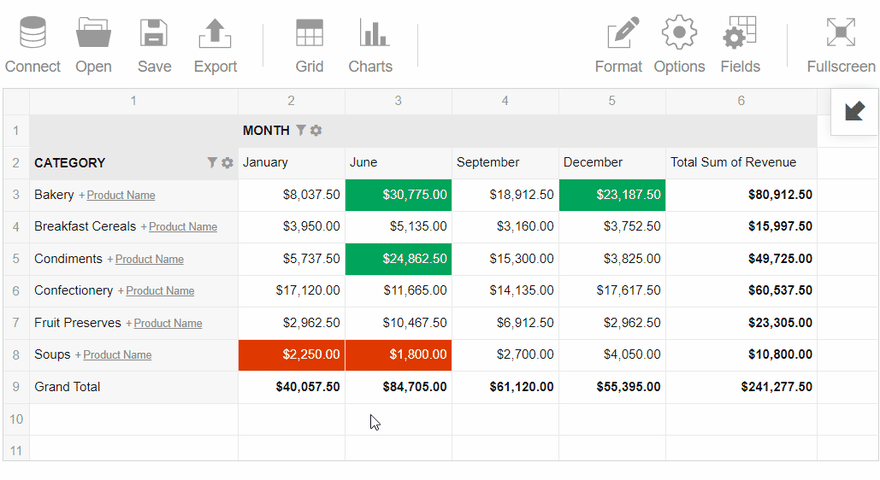
This is how a dashboard with Flexmonster and Google Charts can look like:
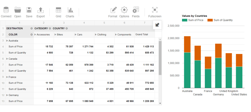
As you see, charts and tables are not in opposition to each other. On the contrary, they shine together when combined. A dashboard has the potential to enhance the communication of the analysis results.
Summary
Today I’ve tried to analyze the benefits of Angular as a platform for building the dynamic web applications. However, one should be aware that Angular can simplify the development process as well as complicate it. Think thoroughly whether your particular project needs this framework or not.
Looking forward to hearing your feedback and suggestions.
Useful links
These guides helped me to walk through the process of integration with Flexmonster and Google Charts.
Feel free to fork it and play with your data :)
 (I recommend opening a web page with a dashboard in a new tab/window as the embedded browser in this IDE doesn't always show the results correctly)


Top comments (7)
Thank you for the feedback and sharing your thoughts about Google Charts from the professional point of view, it was interesting to know about such limitations.
Maybe you could tell about experience with other charting libraries that are suitable for Angular and don't have such drawbacks?
Great article, thanks!
Thank you! I'm glad you've read it and appreciated. Hope you'll like this kind of visualization :)
Hello Nika! Your article is great and very complete, but it seems like the flexmonster license is expired so I couldn't get deeper into the codesandbox example :(
Hi! Thank you for your feedback!
I've changed the trial key in the demo, please check it out :)
On average, how long did it take to develop this reporting module?. I am working on creating one with a NOSQL approach
As you see, the front-end part of the application is quite easy to set up: you can create a dashboard in less than an hour.
The true complexity hides in the logic of your project, namely how the data is transferred between the back end and front end. The time of implementation may vary from several days to weeks.
If you're creating a reporting module with the MongoDB database as a data source, I'd recommend you try the server-side connector released by the Pivot Table team. The only thing you need to do is to install this connector at your data layer. Its advantage is that it pre-processes the data from the database on the server side and sends already aggregated data to the component on your front end. Thus, if you have a lot of data, this saves your resources from being exhausted by client-side calculations.