My team project came to an end some weeks ago, and I'll quickly summarize everything
that happened during that time with you now.
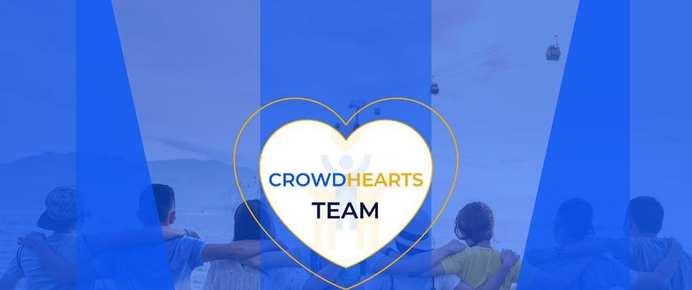
The team consists of front-end developers, technical writers, graphic designers, and
product designers. The group was tasked with creating a charity fund web application
for a non-profit organization, church, NGO, or other organization of a similar nature
which we came up with a brand name “CrowdHearts”. And “Crowd'' means closely
together, while'' hearts “means affection and love.
Every week, we received deliverables, and on the third day following receiving the
delivery, we were instructed to give a presentation to the Techathon team.
Also, as a team, we schedule our meeting before the general meeting to give ourselves
feedback on what each team was able to do.
A meeting was conducted in order for us to identify a problem we would like to address
and to better comprehend the project we were given. At the conclusion of the
discussion, we made the decision to address the problem of users' needing to enter so
much data on the web form in order to make a donation.
For the Developers, they started by creating a repo account which each member added
as collaborators, prepared our boilerplate( Boilerplate are sections of code that are repeated in multiple places with little to no variation, meaning something that helps you
start something so you do not have to start from the scratch. The frontend developers
had a team lead in their track who assigned or tasked each member of the team with
certain pages to be coded to make their work easy.
They also worked on the following pages: sign up page, landing page, the about us
page, gallery page, and the footer page.
Product designers started by creating a design system, the design thinking process
which includes the Empathy stage, Define stage, Prototype stage, and Test stage, in
order to be able to design a user- centric web application.
Technical writer : made herself available in each(every) team meeting to understand the
process they are taking, documents each track’s process and made a publication on
medium and posted it on twitter.
Graphics design came up with colors for the brand Color which are blue, orange and
white. Each color signifies our faith in humanity, compassion for the needy , and
calmness. She also created a flier introducing all the team members, and designed a
flier to publish on both medium and twitter.
These are the tools used in building the websites
Figma and Google tools for the product designers,
Html5, CSS3,JavaScript for the frontend developers,
Adobe illustrator, Photoshop, and Figma for the Graphic designer,
Medium for the technical writer.
The mission is to bridge the gap between benefactors and recipients by bringing them
together to foster love, care and ensuring that donations are used for their intended
purpose.
In conclusion, the websites created will be a responsive web app that will work on all
devices, including mobile, tablet, and desktop, the features include simplicity and the
ability to donate with a few clicks. The Brand motto is bridging the humanity gap.
Veronicaobisesan
Posted on
TEAM 1 GROUP 3 BUILDING A CHARITYFUND WEBSITES.
For further actions, you may consider blocking this person and/or reporting abuse


Oldest comments (0)