In this article, I'll be taking you through the process of building dynamic and modular parent-child components with event-driven data communication in a Vue application. You'll be learning how to dynamically communicate an application's state to the user on the ui, how to work with custom events in making applications dynamic in Vue.js and more.
Prerequisites
For you to be able to follow up with this tutorial, you must have the following installed in your machine.
- Node.js. Click here to learn more.
- Vue CLI. Click here to learn more.
- Yarn Package Manager. Click here to learn more.
Once you have all these installed, fire up your favorite terminal, I'm be using Terminus.
Run the following command to start a Vue project. Replace components-projects with your desired project name but make it memorable, so you can easily get back to it tomorrow for any reason.
vue create components-projects
Next output on the console:
? Please pick a preset:
  vue-default ([Vue 2] babel, pwa, router, vuex, eslint, unit-mocha, e2e-nightwatch)
> Default ([Vue 2] babel, eslint)
  Default (Vue 3 Preview) ([Vue 3] babel, eslint)
  Manually select features
From the prompt, use arrow-down key to select the Default ([Vue 2] babel, eslint) option and hit enter! Wait for the installation to finish.
When it's done installing, follow the instruction to switch into your project folder and run yarn serve to serve your project! If you did this well, your project should be running on port 8080, open your browser and visit http://localhost:8080 to view your project.
Change the content of the App.vue file inside the src folder the one below:
<template>
  <div id="app">
    <h3>Hello World</h3>
  </div>
</template>

<script>
export default {}
</script>

<style>
* {
  padding: 0;
  margin: 0;
  box-sizing: border-box;
}

#app {
  font-family: "Poppins", sans-serif;
  -webkit-font-smoothing: antialiased;
  -moz-osx-font-smoothing: grayscale;
  color: #2c3e50;
  background: #eff7ff;
  display: flex;
  align-items: center;
  justify-content: center;
  flex-direction: column;
  height: 100%;
  width: 100%;
  position: absolute;
}
</style>
Basically, I removed the default stylings and components in the file and changed it to mine, this is to enable me style the app to my taste for future purposes.
When you save the file and open your development server on the browser which is normally http://localhost:8080 for Vue.js projects, you should see a page with 'Hello World' at the center of it and light background color. Let's continue!
Building dynamic and modular components for a task management app
We'll be building a task management app (another to-do app? :)). In this project, you'll learn how to build dynamic and modular components with event-driven data communication from child to parent and vice-versa. We'll be making use of props and the Vue $emit api to communicate our custom change event to complete and oncomplete our tasks in the app.
Without wasting time, go to your components directory under the src directory of your project folder, create a new Vue component file and name it Task.vue and another component file with name, Tasks.vue. The Task component will be for individual tasks while the Tasks component will be the parent component for each tasks which will pass the task data down to each Task component.
Now, paste the following codes into the Task.vue component file and I'll explain what are in the codes.
<template>
  <li class="list-item" :class="task.done ? 'done' : ''" @click="handleClick">
    {{ task.title }}
  </li>
</template>

<script>
export default {
  props: ['task'],
  methods: {
    handleClick: function() {
      this.emitChange()
    },
    emitChange: function() {
      const id = this.task.id
      this.$emit('change', id)
    }
  }
}
</script>

<style scoped>
.list-item {
  cursor: pointer;
  position: relative;
  padding: 10px 15px 10px 45px;
  border-bottom: 1px solid #f1f1f1;
  background: #ffffff;
  font-size: 15px;
  list-style: none;
  text-decoration: none;
  transition: .5s;
}
.list-item.done {
  text-decoration: line-through;
}
.list-item:last-of-type {
  border-bottom: none;
}
.list-item::before {
  content: '';
  height: 15px;
  width: 15px;
  border-radius: 50%;
  background: #eff7ff;
  transition: .5s;
  position: absolute;
  left: 15px;
  top: 10px;
}
.list-item.done::before {
  background: #268aee;
}
</style>
Explaining the Task.vue files
In the Task.vue file, we have a template section which contains the markup of our individual tasks.
<template>
  <li class="list-item" :class="task.done ? 'done' : ''" @click="handleClick">
    {{ task.title }}
  </li>
</template>
Inside the template section, contains a html li tag, with the task, some classes and a click event listener. Based on the status of the task (done/undone), we bind a class to the li tag so we can easily tell the status (done/undone) of the task in the ui using CSS.
Inside the script section is where our component logic happens. Inside the section, we write the JavaScript codes using Vue APIs to make our component dynamic. Inside the section looks as follows.
<script>
export default {
  props: ['task'],
  methods: {
    handleClick: function() {
      this.emitChange()
    },
    emitChange: function() {
      const id = this.task.id
      this.$emit('change', id)
    }
  }
}
</script>
First, you'll see the props, this is where you register the properties of a component, read about props in Vue.js here. In our Task component we'll be receiving a prop named task which will be an Object of the task to be rendered in the UI.
Next comes the methods, in a Vue.js component this is where you write functions that will be used inside the component. There are three methods in our component, the first is the handleClick method which handles click event on the li tag, this happens when a user of our app wants to complete or oncomplete a task.
handleClick: function() {
  this.emitChange()
}
The handleClick calls a function that emits a change event using the Vue.js $emit API, the emitted event will be handled by the parent component of this very component, the Tasks.vue component which we will be working on very shortly.
emitChange: function() {
  const id = this.task.id
  this.$emit('change', id)
}
So when the method is called, we get the id of the current task, and emit a change event passing the id as the handler's parameter. This methods creates awareness to the parent component that the user wants to mark a task as done/undone and calls the specified event handler on the parent component passing the id as the handler's parameter.
Creating the Tasks.vue Component
Next on our task management app, we're going to start writing our Tasks.vue component which will be the parent component of our Task.vue component. Copy and paste the below code into the Tasks.vue file which you created earlier and I'll explain what's in it very shortly.
<template>
  <div class="list-items">
    <h3>My Tasks</h3>
    <ul class="tasks">
      <Task
        v-for="task in tasks"
        :key="task.id"
        :task="task"
        @change="handleChange"
      />
    </ul>
  </div>
</template>

<script>
import Task from './Task.vue'
export default {
  components: { Task },
  data() {
    return({
      tasks: [
        {
          id: 0,
          title: 'Design a components',
          done: true
        },
        {
          id: 1,
          title: 'Design a components',
          done: false
        },
        {
          id: 2,
          title: 'Design a components',
          done: true
        },
        {
          id: 3,
          title: 'Design a components',
          done: false
        },
        {
          id: 4,
          title: 'Design a components',
          done: true
        },
        {
          id: 5,
          title: 'Design a components',
          done: false
        },
      ]
    })
  },
  methods: {
    handleChange: function(id) {
      const task = [...this.tasks].filter(item => item.id === id)[0]
      task.done = !task.done
    }
  }
}
</script>

<style scoped>
.list-items {
  width: 40%;
  border-radius: 8px;
  overflow: hidden;
  padding: 50px 20px;
  background: #ffffff;
}
.list-items > h3 {
  margin-bottom: 25px;
}
.list-items > .tasks {
  box-shadow: 0 0 40px #e1f0ff;
}
</style>
Explaining the Tasks.vue files
In the Tasks.vue file, we have a template section which contains the markup of our tasks. Inside it, we loop through our tasks a property in the data (I'll touch this shortly), and render each task in the ui using the Task component we created earlier .
<template>
  <div class="list-items">
    <h3>My Tasks</h3>
    <ul class="tasks">
      <Task
        v-for="task in tasks"
        :key="task.id"
        :task="task"
        @change="handleChange"
      />
    </ul>
  </div>
</template>
On the Task component, we pass the task and also listen for a change event. Remember that this event occurs when our app user clicks on the li tag inside the Task component, it happens when our app users wants to change the status of a task by clicking on it to toggle done and undone.
The click event listener has a handler, handleClick that calls a function emitChange that emits a change event on the Task component.
So, when this event is emitted, handleChange method is called on the parent component, this method does the actual work of changing the status of the task with the id passed to it, to the opposite. Below is the handleChange codes.
handleChange: function(id) {
  const task = [...this.tasks].filter(item => item.id === id)[0]
  task.done = !task.done
}
In the code above, we filter the tasks for the task(s) with the id passed to the function as parameter, thanks to the fact that each tasks has a unique id, the return will be an array of object(s) with a single object in it. By appending [0] at the end of the filter method, we selected the first item in the returned array.
Inside this component, we have a data mockup for our tasks, in a real-world project you'll be fetching the data from an API, but for the sake of learning, we'll quickly use a mockup. Below is the mocked up data in the Tasks.vue component.
/* .......... */
data() {
  return({
    tasks: [
      {
        id: 0,
        title: 'Design a components',
        done: true
      },
      {
        id: 1,
        title: 'Design a components',
        done: false
      },
      {
        id: 2,
        title: 'Design a components',
        done: true
      },
      {
        id: 3,
        title: 'Design a components',
        done: false
      },
      {
        id: 4,
        title: 'Design a components',
        done: true
      },
      {
        id: 5,
        title: 'Design a components',
        done: false
      },
    ]
  })
},
/* .......... */
The data above is an array of tasks, each task has an id (Number), a title (String), and a done status (Boolean).
In the first three lines inside the script section, we imported our child component which we created earlier and registered it for use in the parent component.
import Task from './Task.vue'
export default {
  components: { Task },
// ............
Next in the file is our CSS styles for the component, I won't be going into this for now.
Testing our app
It's time to see our unicorn prototype :). Now, we are going to import and register the Tasks component for use in our App.vue component. We're going to do this the way components are being imported nd registered in Vue inside the script section. Update the script section in App.vue file with the one below.
<script>
import Lists from './components/Lists.vue'
export default {
  components: { Lists },
}
</script>
Next, update the template section in App.vue file with the one below.
<template>
  <div id="app">
    <lists />
  </div>
</template>
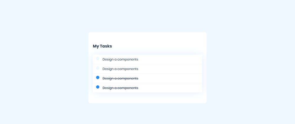
Now, save the changes and check your browser, if you followed me well, your screen should look like in the picture below.

You should see a heading that says 'My Tasks' and list of tasks. Any completed task has a strike-through text decoration and a blue circle on it's left. The uncompleted tasks, has a different look, it has a light blue circle on it's left and has no strike-through text decoration. Thanks to CSS, we're able to differentiate the states in the UI.
You should also see that when you click on a task, the UI changes, that is because the status of the task (done/undone) get changed by the handleChange method. You remember? Yes!
For example, if you click on the first task which is done, the done status will change to false on the background and the UI will change with a subtle transition.
Before clicking the task:
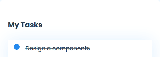
After clicking the task:

Conclusion
In this project, we created a dynamic component that renders a list (a task), it receives a prop (an object containing the task, it's id and it's done status) and when a user wants to change the task' status, they click on the task and the status gets toggled.
When a task is clicked, on the background, the component emits an event, a change event telling the parent component that the status of the task needs to be changed. The parent component then handles the event.
The idea behind this is to create event-driven data communication between components, parent and child. This idea can be used in different use cases, you can use it to create modular, custom and dynamic drop-down, drawer and pop-up ui components having features like value change, open and close toggles, and more.
Resources
You can find the codes for this tutorial here.
View the app we built live here.


Top comments (0)