Whatever the art or design you do, colour theory plays an important role in conveying your message to your audience. Although many won't really know it, the colour mix you implement in your designs can affect the audience in a psychological way.
Before going that mental, let's dig up the basics.
Colour Systems
Understanding colour system is vital in reproducing more colours. There are two main colour systems.
- Additive
- Subtractive
Additive colours are used in screens while subtractive colours are used in printed materials. Another way of looking at this is that objects that emit light use additive colours and objects that reflect light use subtractive colour.
1. Additive Colour
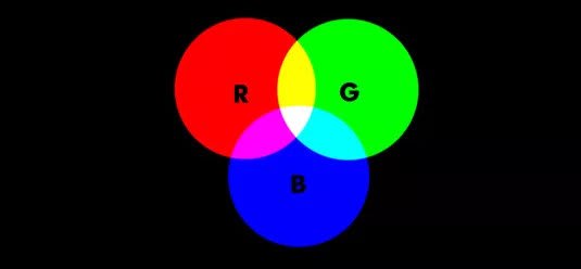
Primary colours of this are Red, Green and Blue (RGB). This is the holy trinity of additive colours that is the basis for all colours that's used on a screen. Combination of all these colours creates white, and absence of the all three colours is black.
2. Subtractive Colour
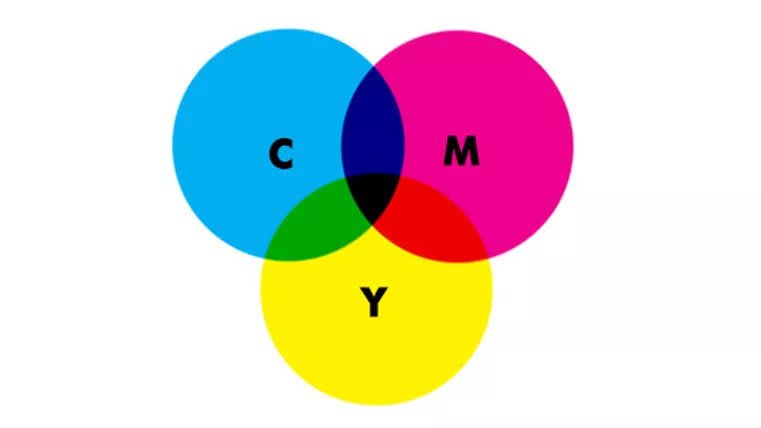
Primary colours of subtractive are cyan, magenta, yellow and black (CMYK). K stands for 'key' because cyan, magenta and yellow don't fully absorb light and a need arose for a compensating colour to account for this. Hence, black is added as a fourth colour.
Colour Wheel

A bit of a history for you; the colour wheel was invented in 1666 by Isaac Newton, as he mapped the colour spectrum onto a circle. The colour wheel is called the basis of colour theory, as it shows the relationship between colours.
Colour Wheel is used to find colour harmonies by using the specific colour combinations. Colour harmony is achieved by using colours that look good together.
Colour Combinations
1. Complementary Colours
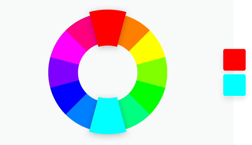
Complementary colours are two colours that are on opposite sides of the colour wheel. A combination of two of these like this provides a high contrast for your work and these colours will appear brighter and more prominent.
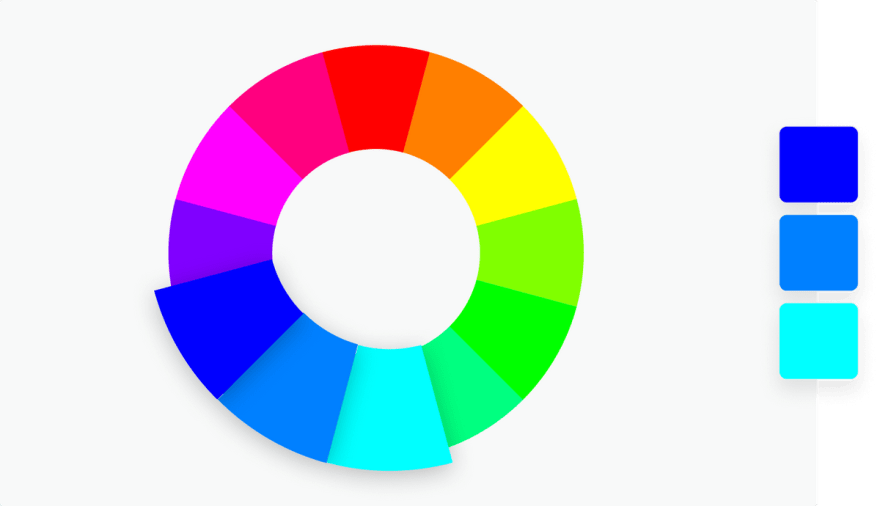
2. Monochromatic

Monochromatic colour is used as shades, tones and tints (later explained) of a one base colour. It adds minimalism to your work and also it's easier to design too.
3. Analogous
Three colours which are placed side by side on the colour wheel are called Analogous colours. The idea is to use one colour as the dominant colour and use the others as supplementary colours. This combination is often called a versatile but overwhelming combination.
4. Triadic

Triadic involves three colours that are evenly spaced on colour wheel. This combination creates a high contrast, bold and vibrant colour schemes.
5. Tetradic
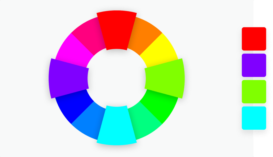
Tetradic is four colours that are evenly spaced on the colour wheel. As in the analogous combination, this combination works best if you let one colour be dominant and use others as supplementary. Although they make a bold impression, more colours means it is more difficult to balance them all.
Warm and Cool Colours
The colours of colour wheel can be also divided as warm and cool. Warmness or coolness is known as the temperature of a colour. According to psychology as mentioned above, different colour temperature evokes different feelings.
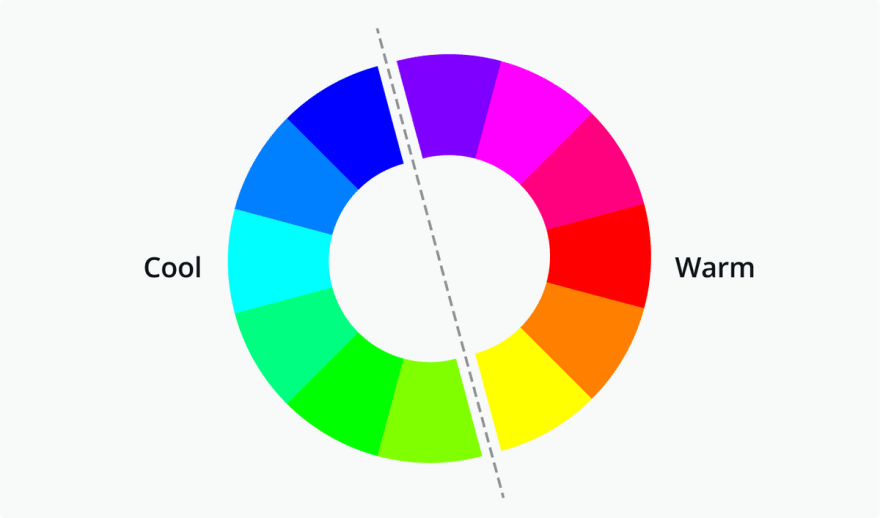
The general idea is that warm colours arouse or stimulate the viewer and cool colours make the viewer calm and relax.
Three Components of a Colour
You can refer to many different 'colours' as when you say the name of a certain colour. To overcome this, there are three primary factors that help in defining a colour.
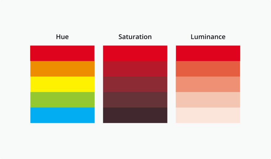
1. Hue
Hue is defined by the position of the colour wheel, and it represents the name of the colour.
2. Saturation
Saturation defines how saturated (rich) a colour is. Saturation at 100% is the normal state of the colour while 0% can result in just a shade of grey.
3. Brightness (Luminance)
Same as the saturation, this is expressed as a percentage between 0 and 100. 0% brightness of a colour is black and 100% bright is the full colour.
Shades, tints and tones

Shade
Created by adding black to base hue and it makes the colour darker. This results in a deeper and richer effect and can be overpowering at times.
Tint
Created by adding white to base hue and results in lighter colour. It decreases the intense and used to balance vivid colour combinations.
Tones
Created by adding black and black and white (or grey) to base hue. Tones may not look lie pastel but can reveal complex characters which were not apparent in the base hue.
Conclusion

This has been just an introduction to the world of colours. However, with the basics in mind, you can explore more combinations and techniques to use colours in your designs to really make an effect on the viewer.


Latest comments (0)