
Responsive design is all about adjusting designs to accommodate screens of different sizes.Tables are one of the most used components on the UI to represent and organize data but setting their responsiveness in mobile have never been an easy task.
The most common practice of setting tables' responsivenes in mobile that's almost everywhere on the web is styling the table's container div with
overflow-x:auto;
Just like this,
<div style="overflow-x:auto;">
  <table>
    ..table headers and rows
  </table>
</div>
With the above code, when you are on devices with small width like mobile the data is shown but you need to scroll in x-direction which in my opinion is not user friendly thought it's a step forward.
This made triggered me to search for a more convinient way of making tables responsive on small devices which is even more user friendly.
Who can't like that!
In this tutorial, I want to share you a very simple CSS trick that I came accross that will make each table responsive regardless of how large the table might be.
Remember this is possible using HTML and CSS only.Sounds, interesting ? I know yes!
Without further ado,

What we are going to do is using “responsive design” principles (CSS @media queries) to detect if the screen is smaller than the maximum squishitude of our table. If that's the situation, we’re going to reformat the table but don't worry nothing is tuff.
Let's use this simple table
<table>
  <caption>Statement Summary</caption>
  <thead>
    <tr>
      <th scope="col">Account</th>
      <th scope="col">Due Date</th>
      <th scope="col">Amount</th>
      <th scope="col">Period</th>
    </tr>
  </thead>
  <tbody>
    <tr>
      <td data-label="Account">Visa - 3412</td>
      <td data-label="Due Date">04/01/2016</td>
      <td data-label="Amount">$1,190</td>
      <td data-label="Period">03/01/2016 - 03/31/2016</td>
    </tr>
    <tr>
      <td scope="row" data-label="Account">Visa - 6076</td>
      <td data-label="Due Date">03/01/2016</td>
      <td data-label="Amount">$2,443</td>
      <td data-label="Period">02/01/2016 - 02/29/2016</td>
    </tr>
    <tr>
      <td scope="row" data-label="Account">Corporate AMEX</td>
      <td data-label="Due Date">03/01/2016</td>
      <td data-label="Amount">$1,181</td>
      <td data-label="Period">02/01/2016 - 02/29/2016</td>
    </tr>
    <tr>
      <td scope="row" data-label="Acount">Visa - 3412</td>
      <td data-label="Due Date">02/01/2016</td>
      <td data-label="Amount">$842</td>
      <td data-label="Period">01/01/2016 - 01/31/2016</td>
    </tr>
  </tbody>
</table>
That's all with HTML
let's add some styles to make it even better
table {
  border: 1px solid #ccc;
  border-collapse: collapse;
  margin: 0;
  padding: 0;
  width: 100%;
  table-layout: fixed;
}

table caption {
  font-size: 1.5em;
  margin: .5em 0 .75em;
}

table tr {
  background-color: #f8f8f8;
  border: 1px solid #ddd;
  padding: .35em;
}

table th,
table td {
  padding: .625em;
  text-align: center;
}

table th {
  font-size: .85em;
  letter-spacing: .1em;
  text-transform: uppercase;
}
The above table looks like this
- On desktop
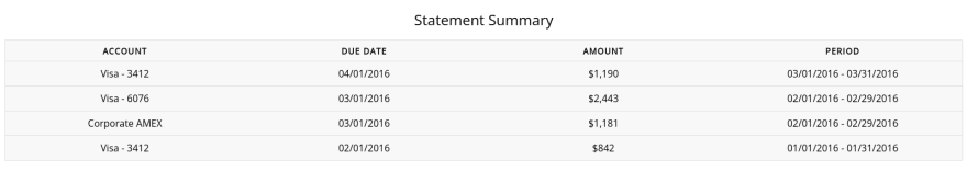
Everthing is fine in desktop and none can't be happy with that i guess.
- On mobile

I hope you can see how the content is more streched before we use our trick.Surely, It's look can't put a smile on your face.
As you've seen from the above results, the above code just gives us a normal table but I want you to be carefull here, Have you noticed data-label attribute that I have added on each <td> in our HTML? What do you realize about it's content?
As you might have noticed, each td's data-label attribute has content equivalent to the table header that that <td> follows under.
Don't be confused nothing is strange there,
Just wait abit and see how it's going to be usefull to us.
For the css, we gonna add few other codes to make our table look better on small devices too. Kepp focused to know what's going on in mobile. Anything else was just normal
@media screen and (max-width: 600px) {
  table {
    border: 0;
  }

  table caption {
    font-size: 1.3em;
  }

  table thead {
    border: none;
    clip: rect(0 0 0 0);
    height: 1px;
    margin: -1px;
    overflow: hidden;
    padding: 0;
    position: absolute;
    width: 1px;
  }

  table tr {
    border-bottom: 3px solid #ddd;
    display: block;
    margin-bottom: .625em;
  }

 /*Here we are setting each td display to block*/
  table td {
    border-bottom: 1px solid #ddd;
    display: block;
    font-size: .8em;
    text-align: right;
  }

/*
Now the other data-label we have added on each td comes into play.
*/

  table td::before {
    content: attr(data-label);
    float: left;
    font-weight: bold;
    text-transform: uppercase;
  }

  table td:last-child {
    border-bottom: 0;
  }
}
Let see what this adds to the beauty of our table.

You know what,smile, we've done it.

To wrap it all,this tutorial was about a very awesome trick to make tables look better even on small devices regarderless of how large the table might be. I hope it was not so tough for you
Note: If you want to play with the codes visit this link which will take you to the codepen
What's next
It's your turn to share us what you thing about this article and share any other trick that you think it's worth our attention in the comment section.
Thanks for being a part of this till the end. Boom! You buddies never dispoint (:


Latest comments (12)
That's a great help to everyone here. Thank you
Thank you for sharing!
Great tip!
Thank you !
that is helpful. Responsive tables are tough tough.
Saved.
Thank you. saved
Saved ! Thank u
That's really helpful
I'm glad it helped
Simply Beautiful 😻
Awesome!!
Thank you