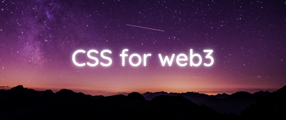
This dark mode web3 aesthetic looks very cool and futuristic. They all have some common designs that achieve this look. Taking inspiration from The Graph, ARCx Money, Rabbithole, Sushi Swap, Buildspace (among others), here are some simple styles you can add to your app:
- Gradient backgrounds
- Glowing effect
- Bright and white text over a dark background
- Semi transparent backgrounds
- A quick and easy transition on hover
Let's go through how we can apply these styles to texts, buttons and backgrounds.
In each of these examples, we have a dark background and white text over it. Let's start with some text styles.
Text styles to create the web3 look
Refer to this codepen.
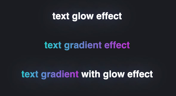
1. Glow effect
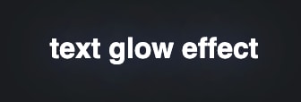
<h1 class="text-glow">text glow effect</h1>
.text-glow {
  text-shadow: 0 0 80px rgb(192 219 255 / 75%), 0 0 32px rgb(65 120 255 / 24%);
}
You can use this effect for headings, or to emphasize a certain word in a heading, or as a hover effect for links. The Graph uses this effect a lot, and I'm here for it!

2. Gradient background effect

<h1><span class="text-gradient">text gradient effect</span></h1>
.text-gradient {
  background: linear-gradient(to right, #30CFD0, #c43ad6);
  -webkit-background-clip: text;
  -webkit-text-fill-color: transparent;
}
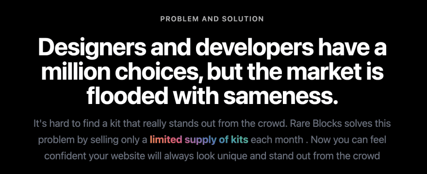
Buildspace uses this style to emphasize words in a heading. Rare Blocks also uses it to emphasize words in a paragraph. The added bold font weight makes it stand out even more.
3. Combine the gradient and glow effect. Use the gradient to emphasize certain words in a phrase.

<h1 class="text-glow">
  <span class="text-gradient">text gradient</span>
  with glow effect
</h1>
Now that we have some text effects, let's move on to buttons.
Button styles to create the web3 look

All these effects can be found in this codepen.
First, let's define the colors we'll be using. I'm going for purple. These are rgb colors that we will later on use with different opacity levels.
:root {
  /* violet */
  --primary-color: 111, 76, 255;

  /* white */
  --text-color: 256, 256, 256;
}
Let's also define the base styling of the button. We will add modifier classes later to create different styles.

<button class="btn">Button</button>
.btn {
  font-family: sans-serif;
  font-size: 18px;
  padding: 12px 32px;
  margin: 1rem;
  cursor: pointer;
  border-radius: 4px;
  transition: all 0.3s ease;
  border-radius: 50px;
}
1. Glow on hover
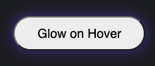
<button class="btn btn-glow">Glow on Hover</button>
.btn-glow:hover {
  box-shadow: rgba(var(--primary-color), 0.5) 0px 0px 20px 0px;
}
Make sure to add a transition. A simple 0.3s transition makes a huge difference.
.btn {
  transition: all 0.3s ease;
}

.btn:hover {
  transition: all 0.3s ease;
}
2. A bright background with white text.
Let's also use the glow effect on this one.
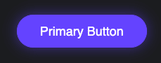
.btn-primary {
  background-color: rgb(var(--primary-color));
  border: 1px solid rgb(var(--primary-color));
  color: rgb(var(--text-color));
}
<button class="btn btn-glow btn-primary">Primary Button</button>
3. A semi transparent background

.btn-semi-transparent {
  background-color: rgba(var(--primary-color), 0.15);
  border: 1px solid rgba(var(--primary-color), 0.25);
  color: rgba(var(--text-color), 0.8);
}
Let's make the colors a tiny bit brighter on hover. Again, this is a small change that actually makes a big difference in the experience.
.btn-semi-transparent:hover {
  background-color: rgba(var(--primary-color), 0.35);
  border: 1px solid rgba(var(--primary-color), 0.5);
  color: rgba(var(--text-color), 0.9);
}
Let's continue to use the glow effect.

<button class="btn btn-semi-transparent btn-glow">Semi Transparent Button</button>
See this in action on The Graph's landing page.

4. Gradient background
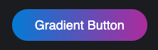
.btn-gradient {
  background-image: linear-gradient(to right, rgb(1 134 218), rgb(182 49 167));
  border: 0;
  color: rgba(var(--text-color));
}
<button class="btn btn-gradient btn-glow">Gradient Button</button>
This is probably the most common button styling that I see on web3 sites such as Sushi Swap and Buildspace.

5. Gradient border

.btn-gradient-border {
  color: rgb(var(--text-color));
  border: 2px double transparent;
  background-image: linear-gradient(rgb(13, 14, 33), rgb(13, 14, 33)), radial-gradient(circle at left top, rgb(1, 110, 218), rgb(217, 0, 192));
  background-origin: border-box;
  background-clip: padding-box, border-box;
}
<button class="btn btn-gradient-border btn-glow">
  Gradient Border Button
</button>
This is inspired by ARCx Money and Sushi Swap.
Blurred Backgrounds to create the web3 look
Here's the code for reference.
For this, we are going to use this galaxy image from Unsplash. Swap this out to experiment.

First, let's create a card.
<div class="card">
  <h1>Some text here</h1>
</div>
These styles aren't necessary, except for position: relative.
.card {
  margin: 1rem;
  padding: 1rem;
  height: 300px;
  width: 300px;
  text-align: center;
  color: white;
  display: flex;
  align-items: center;
  justify-content: center;
  position: relative;
  border-radius: 10px;
}
Let's add the image as a background.
.bg-blur {
  overflow: hidden;
}
.bg-blur::before {
  content: '';
  background-image: var(--bg-image);
  background-size: cover;
  height: 100%;
  width: 100%;
  position: absolute;
  z-index: -1;
}
Now, let's blur the image to create a gradient look using the filter property.
.bg-blur::before {
  filter: blur(30px);
}

In most cases, you don't need an image to achieve a similar effect. You can do it with a gradient background, which Buildspace does really well!

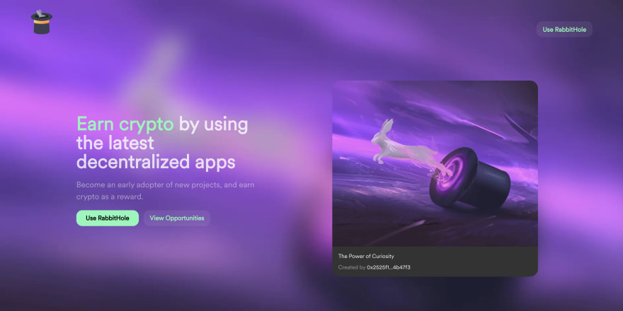
But with an image, you can have dynamic colors. Here's an example from The Graph. They take the logo, add the blur effect, set that as a background on the card and put the logo on top of it.

Rabbithole also uses this effect to match their hero background colors with their hero image. See how the background image is just a blurred version of the rabbit image on the right?
And there you have it! You can start shipping your next web3 project and achieve that web3 aesthetic. Don't forget that you can find all these here:
I hope you enjoyed and learned something from this article! If you'd like to see more of this, let me know in the comments. You can also learn more about me here or download my website template.
PS: I currently have availability for a frontend role and I'm saving that for a web3 project. 😉
Meanwhile, I'll leave you with this beauty that is ARCx's passport designs. 😍


Top comments (21)
muy bueno, pero aqui me muestra un erro en mi VC CODE en la line del webkit
-webkit-background-clip: text;
Also define the standard property 'background-clip' for compatibilitycss(vendorPrefix)
Determines the background painting area.
(Chrome, Safari 3)
Sabes como solucionar?
I agree, if we ever need to use a prefixed CSS property, we must always specify the un-prefixed version as well, even if it's not yet supported by any browser. At some point that CSS proprty will move to a standard. Absolutely no point ignoring browsers that follow the standards but don't support some other vendors prefix.
Asking in Spanish looking for an answer is kinda counterintuitive XD
Just add "background-clip: text;" after your -webkit declaration.
Doesn't the glow look too bright? I mean is it optimized for accessibility?
I guarantee accessibility is the last thing on the minds of these absolute wastes of space.
I know , right? This looks so generic now, with pretty much all opting for these kinds of memory hoggers. I don't know why there's so hype and excitement for these.
Anyways, thanks for the author to share these details.
Wow! is this web3 styling? it's quite cute!
I didn’t know web3 was about glows, gradients and button styles.
I love this article, give me more ideal for my design
Glad it helps!
Tes, You área Nice.
Looks nice
Thanks Timo!
It looks stunning
Thanks Rachit!
Thanks for sharing this awesome content.
Thanks for reading!
Wow that's awesome i didn't know that it's possible for gradient colors for fonts and even applying some photoshop like capabilities.
It's pretty cool!
so cool
Thanks for writing I found it amazing it helps out me a lot I am so happy after getting this trick that I have no words to say.
Please keep writing more content like this .