
📸 Photo by Caspar Camille Rubin on Unsplash
Well, this was a ride. But I came out on the other end. The following is a case study of my journey adding low highlights to headings and links to this blog.
To add a bit more color and style to this blog by adding a low highlight to headers and links, much like you can find on the Rust landing page and Wes Bos' website.
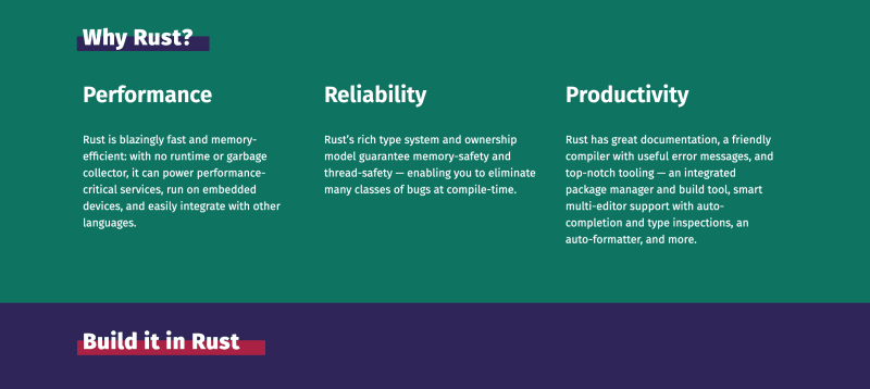
Rust's landing page highlights
Wes' sense of design is always top notch. Always a bit of whimsy with his stuff.
Motivation
I wanted my blog to look cool and modern, fancy, like the big kids in this space. I also wanted to flex my CSS muscles, as that is one of my weaker areas1.
Process
At first, I went into DevTools and copied the CSS from Rust's webpage. It didn't quite work. None of my highlights were showing and I didn't debug because I felt like something deeper was at play2. I decided to skip this idea and go a different route.
I did a bit of Google-fu on how to get this effect and came across How to create a low highlight behind your text by Thirty Eight Visuals. It's a tutorial on how to do this on Squarespace but you can apply it to any website.
I copied this snippet of code:
 background: linear-gradient(180deg, rgba(255, 255, 255, 0) 65%, #ffc1d2 65%);
  display: inline;
created a class and added that to the h1 element in my page.html file. The resulting code looks something like this:
h1.highlight {
  background: linear-gradient(180deg, rgba(255, 255, 255, 0) 65%, #ffc1d2 65%);
  display: inline;
}
This worked for all the h1 elements, but I also wanted the h2 and h3 elements to be highlighted. In this instance, it also only highlighted the h1 elements on the index page, which in my Jekyll theme is default.html.
I tried to add a class to all the header elements but it still didn't work. I found it difficult to actually target those specific elements with the .highlight class. If I added the class to all the header elements in one template, it didn't go across all the other templates in my _layouts folder.
Targeting inline header elements
I wanted all header elements to be highlighted on every page. It was difficult to accomplish this with the different templates that my Jekyll theme has in its _layouts folder.
I dug into the Sass in my theme and looked for any classes that targeted what I wanted and added the gradient to them but that also didn't work.
This image doesn't capture the half of it...
I decided to head back to Google, Stack Overflow and try to find something to help me with this.
MDN and the :not() selector
One of the things I wanted to do was exclude certain elements with certain classes. I found the :not() selector on MDN.
At first it confused me; what are we excluding?
At first I selected all of the elements I wanted to change and added the :not() selector, for instance p:not(.some-class) which highlighted all the p elements that did not have that class. This meant all paragraphs in the body were selected.
I tried to add the linear gradient to all the main hn selectors which meant even those elements that I didn't want selected, like the tags or header in the newsletter box had the gradient added to them which I didn't want. I also wanted to add the gradient to different links in the body. I did the same for the anchor elements, not realizing that the social icons and tags were also links, thus having all the social icons, tags, and other buttons included in the linear gradient selection. It was a disaster so I went back to the docs and reread them.
Decided :not() was not the right selector3
I tried to use :first-child() selector but then I'd need to select different elements that were not descendants to the parent element because this Jekyll theme and Liquid templating is hard to reason about when it comes to custom styles.
Looked up the :nth-child() selector and decided that wouldn't work either.
Sat on it for a few minutes, Googling and trawling Stack Overflow.
Back to basics
Went back to CSS fundamentals and realized I could just add a background: #fff to the elements that I didn't want the highlight to be included in. Learned more about specificity and how to order selectors along the cascade to target specific elements, for example:
p.site-info a {
  background: #fff;
}
to target all the p elements with the class site.info that have an anchor tag, a as a descendant I also changed the color of the text selection when a user selects text on most of the site with the ::selection selector.
Oh ...and a scrollbar
What good is a dev blog without a fancy scrollbar?
Got the idea from swyx and CSS-Tricks.
body::-webkit-scrollbar {
  width: 1em;
}

body::-webkit-scrollbar-track {
  -webkit-box-shadow: inset 0 0 6px rgba(0, 0, 0, 0.3);
}

body::-webkit-scrollbar-thumb {
  background: rgb(6, 215, 217);
  background: linear-gradient(45deg, rgba(6, 215, 217, 1) 0%, rgba(255, 193, 210, 1.00) 35%, rgba(6, 215, 217, 1) 100%);
  border-radius: 3em;
}
Conclusion
CSS can be fun at times and sprucing up this blog with some fancy CSS tricks was quite an adventure.
Learning about specificity, different CSS selectors, and the like, made for a fun yet frustrating evening and I am glad I did it.
Edit:
I could have used a CSS variable instead of writing background: #fff everywhere, declaring the :root pseudo-class and declaring a variable like so:
:root {
  --non-highlights: #fff;
}
And then applying this variable everywhere I need, like this:
.non-highlights {
  var(--non-highlights)
}
I plan on implementing this soon.


Latest comments (2)
Glad to see more of this happening. So many websites (including my own, but I'm working on it) lack any sort of flair and just seem like the same boring white cookie-cutter page with a few action buttons
Thank you for that!! The style is really cool