
There are a lot of different UI components you can find on an app. The ones you'll find the most will probably be buttons, inputs, forms, or images. They are so common that HTML even provides default elements for them! However, it's not rare to encounter lesser-known components that you have to build by yourself.
I worked lately on a switch/toggle component lately, something that looks like this:
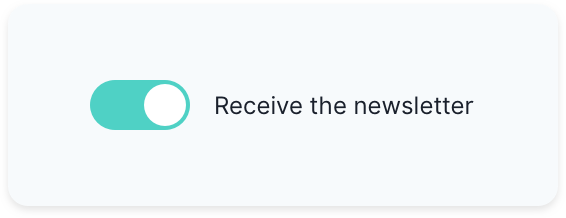
At first, it seems like a simple UI component. But building it can be tricky when you need to consider all the different states, its accessibility, and its reusability.
Well, lucky you! Today I'm going to share with you how you can do the same.
Note: though I'm building it with Vue, the concepts can easily be applied to another framework such as React. Also, I'm using Vue 3 but don't be scared. There are not many differences with Vue 2 here! 😉
A bit of conception
Before jumping straight to your keyboard and start coding, you have few things to consider, especially the switch's purpose. Indeed, a switch can be used in two ways:
- To turn on or off something (as you would do with a light switch)
- To select between two choices (a theme switcher, for example)
It's essential to know which use case is the right one for you because it impacts the underlying implementation. In our case, we're going to go for the first use case.
Additionally, we want to label a toggle switch so that the user knows what is going to happen if he toggles the switch.
Let's look at a real-world example where a user would choose to receive a newsletter. You can think of a first implementation where you would use a checked prop, a label prop and a toggle event:
<Switch
  :checked="shouldReceiveNewsletter"
  @toggle="toggle"
  label="Receive newsletter"
/>
That's good. But we can achieve the same result by using v-model like so:
<Switch v-model:checked="shouldReceiveNewsletter" label="Receive newsletter" />
If you're familiar with Vue, you might be surprised with the use of v-model in the example above. That's one of the changes introduced by Vue 3: you can now use an argument name directly on the template. The code above passes a checked prop to <Switch> that you can update by emitting an update:checked event.
Build the template
Whenever you have to choose HTML elements, you need to select the ones that make sense semantically. In our case, we'll have to use an input as we're building a control. Remember, there are two use cases for a switch:
- Switch a setting on/off: we need a checkbox
- Switching between one option and another (like a light/dark theme): we need two radio buttons
We also need to make sure our input is labeled correctly. One way of doing so is to wrap an <input> in a <label> and add some text.
Finally, we can also add an empty <span> that we're going to use later to build our toggle switch. Go ahead and create a Switch.vue file in which you can paste the following:
<template>
  <label>
    <input type="checkbox" />
    <span></span>
    <span>{{ label }}</span>
  </label>
</template>
Props and v-model
We need to pass two props to the Switch: label which is a string and checked which is a boolean. Remember that the checked prop comes from v-model:checked:
<template>
  <label>
    <input
      type="checkbox"
      :checked="checked"
      @change="$emit('update:checked', $event.target.checked)"
    />
    <span></span>
    <span>{{ label }}</span>
  </label>
</template>

<script>
  export default {
    name: "Switch",
    props: {
      label: {
        type: String,
        required: true,
      },
      checked: {
        type: Boolean,
        required: true,
      },
    },
  };
</script>
There's a problem with the input above. Indeed, the root element is different than the underlying input. We have to create an additional prop for any other attribute we want to pass to the input (disabled, for example).
To fix it, we need to put a v-bind="$attrs" on the input and disable attribute inheritance on the root element:
<input
  v-bind="$attrs"
  type="checkbox"
  @change="$emit('update:checked', $event.target.checked)"
  :checked="checked"
/>

<script>
  export default {
    name: "Switch",
    inheritAttrs: false,
    /* ... */
  };
</script>
Style the component
The container and the label
So far, our switch should look like this:
Let's face it, it's ugly as hell. To make it prettier, we'll add CSS classes to the different elements:
<template>
  <label class="container">
    <input
      v-bind="$attrs"
      class="input"
      type="checkbox"
      :checked="checked"
      @change="$emit('update:checked', $event.target.checked)"
    />
    <span class="switch"></span>
    <span class="label">{{ label }}</span>
  </label>
</template>
We'll do them one by one. First, the .container. We know the text will be on the right of the switch, and we want it to be perfectly centered. We also want the whole toggle to be clickable so let's add a pointer cursor to it:
<style scoped>
  .container {
    cursor: pointer;
    display: flex;
    align-items: center;
  }
</style>
We also need to give a prettier color to the label and give some space from the checkbox:
.label {
  margin-left: 12px;
  color: #1a202c;
}
Then, though we use the <input> for semantic reasons, it won't be useful to us in terms of visuals. We need to hide it visually but still keep it in the DOM for accessibility reasons:
/* Visually hide the checkbox input */
.input {
  position: absolute;
  width: 1px;
  height: 1px;
  padding: 0;
  margin: -1px;
  overflow: hidden;
  clip: rect(0, 0, 0, 0);
  white-space: nowrap;
  border-width: 0;
}
Note: the properties are inspired by the .sr-only class from Tailwind CSS
The switch
The switch is composed of a rounded container element with a circle inside of it. This circle moves to the left or to the right depending on whether the input is checked or not.
If you look at the screenshot, you can see that the inner circle is roughly half the size of the container element. The container width has twice the size of its own height. Let's make use of CSS custom properties for that:
.switch {
  --switch-container-width: 50px;
  --switch-size: calc(var(--switch-container-width) / 2);
}
To create the inner circle, we're going to use the ::before element trick. To make it inside the container, we'll need to give the container a relative position and the inner circle an absolute position.
Additionally, the inner circle should be nearly the size of --switch-size but it shouldn't overflow the container. We'll use the calc function to adjust it:
.switch {
  --switch-container-width: 50px;
  --switch-size: calc(var(--switch-container-width) / 2);

  /* Vertically center the inner circle */
  display: flex;
  align-items: center;
  position: relative;
  height: var(--switch-size);
  flex-basis: var(--switch-container-width);
  /* Make the container element rounded */
  border-radius: var(--switch-size);
  background-color: #e2e8f0;
}

.switch::before {
  content: "";
  position: absolute;
  /* Move a little bit the inner circle to the right */
  left: 1px;
  height: calc(var(--switch-size) - 4px);
  width: calc(var(--switch-size) - 4px);
  /* Make the inner circle fully rounded */
  border-radius: 9999px;
  background-color: white;
}
Here is the result:
That's nice, but if you click on the switch nothing happens. At least, visually. Indeed, the input is checked correctly, but your switch isn't connected to it!
To reflect these changes, you'll need to use the CSS adjacent sibling selector, which is +, to style the switch according to the different input states. For example, when your checkbox is checked, the :checked pseudo-class is added. Let's make use of that then:
.input:checked + .switch {
  /* Teal background */
  background-color: #4fd1c5;
}

.input:checked + .switch::before {
  border-color: #4fd1c5;
  /* Move the inner circle to the right */
  transform: translateX(
    calc(var(--switch-container-width) - var(--switch-size))
  );
}
The way the switch moves from one state to another isn't smooth. We need to add transitions to transform and background-color to fix it:
.switch {
  /* ... */
  transition: background-color 0.25s ease-in-out;
}

.switch::before {
  /* ... */
  transition: transform 0.375s ease-in-out;
}
The focus and disabled states
Right now, you should have a switch that works. But the work isn't entirely done yet! Indeed, there are still different states to an input that we haven't implemented here. For example, if you press the Tab key to focus the switch, you don't have any visual feedback that it's properly focused. The same goes for disabled inputs.
As a first step, we're going to add additional CSS custom properties to .switch and replace the hardcoded colors:
.switch {
  /* ... */

  --light-gray: #e2e8f0;
  --gray: #cbd5e0;
  --dark-gray: #a0aec0;
  --teal: #4fd1c5;
  --dark-teal: #319795;

  /* ... */
  background-color: var(--light-gray);
}

.input:checked + .switch {
  background-color: var(--teal);
}

.input:checked + .switch::before {
  border-color: var(--teal);
  /* ... */
}
Note: the colors come from Tailwind CSS in case you're wondering.
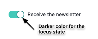
Let's tackle the focus state. We're not going to do anything complicated UI-wise, we'll just have to add a border on the inner circle:
.switch::before {
  /* ... */
  border: 2px solid var(--light-gray);
}
Here, we chose the same color as the background of the switch container. Indeed, initially, we want the inner circle border color to confound with the background color. That way, when we adding a different border-color for the focus state, we'll be able to see it. We're going to add a darker border-color when the input is focused:
.input:focus + .switch::before {
  border-color: var(--dark-gray);
}

.input:focus:checked + .switch::before {
  border-color: var(--dark-teal);
}
Here's how it looks:
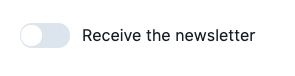
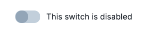
For the disabled state, we're going to fill the inner circle with gray and make the switch container darker to indicate that you can't do anything on it:
.input:disabled + .switch {
  background-color: var(--gray);
}

.input:disabled + .switch::before {
  background-color: var(--dark-gray);
  border-color: var(--dark-gray);
}
Here's what our disabled switch looks like:
The switch's responsiveness
We have one last thing to check. Look at the screenshot below:
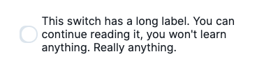
If you have a long label, you can see that the text overflows on the switch and may take multiple lines. That's not responsive, is it? Let's make sure our switch can't shrink, and the label doesn't take more than one line:
.switch {
  /* ... */
  /* In case the label gets long, the toggle shouldn't shrink. */
  flex-shrink: 0;
}

.label {
  /* ... */
  /* Show an ellipsis if the text takes more than one line */
  overflow: hidden;
  text-overflow: ellipsis;
  white-space: nowrap;
}
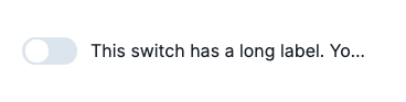
Now, our switch is responsive:
Voilà! We're done for the switch. The switch is a small piece of UI, but it's not that easy to implement. Here are the main takeaways when building such a component:
- Think of your component's API beforehand and its use cases. You'll have a better vision of what you want to build.
- Don't forget to think of the different constraints of a UI component: its accessibility, its various states, its responsiveness, etc.
- Build your component step by step. You should have an iterative approach with these kinds of components.
In case, you want to have the full code, I put it in a GitHub Gist that you can find below. How nice is that? 😄


Top comments (1)
Wow thankyou very much!!