I've been using Tailwind CSS for quite a while and I'd never go back to a CSS framework that doesn't use a utility-first approach.
One disadvantage of Tailwind CSS compared to other frameworks like Bootstrap or Bulma is the lack of a set of components like buttons, dropdowns, alerts, and more.
That's why I decided to start a tutorial series here on the DEV community where I show you how to build one of the most commonly used components.
Last time I showed you how to build a modal component and today I'll show you how to build a Tailwind CSS tabs components.
Here's how it will look in the end:

Let's get started!
Tailwind CSS tabs component
First of all we need to code the base HTML markup which can either be a nav component with <a> tags inside or use a <ul> element with list items.
We'll stick with the list variant so let's use the following markup:
<ul>
    <li>
        <a href="#">Profile</a>
    </li>
    <li>
        <a href="#">Dashboard</a>
    </li>
    <li>
        <a href="#">Settings</a>
    </li>
    <li>
        <a href="#">Contacts</a>
    </li>
    <li>
        <a>Disabled</a>
    </li>
</ul>
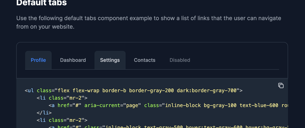
Nice and simple, right? But now we need to start make it look pretty. Let's first design the whole list:
<ul class="flex flex-wrap border-b border-gray-200">
    <li>
        <a href="#">Profile</a>
    </li>
    <li>
        <a href="#">Dashboard</a>
    </li>
    <li>
        <a href="#">Settings</a>
    </li>
    <li>
        <a href="#">Contacts</a>
    </li>
    <li>
        <a>Disabled</a>
    </li>
</ul>
This helps order the list items horizontally. Now we need to style the list items and the links:
<ul class="flex flex-wrap border-b border-gray-200">
    <li class="mr-2">
        <a href="#" aria-current="page" class="inline-block bg-gray-100 text-blue-600 rounded-t-lg py-4 px-4 text-sm font-medium text-center active">Profile</a>
    </li>
    <li class="mr-2">
        <a href="#" class="inline-block text-gray-500 hover:text-gray-600 hover:bg-gray-50 rounded-t-lg py-4 px-4 text-sm font-medium text-center">Dashboard</a>
    </li>
    <li class="mr-2">
        <a href="#" class="inline-block text-gray-500 hover:text-gray-600 hover:bg-gray-50 rounded-t-lg py-4 px-4 text-sm font-medium text-center">Settings</a>
    </li>
    <li class="mr-2">
        <a href="#" class="inline-block text-gray-500 hover:text-gray-600 hover:bg-gray-50 rounded-t-lg py-4 px-4 text-sm font-medium text-center">Contacts</a>
    </li>
    <li>
        <a class="inline-block text-gray-400 rounded-t-lg py-4 px-4 text-sm font-medium text-center cursor-not-allowed">Disabled</a>
    </li>
</ul>
Great! Now it should look something like this:

We should also create a dark mode style for this component, so let's start by adding the following classes:
<ul class="flex flex-wrap border-b border-gray-200 dark:border-gray-700">
    <li class="mr-2">
        <a href="#" aria-current="page" class="inline-block bg-gray-100 text-blue-600 rounded-t-lg py-4 px-4 text-sm font-medium text-center active dark:bg-gray-800 dark:text-blue-500">Profile</a>
    </li>
    <li class="mr-2">
        <a href="#" class="inline-block text-gray-500 hover:text-gray-600 hover:bg-gray-50 rounded-t-lg py-4 px-4 text-sm font-medium text-center dark:text-gray-400  dark:hover:bg-gray-800 dark:hover:text-gray-300">Dashboard</a>
    </li>
    <li class="mr-2">
        <a href="#" class="inline-block text-gray-500 hover:text-gray-600 hover:bg-gray-50 rounded-t-lg py-4 px-4 text-sm font-medium text-center dark:text-gray-400 dark:hover:bg-gray-800 dark:hover:text-gray-300">Settings</a>
    </li>
    <li class="mr-2">
        <a href="#" class="inline-block text-gray-500 hover:text-gray-600 hover:bg-gray-50 rounded-t-lg py-4 px-4 text-sm font-medium text-center dark:text-gray-400  dark:hover:bg-gray-800 dark:hover:text-gray-300">Contacts</a>
    </li>
    <li>
        <a class="inline-block text-gray-400 rounded-t-lg py-4 px-4 text-sm font-medium text-center dark:text-gray-500 cursor-not-allowed">Disabled</a>
    </li>
</ul>
If you want to learn how to toggle dark mode with Tailwind CSS check out the guide from Flowbite.
If dark mode is actived the tabs component should look like this:

Flowbite - Tailwind CSS components
This tabs component is part of a larger open source component library based on Tailwind CSS called Flowbite.

If you head over to the Flowbite documentation you'll see that there are a lot more variants and options for components such as the tabs.


Latest comments (6)
I am unable to make the interactive tabs work. i have included everything but it does not work.
I have also tried to use React flowbite tab component but in that I can not style them, the className or class prop doesn't work. Any help for this or the above one kindly?
I think that for Flowbite React customization you need to check the theme functionality: flowbite-react.com/theme
I have no exp. with it, but is this the final production result:
flex flex-wrap border-b border-gray-200 etc,so many classes, more than the actual content itself ?
Thanks for sharing!
What's next?
Looks great with a dark layout
🚀🚀
Thanks!