In this article I will show you how to build and use a speed dial component for quick user actions using Tailwind CSS and Flowbite.
It's a commonly used component for websites such as Gmail, Facebook, and Twitter where you can use the button to create a new action, such as writing an email or creating a new post.
For this tutorial you will require to have Tailwind CSS and Flowbite installed in your local project.
Before that, I will introduce you these two technologies briefly.
Tailwind CSS is the most popular open-source CSS framework with a utility-first methodology for the class names, meaning that instead of an OOCSSS approach like btn and btn-lg you will instead use utility classes for paddings, margins, colors, and more.
Flowbite is a popular and open-source component library built on top of the Tailwind CSS framework featuring interactive elements such as dropdowns, navbars, modals, and other more complex components that can help you save time when building websites with Tailwind CSS.
Now that we have introduced these two technologies let's get into the tutorial itself!
Tailwind CSS Speed Dial
A speed dial component consists of a main trigger button that will open up a list of other buttons or menu items when hovering or clicking it.
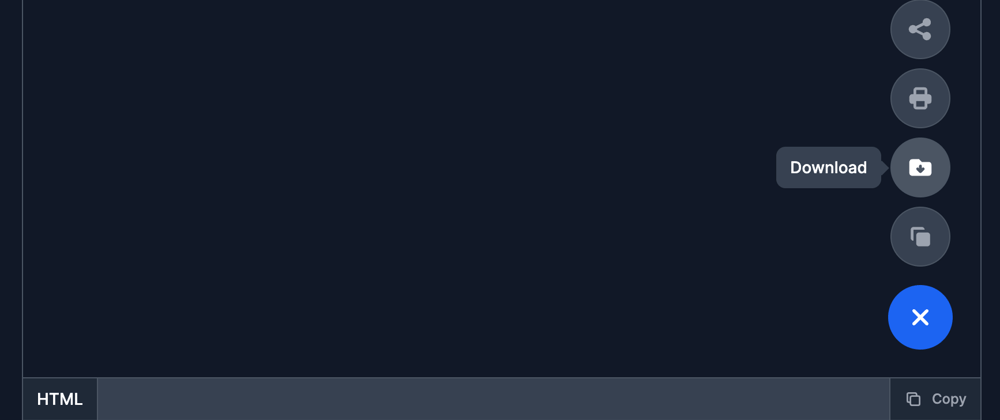
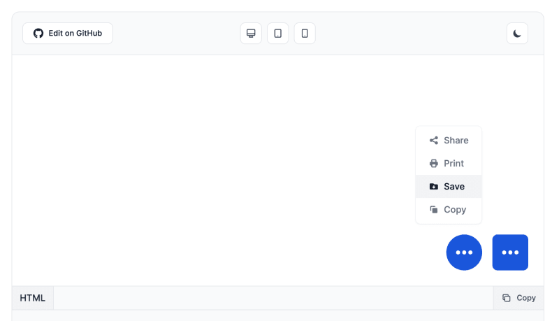
Here's a preview of what we will build:

This is a reference from the speed dial component from the Flowbite Library.
The first step is to build the button that will trigger the actions menu and for that we will use the <button> component like this:
<button type="button" class="flex justify-center items-center w-14 h-14 text-white bg-blue-700 rounded-full hover:bg-blue-800 dark:bg-blue-600 dark:hover:bg-blue-700 focus:ring-4 focus:ring-blue-300 focus:outline-none dark:focus:ring-blue-800">
        <svg aria-hidden="true" class="w-8 h-8 transition-transform group-hover:rotate-45" fill="none" stroke="currentColor" viewBox="0 0 24 24" xmlns="http://www.w3.org/2000/svg"><path stroke-linecap="round" stroke-linejoin="round" stroke-width="2" d="M12 6v6m0 0v6m0-6h6m-6 0H6"></path></svg>
        <span class="sr-only">Open actions menu</span>
    </button>
I already took the styles from the Flowbite Library to set up the style of the buttons, but it's still not working.
An important part of this component is to decide where to position it relative to the body element, and one of the most suitable places would be the bottom right side.
For that, we will wrap this button component inside a <div> element and use absolute positioning:
<div class="fixed right-6 bottom-6 group">
 <!-- here goes the trigger button !-->
</div>
Great! Now you should have a well-styled and well-positioned speed dial button, but there's no menu yet and the functionality also doesn't work.
Inside the <div> wrapper and just before the <button> component you should add the following list of button elements for which we will use the flexbox classes from Tailwind CSS to align them vertically:
<div id="speed-dial-menu-default" class="flex hidden flex-col items-center mb-4 space-y-2">
        <button type="button" data-tooltip-target="tooltip-share" data-tooltip-placement="left" class="flex justify-center items-center w-[52px] h-[52px] text-gray-500 hover:text-gray-900 bg-white rounded-full border border-gray-200 dark:border-gray-600 shadow-sm dark:hover:text-white dark:text-gray-400 hover:bg-gray-50 dark:bg-gray-700 dark:hover:bg-gray-600 focus:ring-4 focus:ring-gray-300 focus:outline-none dark:focus:ring-gray-400">
            <svg aria-hidden="true" class="-ml-px w-6 h-6 " fill="currentColor" viewBox="0 0 20 20" xmlns="http://www.w3.org/2000/svg"><path d="M15 8a3 3 0 10-2.977-2.63l-4.94 2.47a3 3 0 100 4.319l4.94 2.47a3 3 0 10.895-1.789l-4.94-2.47a3.027 3.027 0 000-.74l4.94-2.47C13.456 7.68 14.19 8 15 8z"></path></svg>
            <span class="sr-only">Share</span>
        </button>
        <div id="tooltip-share" role="tooltip" class="inline-block absolute invisible z-10 py-2 px-3 w-auto text-sm font-medium text-white bg-gray-900 rounded-lg shadow-sm opacity-0 transition-opacity duration-300 tooltip dark:bg-gray-700">
            Share
            <div class="tooltip-arrow" data-popper-arrow></div>
        </div>
        <button type="button" data-tooltip-target="tooltip-print" data-tooltip-placement="left" class="flex justify-center items-center w-[52px] h-[52px] text-gray-500 hover:text-gray-900 bg-white rounded-full border border-gray-200 dark:border-gray-600 shadow-sm dark:hover:text-white dark:text-gray-400 hover:bg-gray-50 dark:bg-gray-700 dark:hover:bg-gray-600 focus:ring-4 focus:ring-gray-300 focus:outline-none dark:focus:ring-gray-400">
            <svg aria-hidden="true" class="w-6 h-6" fill="currentColor" viewBox="0 0 20 20" xmlns="http://www.w3.org/2000/svg"><path fill-rule="evenodd" d="M5 4v3H4a2 2 0 00-2 2v3a2 2 0 002 2h1v2a2 2 0 002 2h6a2 2 0 002-2v-2h1a2 2 0 002-2V9a2 2 0 00-2-2h-1V4a2 2 0 00-2-2H7a2 2 0 00-2 2zm8 0H7v3h6V4zm0 8H7v4h6v-4z" clip-rule="evenodd"></path></svg>
            <span class="sr-only">Print</span>
        </button>
        <div id="tooltip-print" role="tooltip" class="inline-block absolute invisible z-10 py-2 px-3 w-auto text-sm font-medium text-white bg-gray-900 rounded-lg shadow-sm opacity-0 transition-opacity duration-300 tooltip dark:bg-gray-700">
            Print
            <div class="tooltip-arrow" data-popper-arrow></div>
        </div>
        <button type="button" data-tooltip-target="tooltip-download" data-tooltip-placement="left" class="flex justify-center items-center w-[52px] h-[52px] text-gray-500 hover:text-gray-900 bg-white rounded-full border border-gray-200 dark:border-gray-600 shadow-sm dark:hover:text-white dark:text-gray-400 hover:bg-gray-50 dark:bg-gray-700 dark:hover:bg-gray-600 focus:ring-4 focus:ring-gray-300 focus:outline-none dark:focus:ring-gray-400">
            <svg aria-hidden="true" class="w-6 h-6" fill="currentColor" viewBox="0 0 20 20" xmlns="http://www.w3.org/2000/svg"><path clip-rule="evenodd" d="M4 4a2 2 0 00-2 2v8a2 2 0 002 2h12a2 2 0 002-2V8a2 2 0 00-2-2h-5L9 4H4zm7 5a1 1 0 00-2 0v1.586l-.293-.293a.999.999 0 10-1.414 1.414l2 2a.999.999 0 001.414 0l2-2a.999.999 0 10-1.414-1.414l-.293.293V9z" fill-rule="evenodd"></path></svg>
            <span class="sr-only">Download</span>
        </button>
        <div id="tooltip-download" role="tooltip" class="inline-block absolute invisible z-10 py-2 px-3 w-auto text-sm font-medium text-white bg-gray-900 rounded-lg shadow-sm opacity-0 transition-opacity duration-300 tooltip dark:bg-gray-700">
            Download
            <div class="tooltip-arrow" data-popper-arrow></div>
        </div>
        <button type="button" data-tooltip-target="tooltip-copy" data-tooltip-placement="left" class="flex justify-center items-center w-[52px] h-[52px] text-gray-500 hover:text-gray-900 bg-white rounded-full border border-gray-200 dark:border-gray-600 dark:hover:text-white shadow-sm dark:text-gray-400 hover:bg-gray-50 dark:bg-gray-700 dark:hover:bg-gray-600 focus:ring-4 focus:ring-gray-300 focus:outline-none dark:focus:ring-gray-400">
            <svg aria-hidden="true" class="w-6 h-6" fill="currentColor" viewBox="0 0 20 20" xmlns="http://www.w3.org/2000/svg"><path d="M7 9a2 2 0 012-2h6a2 2 0 012 2v6a2 2 0 01-2 2H9a2 2 0 01-2-2V9z"></path><path d="M5 3a2 2 0 00-2 2v6a2 2 0 002 2V5h8a2 2 0 00-2-2H5z"></path></svg>
            <span class="sr-only">Copy</span>
        </button>
        <div id="tooltip-copy" role="tooltip" class="inline-block absolute invisible z-10 py-2 px-3 w-auto text-sm font-medium text-white bg-gray-900 rounded-lg shadow-sm opacity-0 transition-opacity duration-300 tooltip dark:bg-gray-700">
            Copy
            <div class="tooltip-arrow" data-popper-arrow></div>
        </div>
</div>
As you can see, I already added some tooltip components when hovering over the buttons, but that will only work if you've installed Flowbite in your project.
You can follow the Flowbite Quickstart guide to get started.
Awesome! We have all of the ingredients in terms of styling and HTML, but we still need to make it work.
For that, we will have to apply the data attributes from the Flowbite Speed Dial documentation to enable showing the menu using hover or click.
First of all, make sure you add the data-dial-init attribute to the <div> wrapper element:
<div data-dial-init class="fixed right-6 bottom-6 group">
Secondly, make sure that you add the targeted parent element that will be shown or hidden when hovering or clicking on the trigger button using the data-dial-toggle data attribute and the other aria-* accessibility attributes:
<button type="button" data-dial-toggle="speed-dial-menu-default" aria-controls="speed-dial-menu-default" aria-expanded="false" class="flex justify-center items-center w-14 h-14 text-white bg-blue-700 rounded-full hover:bg-blue-800 dark:bg-blue-600 dark:hover:bg-blue-700 focus:ring-4 focus:ring-blue-300 focus:outline-none dark:focus:ring-blue-800">
        <svg aria-hidden="true" class="w-8 h-8 transition-transform group-hover:rotate-45" fill="none" stroke="currentColor" viewBox="0 0 24 24" xmlns="http://www.w3.org/2000/svg"><path stroke-linecap="round" stroke-linejoin="round" stroke-width="2" d="M12 6v6m0 0v6m0-6h6m-6 0H6"></path></svg>
        <span class="sr-only">Open actions menu</span>
</button>
Lastly, make sure that the ID inside of the data-dial-toggle attribute coincides with the ID of the menu wrapper element:
<div id="speed-dial-menu-default" class="flex hidden flex-col items-center mb-4 space-y-2">
   <!-- menu items -->
</div>
Awesome! Finally, this should be the final code:
<div data-dial-init class="fixed right-6 bottom-6 group">
    <div id="speed-dial-menu-default" class="flex hidden flex-col items-center mb-4 space-y-2">
        <button type="button" data-tooltip-target="tooltip-share" data-tooltip-placement="left" class="flex justify-center items-center w-[52px] h-[52px] text-gray-500 hover:text-gray-900 bg-white rounded-full border border-gray-200 dark:border-gray-600 shadow-sm dark:hover:text-white dark:text-gray-400 hover:bg-gray-50 dark:bg-gray-700 dark:hover:bg-gray-600 focus:ring-4 focus:ring-gray-300 focus:outline-none dark:focus:ring-gray-400">
            <svg aria-hidden="true" class="-ml-px w-6 h-6 " fill="currentColor" viewBox="0 0 20 20" xmlns="http://www.w3.org/2000/svg"><path d="M15 8a3 3 0 10-2.977-2.63l-4.94 2.47a3 3 0 100 4.319l4.94 2.47a3 3 0 10.895-1.789l-4.94-2.47a3.027 3.027 0 000-.74l4.94-2.47C13.456 7.68 14.19 8 15 8z"></path></svg>
            <span class="sr-only">Share</span>
        </button>
        <div id="tooltip-share" role="tooltip" class="inline-block absolute invisible z-10 py-2 px-3 w-auto text-sm font-medium text-white bg-gray-900 rounded-lg shadow-sm opacity-0 transition-opacity duration-300 tooltip dark:bg-gray-700">
            Share
            <div class="tooltip-arrow" data-popper-arrow></div>
        </div>
        <button type="button" data-tooltip-target="tooltip-print" data-tooltip-placement="left" class="flex justify-center items-center w-[52px] h-[52px] text-gray-500 hover:text-gray-900 bg-white rounded-full border border-gray-200 dark:border-gray-600 shadow-sm dark:hover:text-white dark:text-gray-400 hover:bg-gray-50 dark:bg-gray-700 dark:hover:bg-gray-600 focus:ring-4 focus:ring-gray-300 focus:outline-none dark:focus:ring-gray-400">
            <svg aria-hidden="true" class="w-6 h-6" fill="currentColor" viewBox="0 0 20 20" xmlns="http://www.w3.org/2000/svg"><path fill-rule="evenodd" d="M5 4v3H4a2 2 0 00-2 2v3a2 2 0 002 2h1v2a2 2 0 002 2h6a2 2 0 002-2v-2h1a2 2 0 002-2V9a2 2 0 00-2-2h-1V4a2 2 0 00-2-2H7a2 2 0 00-2 2zm8 0H7v3h6V4zm0 8H7v4h6v-4z" clip-rule="evenodd"></path></svg>
            <span class="sr-only">Print</span>
        </button>
        <div id="tooltip-print" role="tooltip" class="inline-block absolute invisible z-10 py-2 px-3 w-auto text-sm font-medium text-white bg-gray-900 rounded-lg shadow-sm opacity-0 transition-opacity duration-300 tooltip dark:bg-gray-700">
            Print
            <div class="tooltip-arrow" data-popper-arrow></div>
        </div>
        <button type="button" data-tooltip-target="tooltip-download" data-tooltip-placement="left" class="flex justify-center items-center w-[52px] h-[52px] text-gray-500 hover:text-gray-900 bg-white rounded-full border border-gray-200 dark:border-gray-600 shadow-sm dark:hover:text-white dark:text-gray-400 hover:bg-gray-50 dark:bg-gray-700 dark:hover:bg-gray-600 focus:ring-4 focus:ring-gray-300 focus:outline-none dark:focus:ring-gray-400">
            <svg aria-hidden="true" class="w-6 h-6" fill="currentColor" viewBox="0 0 20 20" xmlns="http://www.w3.org/2000/svg"><path clip-rule="evenodd" d="M4 4a2 2 0 00-2 2v8a2 2 0 002 2h12a2 2 0 002-2V8a2 2 0 00-2-2h-5L9 4H4zm7 5a1 1 0 00-2 0v1.586l-.293-.293a.999.999 0 10-1.414 1.414l2 2a.999.999 0 001.414 0l2-2a.999.999 0 10-1.414-1.414l-.293.293V9z" fill-rule="evenodd"></path></svg>
            <span class="sr-only">Download</span>
        </button>
        <div id="tooltip-download" role="tooltip" class="inline-block absolute invisible z-10 py-2 px-3 w-auto text-sm font-medium text-white bg-gray-900 rounded-lg shadow-sm opacity-0 transition-opacity duration-300 tooltip dark:bg-gray-700">
            Download
            <div class="tooltip-arrow" data-popper-arrow></div>
        </div>
        <button type="button" data-tooltip-target="tooltip-copy" data-tooltip-placement="left" class="flex justify-center items-center w-[52px] h-[52px] text-gray-500 hover:text-gray-900 bg-white rounded-full border border-gray-200 dark:border-gray-600 dark:hover:text-white shadow-sm dark:text-gray-400 hover:bg-gray-50 dark:bg-gray-700 dark:hover:bg-gray-600 focus:ring-4 focus:ring-gray-300 focus:outline-none dark:focus:ring-gray-400">
            <svg aria-hidden="true" class="w-6 h-6" fill="currentColor" viewBox="0 0 20 20" xmlns="http://www.w3.org/2000/svg"><path d="M7 9a2 2 0 012-2h6a2 2 0 012 2v6a2 2 0 01-2 2H9a2 2 0 01-2-2V9z"></path><path d="M5 3a2 2 0 00-2 2v6a2 2 0 002 2V5h8a2 2 0 00-2-2H5z"></path></svg>
            <span class="sr-only">Copy</span>
        </button>
        <div id="tooltip-copy" role="tooltip" class="inline-block absolute invisible z-10 py-2 px-3 w-auto text-sm font-medium text-white bg-gray-900 rounded-lg shadow-sm opacity-0 transition-opacity duration-300 tooltip dark:bg-gray-700">
            Copy
            <div class="tooltip-arrow" data-popper-arrow></div>
        </div>
    </div>
    <button type="button" data-dial-toggle="speed-dial-menu-default" aria-controls="speed-dial-menu-default" aria-expanded="false" class="flex justify-center items-center w-14 h-14 text-white bg-blue-700 rounded-full hover:bg-blue-800 dark:bg-blue-600 dark:hover:bg-blue-700 focus:ring-4 focus:ring-blue-300 focus:outline-none dark:focus:ring-blue-800">
        <svg aria-hidden="true" class="w-8 h-8 transition-transform group-hover:rotate-45" fill="none" stroke="currentColor" viewBox="0 0 24 24" xmlns="http://www.w3.org/2000/svg"><path stroke-linecap="round" stroke-linejoin="round" stroke-width="2" d="M12 6v6m0 0v6m0-6h6m-6 0H6"></path></svg>
        <span class="sr-only">Open actions menu</span>
    </button>
</div>
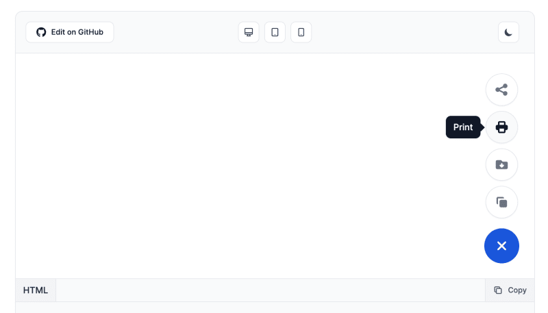
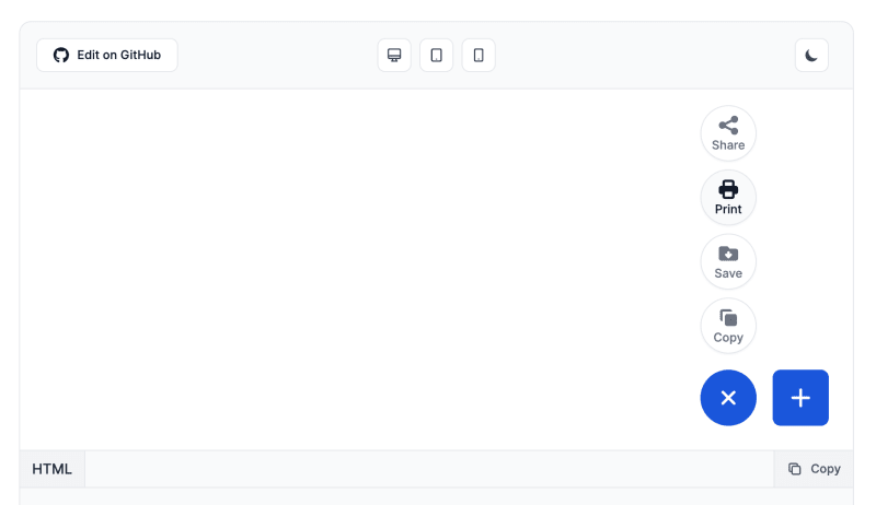
And this should be the final result:
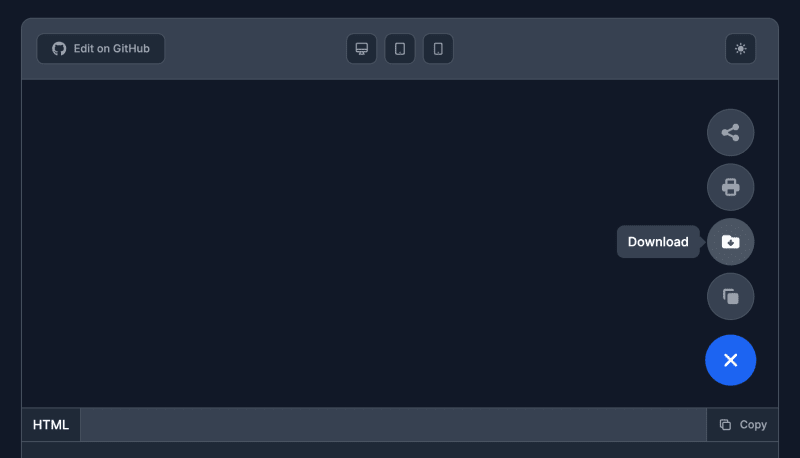
If you enable dark mode with Tailwind CSS then the component will automatically switch styles and look like this:
Other Speed Dial Components
The awesome part about Flowbite is that the Speed Dial component has a lot more styles, positionings, colors, and even a JavaScript API that you can use to manipulate the component more effectively.
Here's a list of some of these styles that you can browse:
Text inside button
This example can be used to show the descriptive text inside the button instead of a tooltip.
Text outside button

Dropdown menu
These are just a few of the options that you can use. To browse through all of the examples and options you can go ahead to the Speed Dial component docs page on Flowbite.
Credits
This tutorial could not be made without the open-source software from Tailwind CSS and Flowbite.


Top comments (0)