I've been using Tailwind CSS quite regularly in my projects and I am getting quite fond of this utility-first approach when building web user interfaces.
One problem that I did encounter is the necessity to design and code some commonly used web components every time I start a new project.

That's why I decided to start a tutorial series where I show you how to build some of the most commonly used web components such as buttons, dropdowns, navigation bars, and more using only the utility classes from Tailwind CSS.
Last time I showed you how to build a dropdown component with Tailwind CSS and today I want to show you how to design and build form input elements.
Form input elements in Tailwind CSS
First of all, let's build the styles for one single text input element together with a label. Let's build the HTML first:
<label for="email">Your email</label>
<input type="email" id="email" placeholder="name@flowbite.com" required>
Great. We still have to apply some styles. Let's add some of the basic styles both to the label and the input element.
<label for="email" class="text-sm font-medium text-gray-900 block mb-2">Your email</label>
<input type="email" id="email" class="bg-gray-50 border border-gray-300 text-gray-900 sm:text-sm rounded-lg block w-full p-2.5" placeholder="name@flowbite.com" required>
Looking better! Let's also add some focus styles as well.
<label for="email" class="text-sm font-medium text-gray-900 block mb-2">Your email</label>
    <input type="email" id="email" class="bg-gray-50 border border-gray-300 text-gray-900 sm:text-sm rounded-lg focus:ring-blue-500 focus:border-blue-500 block w-full p-2.5" placeholder="name@flowbite.com" required>
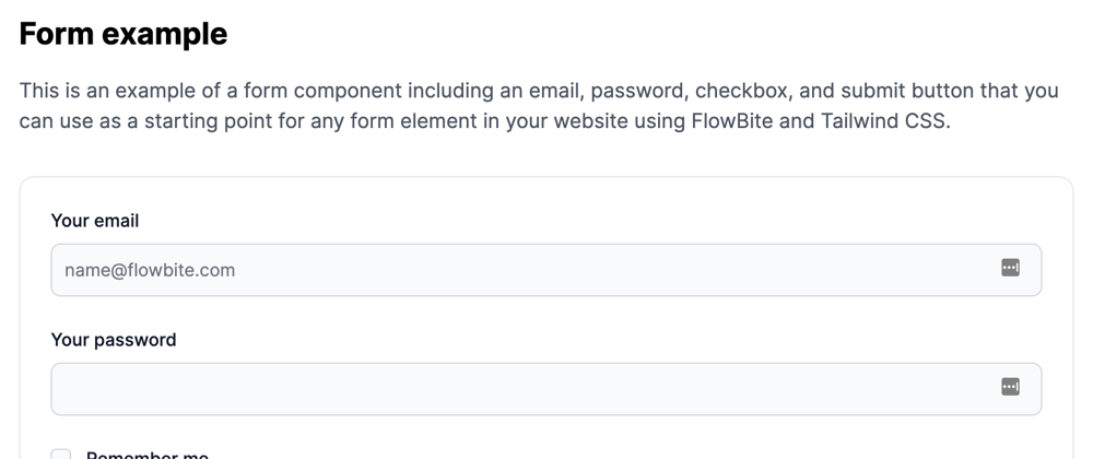
Although this looks good, input elements are usually part of a form element and there are multiple inputs.
Here's an example of a simple authentication form.
<form>
  <div class="mb-6">
    <label for="email" class="text-sm font-medium text-gray-900 block mb-2">Your email</label>
    <input type="email" id="email" class="bg-gray-50 border border-gray-300 text-gray-900 sm:text-sm rounded-lg focus:ring-blue-500 focus:border-blue-500 block w-full p-2.5" placeholder="name@flowbite.com" required="">
  </div>
  <div class="mb-6">
    <label for="password" class="text-sm font-medium text-gray-900 block mb-2">Your password</label>
    <input type="password" id="password" class="bg-gray-50 border border-gray-300 text-gray-900 sm:text-sm rounded-lg focus:ring-blue-500 focus:border-blue-500 block w-full p-2.5" required="">
  </div>
  <div class="flex items-start mb-6">
    <div class="flex items-center h-5">
      <input id="remember" aria-describedby="remember" type="checkbox" class="bg-gray-50 border-gray-300 focus:ring-3 focus:ring-blue-300 h-4 w-4 rounded" required="">
    </div>
    <div class="text-sm ml-3">
      <label for="remember" class="font-medium text-gray-900">Remember me</label>
    </div>
  </div>
  <button type="submit" class="text-white bg-blue-700 hover:bg-blue-800 focus:ring-4 focus:ring-blue-300 font-medium rounded-lg text-sm px-5 py-2.5 text-center">Login</button>
</form>
These Tailwind CSS form input elements are part of a larger and open source Tailwind CSS component library called Flowbite.

If you want to check out more form input elements such as checkboxes, radios, success and error message styles then make sure to check out the Tailwind CSS Forms section from Flowbite.


Latest comments (6)
This one's awesome!!
Will you be interested to collaborate with us and write a tutorial for our businesses? Happy to pay! You can either DM me on twitter at twitter.com/AndrewPierno or fill out this little airtable form airtable.com/shrN6S3NMZ7oxRXTt.
🚀🚀
Thanks for this great kit.
In case you have the time, might be a good idea to provide variations:
Thanks! You can check out the whole Flowbite library for more variations and styles (they are also open source).
Thanks for sharing!
Ty!