For the last few projects I've been using Tailwind CSS to build and style the components, sections, and pages for the website.
One thing that bothers me, however, is that I have to build certain commonly components over and over every time I start a new project.

This is why I decided to start a Tailwind CSS Components series here and teach you how to build elements such as buttons, dropdowns, modals, and more.
A few days ago I showed you how to build a Tailwind CSS breadcrumb component and today I will show you how to build button components.
Let's get started!
Tailwind CSS button component
First of all, it is important to understand what kind of HTML a button can be. It is most usually used as an <a> element, however, you can also use it as a <button> element too.
Let's first create the HTML markup for the button:
<button type="button">Flowbite</button>
Let's add some spacing classes:
<button type="button" class="px-5 py-2.5">Default</button>
Now let's add some colors:
<button type="button" class="text-white bg-blue-700 px-5 py-2.5">Flowbite</button>
It's also important to apply text related stylings:
<button type="button" class="text-white bg-blue-700 font-medium text-sm px-5 py-2.5 text-center">Flowbite</button>
Now let's make the button rounded, but you can keep it squared as well depending on your preferences:
<button type="button" class="text-white bg-blue-700 font-medium rounded-lg text-sm px-5 py-2.5 text-center">Flowbite</button>
Lastly, let's not forget to add hover and focus styles:
<button type="button" class="text-white bg-blue-700 hover:bg-blue-800 focus:ring-4 focus:ring-blue-300 font-medium rounded-lg text-sm px-5 py-2.5 text-center">Flowbite</button>
Tailwind CSS outline button style
You can also use the following styles to build a button that doesn't have a solid background:
<button type="button" class="rounded-lg border border-gray-200 bg-white text-sm font-medium px-4 py-2 text-gray-900 hover:bg-gray-100 hover:text-blue-700 focus:z-10 focus:ring-2 focus:ring-blue-700 focus:text-blue-700 mr-3 mb-3">Flowbite</button>
Tailwind CSS button with icon
You may want to use an icon inside the button as well. I recommend using flex and SVG icons for the best performance.
<button type="button" class="text-white bg-blue-700 hover:bg-blue-800 focus:ring-4 focus:ring-blue-300 font-medium rounded-lg text-sm px-5 py-2.5 text-center inline-flex items-center mr-3">
    <svg class="-ml-1 mr-2 h-5 w-5" fill="currentColor" viewBox="0 0 20 20" xmlns="http://www.w3.org/2000/svg"><path d="M3 1a1 1 0 000 2h1.22l.305 1.222a.997.997 0 00.01.042l1.358 5.43-.893.892C3.74 11.846 4.632 14 6.414 14H15a1 1 0 000-2H6.414l1-1H14a1 1 0 00.894-.553l3-6A1 1 0 0017 3H6.28l-.31-1.243A1 1 0 005 1H3zM16 16.5a1.5 1.5 0 11-3 0 1.5 1.5 0 013 0zM6.5 18a1.5 1.5 0 100-3 1.5 1.5 0 000 3z"></path></svg>
    Buy now
</button>
Buttons as links
You can easily use buttons as link by using an <a> tag instead of a <button> element:
<a href="#" class="text-white bg-blue-700 hover:bg-blue-800 focus:ring-4 focus:ring-blue-300 font-medium rounded-lg text-sm px-5 py-2.5 text-center mr-3 mb-3">I'm a link</a>
That's it! I hope that this tutorial will help you in your Tailwind CSS journey.
Flowbite - Tailwind CSS component library
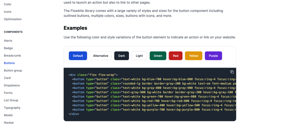
This Tailwind CSS button component is part of a larger library called Flowbite, which includes many more variants and components built using the utility classes from Tailwind CSS.

You can learn more and get started with Flowbite by reading the introduction and quickstart guide from the official documentation.


Top comments (0)