I've been using Tailwind CSS for quite a while now and although I love working with the utility classes directly in my HTML, one disadvantage that I've encountered is the lack of components such as buttons, dropdowns, and more.
This is why I have started a series of articles here on the DEV community showing you how you can build some of the most commonly used web components using the utility classes from Tailwind CSS.
Last time I showed you how to build a Tailwind CSS toggle component and today I'd like to teach you how to build a list group element.
Let's get started!
Tailwind CSS list group
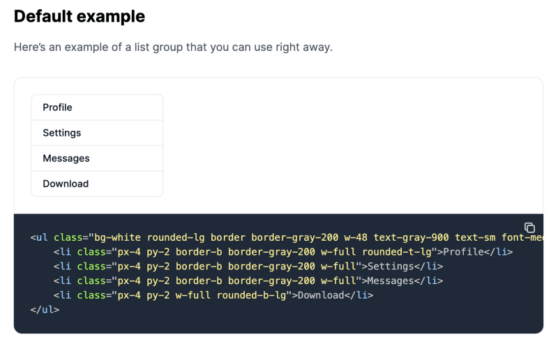
As always, the first step is to build up the HTML semantic code. We should build a ul element with list items inside:
<ul>
    <li>Profile</li>
    <li>Settings</li>
    <li>Messages</li>
    <li>Download</li>
</ul>
This is pretty basic, but it's a good starting point. Let's style the main ul element now:
<ul class="bg-white rounded-lg border border-gray-200 w-48 text-gray-900 text-sm font-medium">
    <li>Profile</li>
    <li>Settings</li>
    <li>Messages</li>
    <li>Download</li>
</ul>
Looking a little better. Now let's add some styles to each li element:
<ul class="bg-white rounded-lg border border-gray-200 w-48 text-gray-900 text-sm font-medium">
    <li class="px-4 py-2 border-b border-gray-200 w-full rounded-t-lg">Profile</li>
    <li class="px-4 py-2 border-b border-gray-200 w-full">Settings</li>
    <li class="px-4 py-2 border-b border-gray-200 w-full">Messages</li>
    <li class="px-4 py-2 w-full rounded-b-lg">Download</li>
</ul>
Awesome! The result should look something like this:
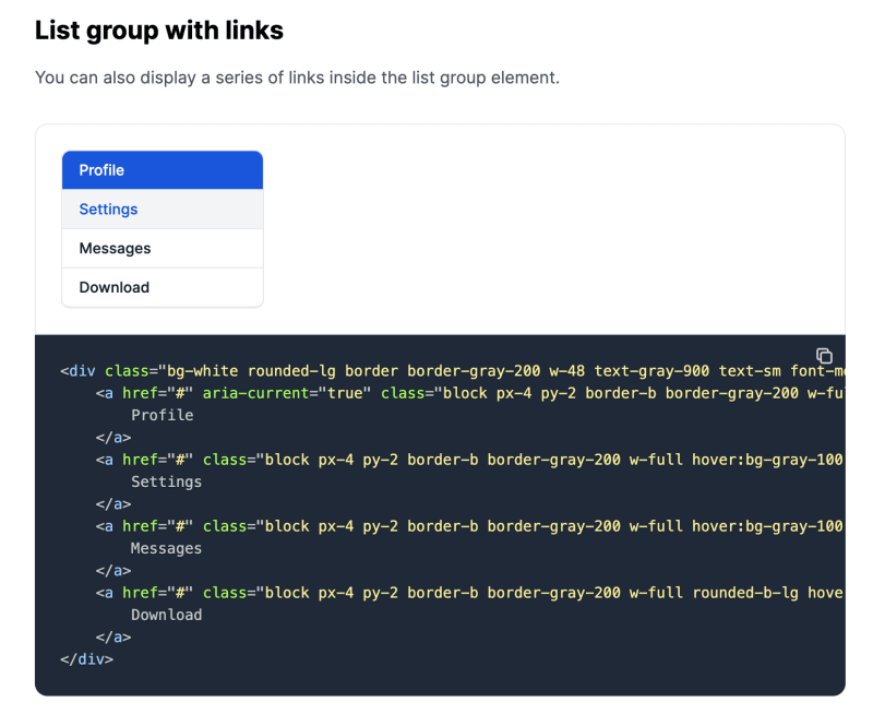
Tailwind CSS list group with links
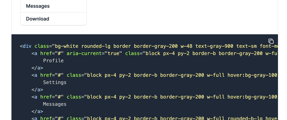
Perhaps you would like to add links for the items. I recommend you use the following markup to do that:
<div class="bg-white rounded-lg border border-gray-200 w-48 text-gray-900 text-sm font-medium">
    <a href="#" aria-current="true" class="block px-4 py-2 border-b border-gray-200 w-full rounded-t-lg bg-blue-700 text-white cursor-pointer">
        Profile
    </a>
    <a href="#" class="block px-4 py-2 border-b border-gray-200 w-full hover:bg-gray-100 hover:text-blue-700 focus:outline-none focus:ring-2 focus:ring-blue-700 focus:text-blue-700 cursor-pointer">
        Settings
    </a>
    <a href="#" class="block px-4 py-2 border-b border-gray-200 w-full hover:bg-gray-100 hover:text-blue-700 focus:outline-none focus:ring-2 focus:ring-blue-700 focus:text-blue-700 cursor-pointer">
        Messages
    </a>
    <a href="#" class="block px-4 py-2 border-b border-gray-200 w-full rounded-b-lg hover:bg-gray-100 hover:text-blue-700 focus:outline-none focus:ring-2 focus:ring-blue-700 focus:text-blue-700 cursor-pointer">
        Download
    </a>
</div>
As you can see, the first element for this component also has an active style.
I hope that this short tutorial has further helped you with your journey with Tailwind CSS.
Flowbite - Tailwind CSS component library
This Tailwind CSS list group element is part of a larger open source component library built with the utility classes from Tailwind CSS called Flowbite.
You can quickly get started by downloading it via NPM and requiring it as a plugin in your existing Tailwind CSS project and be able to start using interactive elements such as dropdowns, modals, datepickers, and more.


Oldest comments (3)
Nice!
Back to the basics ..
Thanks for sharing.
Great!
What's next?