Your frontend application needs a design system. If you want to provide a consistent user experience (UX), ship features faster, make re-branding changes more easily, and free up your time to focus on hard UX problems, this article is for you.
First off, what is a design system?
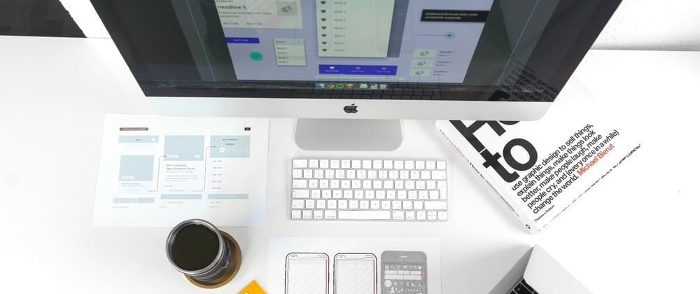
A design system is a tool that enables you to build your application. It provides all the building blocks and guidance your team needs to design and develop a product. In simple terms, you can think of a design system as a component library. At the “atomic” level, you might have components for a button, or an avatar, or a tooltip. These components are used like Lego blocks to piece together your application, forming “molecules” and eventually whole pages.
 component library](https://res.cloudinary.com/practicaldev/image/fetch/s--xcOPhLIc--/c_limit%2Cf_auto%2Cfl_progressive%2Cq_auto%2Cw_800/https://cdn-images-1.medium.com/max/2000/0%2ArIFyJCY2SvlkpQZj.png)
However, a design system is more than just a component library. It also includes the design principles and branding rules on how to use the components. It includes good documentation with templates and examples of do’s and don’ts. It encompasses the surrounding processes, strategy, and vision for the component library. It might include a blog or newsletter for updates. And it has a clearly defined governance model for who owns the design system or contributes to it.
There’s a lot more to design systems than meets the eye!
Why would you use a design system?
Now that we’ve gotten that definition out of the way, why would you want to use a design system when building your app? There are four main reasons:
- To provide consistency throughout the app
- To enable you to ship features faster
- To make re-branding changes easy
- To allow you to focus on the hard UX problems
Let’s explore these ideas.
Provide consistency throughout the app
Consistency creates a sense of familiarity for your users as they navigate your app. If a button looks a certain way on one page, it’s disorienting to have it look differently on another page. For more complex interactions in components like dropdowns, modals, or autocomplete inputs, you absolutely want the behavior to be consistent. If the same element looks and behaves differently from page to page, your users may become frustrated or confused.
Spotify provides a fascinating case study of how they addressed inconsistency in their UI.
If you think back to 2009, the Spotify app looked much different ten years ago than it does today! The experience and design for web, desktop, and mobile looked nothing like each other. You had to re-learn how to use the app depending on your device. Even moving from page to page was a struggle. The home page didn’t feel the same as a playlist or artist page did. The experience felt disjointed.

Spotify recognized this problem and sought a solution that would unify their user experience across pages, devices, and platforms. Starting in 2013, they spent two years building and implementing their design system. That’s a long time! But just look at the result:
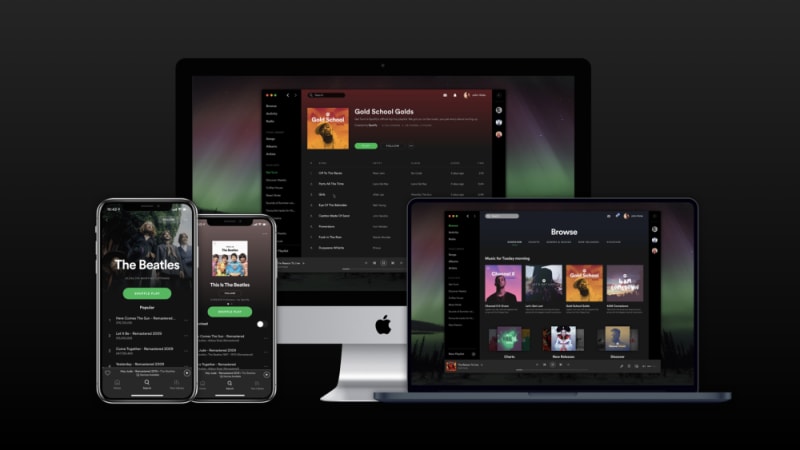
Was it worth it? I think so.
Ship features faster
Web applications are full of duplicated functionality. Sure, you may be building a new feature at the moment, but that feature is made up of building blocks. You likely have buttons, tooltips, avatars, and dialog modals all over your app.
So, if you have 20 modals in your app, which scenario would you prefer: You can build each modal from scratch, with each modal taking one day to build. Or, you can build one reusable modal in three days, and then you can implement this modal in under 15 minutes anywhere you need it.

This should be a no-brainer. It’s more beneficial to build a reusable component rather than re-writing similar code from scratch. Using a design system enables you to speed up your development lifecycle and ship features faster without sacrificing quality.
Make re-branding changes easy
It’s not uncommon for a company to go through some sort of re-branding or design refresh every few years. And while the design changes may be relatively straightforward, it can be tedious to apply the style updates everywhere they’re needed.
Design systems allow you to make an update in one place and then sit back and watch as the changes are applied everywhere in your app.
Consider a simple change in which blue buttons with subtle rounded edges now need to be green buttons with more pronounced rounded edges. This change needs to be applied to every button in your app.

If you built each button as a one-off implementation or used a design system inconsistently, this menial task will easily become a nightmare.
In the screenshot below, the first button was implemented using the design system, the second was built on its own but styled to look like the design system’s button, and the third is using entirely different styles. When it comes time to update your app’s design, only the first button will be affected by the changes in the design system. Now the look of the app is even more inconsistent!

Now, what if every button in the app was provided by the design system? Updating the style in the design system is simple, and now all the buttons in your app have the appropriate new styles. Beautiful!

Focus on the hard UX problems
One piece of pushback I sometimes hear criticizing the use of a design system goes a little like this: “Designers don’t want a design system. They don’t want to be put in a box. They want the freedom to be creative in their designs with each new feature they build.”
However, I’d argue that this line of thinking is short-sighted.
If you are a designer mocking up a new feature, do you really want to consider how a dropdown menu should appear and function? Do you want to design a new button each time? Do you want to re-imagine tooltip styles?
Or, would you rather focus on the user experience as a whole? Would you rather focus on how this new feature can solve an important problem for your users? Would you rather focus on the overall workflow of the page and ensure that it feels natural and follows a logical progression?
I’m betting most people would choose the latter set of choices. Design systems don’t limit creativity — they enable creativity. Design systems take care of providing the building blocks so you can focus on what’s most important: designing an exceptional user experience.
Conclusion
If you want to build an application that can scale, you need a design system. Design systems enable you to provide a consistent user experience, ship features faster, make re-branding changes more easily, and free up your time to focus on hard UX problems.


Top comments (10)
This has been my choice of a design system for past years:
github.com/system-ui/theme-specifi...
They have very nicely-orders GITHUB with examples and I use this with
styled-componentsThis "forces" you to only use values from the theme and not make up some random
padding/marginand shadows. Consistency is key to a beautiful design.That's critical - having non arbitrary values. 👍
The point you make about saving time for more worthwhile/hard endeavors is one more people need to listen to. This is absolutely true and yak shaving the same UI for years is not a good use of time!
Well said!
great article!
Thank you!
Well, that's a superb article! Thank you for this great information, you write very well which I like very much. I am really impressed by your post.
tetris
Thank you for your kind words! I'm glad you enjoyed the article.
Thanks
You're welcome! Thanks for reading.