
Grid helps us lay the content out in an effective way. The element is laid out in rows and columns. When we need to customize the complex layout, grid is so powerful.
In order to consider grid, we're going to learn some basic CSS that we can do in grid, and make a demo using it together.
Let's dig in!
Make it grid
This is the code in order to demo the CSS property in Grid:
- grid-template-columns
By default, Grid element behaves as the normal flow, and it doesn't make any effects for the layout. Using grid-template-columns we can now divide the element into many columns.
Some values we need to consider using grid-template-columns:
. 1fr: 1 fraction, make the width of the element as wide as possible until no available space exists.
. auto: the width is decided by the content that it contains.
. xxxpx: we can define a specific value for the column width.
How can we add the space between the elements?
Grid already had the gap property for us. Specifically, you can use grid-row-gap, grid-column-gap.
- grid-auto-columns
Sometimes, our grid was created in an implicit way, without using grid-temlate-columns. As an escape hatch, we can use grid-auto-columns in order to set the size for the column of the child element.
Take a look at the second example above.
- number of grid
Assuming, I have the layout as below, I would like to define the position that the element's width will be.
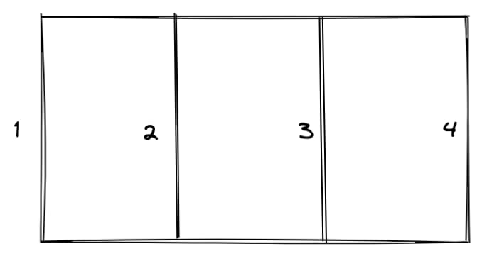
Fortunately, Grid supports it. We can define the start position, the end position for the element using grid-row-start, grid-row-end, or a brief property grid-row.
- The
Column 1element's width starts from number1and ends at3. - The
Column 2element's width automatically is the remaining width. - The
Column 3element's width starts from number1and ends at3.
- grid-area
Using grid-area we can point exactly what place the element will be, instead of we define the start position and the end position of the element.
I'm going to use grid-area to make the layout below.

Based on the layout above, We have this assertion:
- The layout need to have two columns.
- The layout need to have three rows.
Next, I need to define the label of the element. These are header, nav, main, and footer.
.header {
  grid-are: header;
}

...
And then combine them using grid-template-areas:
grid-template-areas:
  'header header'
  'nav main'
  'footer footer';
- repeat, minmax
It is very helpful if you don't know how many elements you have . If you don't know, you only need to make it repeat with the same layout.
Sometimes, you also want to make the element have a specific minimum width, and that element's width can be opened wider more than the minimum width.
Assuming, I would like to have seven columns, the first six columns have equal width in the range 50 px - 100 px. And the last column is in the rage 100px - 1fr.
I can use repeat to make the first six columns, and minmax to make the range width, the remaining column only needs to use minmax.
grid-template-columns: repeat(6, minmax(50px, 100px)) minmax(100px, 1fr);
Conclusion
We just learned about Grid in CSS, it is powerful CSS that we can use and make customizing the complex layout become easier than ever. Why don't pick some layout and use the power of grid for your website?


Top comments (0)