
Nowadays, if you have ever tried to build a user interface you might have come across many problems. Building these interface components is a very expensive and effort consuming task. We have designers, product managers and many developers working on a single project.
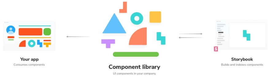
The modern User interfaces are built with thousands of UI components that are reused between different screens and different user interfaces and sometimes between different products inside the same company to make the design look consistent. Now usually in these scenarios, there are design systems in place with the catalogs of all the reusable components in one place. This helps improves the productivity of the developers by up to 30–40%. Modern UI interfaces are build from thousands of reusable UI components

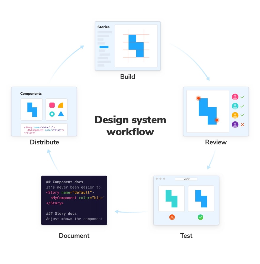
Now here Design System contains reusable components which can be used among different application to build complex, durable and accessible user interfaces. Since both designs and developers contribute to a Design system so it servers as a “single source of truth” where designs can test the Component design they build in different scenarios.
When Do we need a design system?
Now despite all the hype and pros of a design system, it is not for everyone. If you are working on a single project, you will be better off without a design system. It will just add to the complexity of your application. But if you sharing your components across different projects then building a designing a design system makes sense for you rather then copy and pasting component from one place to another.
okay, So what exactly does storybook do?
Storybook is used by developers for the following reasons
Building the UI component in isolation
To prevent UI bugs
Standardizing Styling across different Projects
Distributing UI Components among different projects
Okay, Great but how will Storybook help me?
UI/UX Designers
UI/UX designs can go into the storybook to see how exactly the components look and feel in different scenarios, see all the states of the component, how they are behaving in these different state changes and provide your valuable feedback.
Developers
Developers can easily share these components between different projects and see how exactly they are being used what properties do these components have and how they can extend them. This speeds up the development process since now you just have to build your component once and just import and use it elsewhere. Codesharing becomes easier and side effects can be easily handled at one single place.
Getting Started with React Storybook
Now the storybook book can be used with almost every frontend framework possible, and there are a lot of them. Why can we stick with just one and make it standard? Okay, enough of the framework rant. let us start with React. You can find documentation for other frameworks here.
Installing React Storybook
Now since Storybook is a part of the javascript ecosystem you can install it using your favorite package manager. For this introduction, I’m going to use yarn but npm also works the same way.
yarn global add @storybook/cli
It will globally install storybook CLI on your system. if you don’t want to permanently install storybook CLI you can also use npx. Read more about this here.
Now all we need a React application. And we are going to create that using create-react-app. Install creat-react-app in your by running following command in your system.
yarn create react-app storybook-intro --typescript
cd storybook-intro

You can read more about create-react-app here. Now let’s start by adding storybook to our project.
Now run the following command to add storybook to your project.
getstorybook
Now if you notice there are some extra folders add to your project.

.storybook is used for configuring storybook. we will do that later.
Now run
yarn storybook
Now if you go to http://localhost:9009/ you will see the following page. Now make sure to restart your server whenever you change any config or add any new package.
](https://res.cloudinary.com/practicaldev/image/fetch/s--wvlgM4cq--/c_limit%2Cf_auto%2Cfl_progressive%2Cq_auto%2Cw_880/https://cdn-images-1.medium.com/max/5116/1%2AwM2b0Hd9MVZe_Q10uz4WsQ.png)
Now let’s start building some component then we will see how we can configure storybook and make it more powerful and fully utilize its purpose.
So let’s create a basic component. Let’s start with a button.
import React from "react";

import "./index.css";

interface IButtonProps {}
const Button: React.FC<IButtonProps> = () => {
return (
<>
<button className="button">Primary Button</button>
</>
);

};

export default Button;
export { Button };
Add the following CSS
.button {

background-color: #4caf50; /* Green */

border: none;

color: white;

padding: 15px 32px;

text-align: center;

text-decoration: none;

display: inline-block;

font-size: 16px;

margin: 4px 2px;

cursor: pointer;

}
.primary {
background-color: #008cba;
}

.danger {

background-color: #f44336;

}
Now let’s add a story for this component. btw you can delete the stories folder we don’t need anyway. Now create a new file button.stories.TSX alongside your button component.

Now let’s create our first story inside button.stories.tsx
import React from "react";

import { Button } from "./index";

export default {

title: "Button",

component: Button

};

export const Primary = () => <Button>Hello Button</Button>;
Let’s start the storybook server again and let’s see how our story looks.

Okay, we don’t see our newly added story. But why is that? If we go to .storybook/config.js file we see that the storybook is configured for javaScript, not TypeScript.

Now let’s configure it for TypeScript. This can easily be solved by just adding the correct regex in stories.
../src/**/*.stories.(ts|tsx|js|jsx)

It will pick all the JSX/TSX/js/ts files in the project. Now if you go to localhost:9009 we see our story. Make sure you restart the storybook server since this is a configuration change.

Now let’s make our component a little more standard so we can expect some props and make changes.
import React from "react";

import "./index.css";

interface IButtonProps {

buttonText: string;

primary?: boolean;

danger?: boolean;

}

const Button: React.FC<IButtonProps> = props => {
const { buttonText, primary, danger } = props;
let styles;
primary ? (styles = "primary") : danger ? (styles = "danger") : (styles = "");

return (
<>
<button className={"button" + " " + styles}>{buttonText}</button>
</>

);

};

export default Button;
export { Button };
Now since we update we also need to update our storybook component to send in these props which we just added to our component.
import React from "react";

import { Button } from "./index";

export default {

title: "Button",

component: Button

};

export const Primary = () => (

<Button buttonText="Primary Button" primary={true} />

);

export const DangerButton = () => (

<Button buttonText="Danger Button" danger={true} />

);
Now if we go back to our storybook we see 2 stories. One with Primary Button and one with Danger Button.

Now, This is just the isolation part of the development. we developed a storybook component in isolation but how do we tell other developers that we are expecting all these props like button text, primary, danger and they can change these to change the appearance of the button. That’s where storybook add-ons come to play which makes storybook so powerful for building a common component library.
Storybook has several recommended add-ons
a11y — Test components for user accessibility in Storybook
actions — Log actions as users interact with components in the Storybook UI
knobs — Interactively edit components input data in the Storybook UI
source — View a Stories code within the Storybook UI
viewport — Change display sizes and layouts for responsive components using Storybook. This can help you build responsive layouts
You can see all the add-ons here. On top of this, you can create your addon if you want. Learn more about that here.
Now let’s add some add-ons to our little project. Let’s start with the knobs add-on so that we can interact with our component.
Installation
First, we need to install the add-on to our project
yarn add @storybook/addon-knobs @types/storybook__addon-knobs
Now register knob in your .storybook/main.js file
// .storybook/main.js

module.exports = {
stories: ["../src/**/*.stories.(ts|tsx|js|jsx)"],

addons: [

"@storybook/preset-create-react-app",

"@storybook/addon-actions",
"@storybook/addon-links",
"@storybook/addon-knobs"
]
};
Now let’s add the newly added knob there. Go to the .storybook folder and create new file config.js and add the newly added addon there. Adding addon like this will it to all the stories. If you just want want to add the addon to only one story that can also be done. You can read about that here. But if you are building a library you won’t be adding add-ons one by one to each file. So let’s start by creating a config.js file.
// .storybook/config.js

import { withKnobs } from "@storybook/addon-knobs";
import { addDecorator } from "@storybook/react";

addDecorator(withKnobs);

Now before we see any changes with our storybook we need to use knob inside our story. So now go to button.stories.tsx and use the knob. Now the knob provides us with a lot of knobs like text, boolean, object depending on your data type. Now in our case, we only need text and boolean since these are the only types we support in our button component. Now import the appropriate knob from the @storybook/addon-knobs
// Button/button.stories.tsx

import { text, boolean } from "@storybook/addon-knobs";
Now go to the component story and use the knob as follows.
// PrimaryButton inside Button/button.stories.tsx
<Button

buttonText={text("Button Text", "Primary Button")}

primary={boolean("Primary button", true)}

/>

// DangerButton inside Button/button.stories.tsx

<Button

buttonText={text("Button Text", "Danger Button")}

danger={boolean("Danger Button", true)}

/>
Now if you go back to localhost:9009/ you see your newly added knobs in action.

Now we can change the text of the button and use boolean to set the state of the button and see how the button behaves when its state changes.
Another very useful addon is the info. Now when you install it every story in your library gets a Documentation page. These can be used for documenting your component so the other developer can understand how and why it can be used.
To add this addon just install the addon
yarn add @storybook/addon-info @types/storybook__addon-info
Now, lets first register it to our main.js file onto our addons.
// .storybook/main.js
module.exports = {

stories: ["../src/**/*.stories.(ts|tsx|js|jsx)"],

addons: [

"@storybook/preset-create-react-app",

"@storybook/addon-actions",

"@storybook/addon-links",

"@storybook/addon-knobs",

"@storybook/addon-info"

]

};
After this, we also need to configure this addon to work with our storybook so go to config.js and register this new addon.
// .storybook/config.js

import { withKnobs } from "@storybook/addon-knobs";

import { addDecorator, addParameters } from "@storybook/react";

import { withInfo } from "@storybook/addon-info";


addDecorator(withInfo);

addDecorator(withKnobs);
Now go back to your button story and configure this addon.
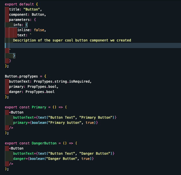
import PropTypes from "prop-types";


import { Button } from "./index";

export default {

title: "Button",

component: Button,

parameters: {

info: { inline: false }

}

};

Button.propTypes = {

buttonText: PropTypes.string.isRequired,

primary: PropTypes.bool,

danger: PropTypes.bool

};
We just need can use the info the parameter to either pass certain options or specific documentation text to your stories. and add prop types to show the props received by the button component info. It is also possible to disable the add-on entirely. Depending on the scope at which you want to disable the addon. Just pass info:{disable:true} Now if we go back to localhost:9009/ after restarting the server we see a new section called show info on the top right corner.

Now if we go to docs we don’t see anything interesting. Just the component and how it is being used.

Now let’s add some documentation to better elaborate this component what it does and how it should be used. We can pass another key to info the called text which describes what the component does and how it can be used.
Now after adding the text if we go back to localhost:9009/ and click on show info we see our documentation of the component.

Conclusion
As you see throughout this article, Storybook is easy to use and has a lot of add-ons and make it easy for the code to be shared among different project along with the proper documentation and we can build all our components in isolation and all the team members can see what components have been built and how they can use these components. And if a new person joins he won’t have to worry whether a component has been build or how to use a component. This significantly reduces the development time and helps strengthen your interfaces and make them consistent throughout different projects.
P.S :- all code for this article is available here


Top comments (1)
Glad! I could help.