This article is neither an introduction to the flexbox nor an exhaustive treatise of all its features.
Instead I attempt to shine a spotlight on some selected flexbox features that are often overlooked.
The Swiss Army Knife of CSS Layout
I frequently resort to the flexbox for layouting. It comes with a wealth of features that allows us to faithfully transfer elaborate UI designs into working code.
If I am in the middle of writing some beautiful CSS and stop for a moment because I can't remember the exact property name I usually visit A Complete Guide to Flexbox and lookup flexbox properties there.
But knowing all the properties is only half the battle, the other half is knowing what they can accomplish, and it is in this second half where some marvelous discoveries can be made.
An article that made me aware of some of the not-so-obvious parts of the flexbox is 11 things I learned reading the flexbox spec.
Others I discovered while working with the flex, investigated odd behavior, or stumbled upon on mdn while on some unrelated errand.
And it is in the vein of this 11 things article that I attempt to shine a spotlight on some selected flexbox features here that I feel are often overlooked or a bit esoteric.
Control the Split
We all know how to bring all elements to the left, or all to the right. We can stack them all at the top, or all at the bottom.
But what if there needs to be a split? Say 3 to the left and 2 to the right?
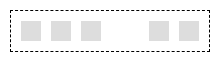
And multiple splits? Say one to the left, one to the right, and the rest in the middle?
Use margin: auto to control where the split shall be. This is special flexbox behavior. The auto margin gets all the remaining space; if more than one flex child has auto margin it is distributed equally among them.
The two splits shown in the image above can be created like this:
<div class="container">
  <div class="item" style="margin-right: auto;"></div>
  <div class="item"></div>
  <div class="item"></div>
  <div class="item"></div>
  <div class="item" style="margin-left: auto;"></div>
</div>
Before I knew about the special meaning of margin: auto I usually used flex-grow on one or more of the flex children as a means to push the items apart.
I now consider auto margin the proper way.
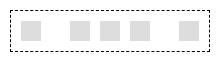
Multiline Layouts
You can create intricate multiline layouts by deliberately pushing items onto separate lines.
Use calculated margins to control how many items should end up on a single line, pushing later items to the next line.
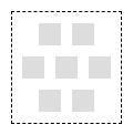
A honeycomb layout for example could be achieved thus:
<div class="container">
  <div class="item first of-2"></div>
  <div class="item last of-2"></div>
  <div class="item first of-3"></div>
  <div class="item"></div>
  <div class="item last of-3"></div>
  <div class="item first of-2"></div>
  <div class="item last of-2"></div>
</div>
.container {
  display: flex;
  flex-wrap: wrap;
  gap: 10px;
}
.item {
  width: 20px;
  height: 20px;
  background: #dddddd;
}
/*                         width of items   width of gaps      */
.of-1 { --indent: calc((100% - (1 * 20px) - (0 * 10px)) * 0.5); }
.of-2 { --indent: calc((100% - (2 * 20px) - (1 * 10px)) * 0.5); }
.of-3 { --indent: calc((100% - (3 * 20px) - (2 * 10px)) * 0.5); }
.first { margin-left: var(--indent); }
.last { margin-right: var(--indent); }
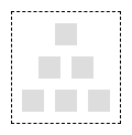
And a pyramid could use the same CSS and have such markup:
<div class="container">
  <div class="item first last of-1"></div>
  <div class="item first of-2"></div>
  <div class="item last of-2"></div>
  <div class="item first of-3"></div>
  <div class="item"></div>
  <div class="item last of-3"></div>
</div>
wrapping flexbox children without breaking the parent-child nesting
Some time ago I needed to wrap some DOM element in a simple <div> (to hook into bubbling DOM events; and I couldn't just addEventListener to the wrapped element for reasons). But I didn't want to break any layout that relies on direct parent-child nesting which is the case with the flexbox layout.
My solution was to apply display: contents to the wrapper (MDN).
This causes the CSS layout to be rendered as if the wrapper didn't exist and as if the wrapped elements were direct children of the original parent.
Both <p> elements are treated as flexbox children here:
<div style="display: flex">
  <div style="display: contents">
    <p style="flex-grow: 1"></p>
  </div>
  <p style="flex-grow: 1"></p>
</div>
flex: none - all the SVGs!
By default flex children are "squishy". And it happend more than once that I used flex to align an icon and a corresponding text on the same line, only to discover some time later that long texts will squish the icon out of shape.
I now have it as a personal rule of thumb to always set flex: none to flex items that are supposed to have a fixed width, i.e. that are not supposed to grow / shrink together with their surrounding flex container.
So in my experience items usually fall in one of two categories: fixed size items and responsive size items.
It probably is a good idea to just be explicit in the style rules for flex items and set either flex: none or flex: auto; and thereby declaring in which category they belong.
mind the gap
The flexbox has a gap property (and more specific row-gap / column-gap) so we no longer need to set margins on the items.
This eliminates the need to have any special rule for the first or the last child.
Before the gap property was fully supported it was often necessairy to apply a margin-left to all children except the first; or to apply a margin-right to all children except the last.
Bits and Pieces
I felt the following things are probably not immensely useful. But I don't want to keep them secret either.
special handling of stacking context
A flex child with any z-index set will establish a stacking context. Remember that for any other element setting position to absolute or relative is needed in addition to the z-index to establish a new stacking context.
special handling of visibility: collapse
If a few months ago I would have had to descibe the different effects on layout the three possible visibility values visible, hidden, collapse would have on any given element, I would have got it wrong. I was so sure of it: that collapse would free up the space and allow other elements to take up the place of the collapsed element.
Well, that is simply not true. The values hidden and collapse both have the same effect generally. I was astonished to find this out, read for yourself on mdn.
Strangely but luckily the behavior of flex children is special: here the value actually acts in accordance with the expectations of any sane person.
A flex child with visibility: collapse frees up its space so other elements can take it up.
Addendum: In Chrome (and browsers that use the same engine) this doesn't work. There is a bug that hidden and collapse on flex children currently behave the old way, i.e. not freeing up space in the collapse case. It was opened 2014 and is still open in 2024 so I don't expect this to get fixed anytime soon.
IE11 and the flexbox
If you find yourself in a situation when you have to solve a flexbox related layout bug for IE11, you might want to have a look at this collection of known issues and workarounds which helped me a great deal in the past.
reminder: there is an inline variant
There is also a display: inline-flex variant. Towards its surroundings it acts as any inline element, towards its children it is a flexbox.
I sometimes need this if I need to place a flexbox inside a <table> cell so the box itself can be aligned left, center, or right like any text cell content.


Latest comments (0)