
Cover photo by J A N U P R A S A D via Unsplash.
Does anyone else remember the old days of using floats for layout? We used to have to do our CSS uphill in the snow, barefoot, both ways. Whippersnappers these days with their flexbox and their grids...
In any case, floats are still useful for things that aren't large-scale layout. And even if you don't end up wanting to use them in your newest app, you may end up maintaining an old legacy application that uses a heavy-handed approach to floats. Having a basic knowledge of how they work can come in handy in a variety of situations.
Plus, floats are one of the big CSS fears. Applying a float and having everything on the page suddenly shift (and not knowing why) is something many of us have done. Let's get over that stumbling block today.
So, let's jump right in and examine the mystery of the float.
The basics
This is what floats are best at: Flowing text around other things. Floats are the absolute best way to mimic print layouts when it comes to this.
What is happening is, very simply, this:
- The floating element is placed where it would otherwise be
- It's removed from the normal document flow and shoved as far left or right as it can go
- Elements that come after it will arrange themselves around the floating element
Can I float center?
Nope. I know it would be cool, but it does not work.
I guess imagine how you would implement the text-and-cat-picture version of this. How would you go about breaking the text up neatly? There's no great way to do it. That's probably why it was never implemented.
Floats aren't in the normal document flow? So it's like "position: absolute"?
Not quite. Elements with position: absolute (or a similar property) are removed entirely from the document flow. An absolutely positioned element can often end up on top of or underneath other nearby elements, since they simply ignore each other.
When an element is floated, it's not exactly in the normal document flow, but it does interact with other elements; they are subject to special positioning rules, mostly that they will arrange themselves around it.
Floats don't want to be large
A floating element that doesn't have an explicit size set will "shrink to fit" its content - that is, it will only take up as much width as it needs to. If there's not much content inside of it, it won't be very large; if there's a lot, it gets bigger. You may have seen similar behavior before in position: absolute and position: fixed elements.
Predicting where floats will go
While you were playing around with the Jabberwocky example, did you happen to find something like this?
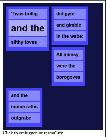
One of the reasons people tend to avoid floats is that they can seem unpredictable. What happens if a series of floats of different heights overflows its line?
Let's take a look at the specification for how floating elements are positioned:
[...] when an element is floated, it is taken out of the normal flow of the document (though still remaining part of it). It is shifted to the left, or right, until it touches the edge of its containing box, or another floated element.
So when we have something that would fit within our width, all fine and dandy. When it doesn't, it goes downward and floats some more until it hits an edge that it would like to stop at - the edge of its parent container, or another float.

Why didn't the last one move upward to fill in that terrible whitespace?
A float will never position itself above something that comes before it in the HTML order.
It will, however, try to "float" as high as it can, keeping that restriction in mind.
Margins, the box model, and HTML order
In the basic example, were you bothered by this?

What we need here is a margin. You have about a 1/3 chance of guessing which element to apply the margin to if you choose randomly. As much as it feels like random guessing is the essence of CSS, though, let's try to understand what the floats are doing here.

#1 - This is what happens if you add margin-left to the outer container #container - it just shoves everything to the right. This doesn't really fix the problem of the text coming to a hard edge with the floating box. Probably nobody has tried to fix floats this way, except at 3am, crying with desperation. (Who hasn't been there?)
#2 - This is something you might actually have tried - applying a margin-left to the text itself. The text's margin, however, is based on the text's "box" - where the text would be if the float wasn't there. (You can picture it as having a margin "under" the floating element.)
The text itself is still flowing around the float as it was before, but it has a margin left relative to its parent element. The margin property cannot add a "zigzag" margin to the text, and it must have a separation from its parent element represented by the margin, so the separation from the float just won't do.
#3 - The margin is added to the actual floating element, expanding its box. The text will flow around the entire floating box, margin included. So adding margin-right to our left-floating cats and margin-left to our right-floating cats will give the text a bit of space.
In summary - putting the margin on the floating element causes other stuff to flow around the combined float's box, including any margins.
The idea that we're getting at here is this - other stuff on the page moves around the float, rather than the float moving around other stuff on the page.
We can also stack floats next to each other! Floats will sit nicely next to other floats, and the text will keep flowing around them all.
Just note that it's important where in the HTML order the floats are placed. When in doubt, floats come first. Pretend you're the browser, and you're reading the HTML "in order" - you'd want to know where your floating things are first, so you don't have to redraw all the stuff that has to flow around it afterward.
Clearing floats
An element with the clear property on it describes how that element will interact with nearby floating elements. You can put a clear property on both floating things and non-floating things.
The clear property means: I don't want any floats near me, in this direction!
Since it's rude to push other things around the page, the element that has the clear property on it will move downward if there's a conflicting float nearby. Think of a clearing element as being socially awkward and conflict-avoidant.
Floats don't take up space the way you might expect
If you've used floats before, you might have found yourself in this position:
The #container that holds all the floats (and only floats) has collapsed. This is because floating an element removes it from normal document flow, and the surrounding container does not create a new block formatting context.
Remember when I said above:
It's removed from the normal document flow and shoved as far left or right as it can go
"Removed from document flow" has a meaning and technical consequences here!
Due to the rules that our CSS overlords have specified, the height of a container is determined by all of its contents that are "within normal document flow". However, we can also make the container be a "block formatting context" - kind of like a mini-layout within a page - to tell the container that it needs to treat itself as if it's a mini-document, in that it stretches to fit all its contents, even the out-of-flow ones.
We will need to do some convincing to get the container to stretch to fit our floats, but know that we have options.
A couple possible solutions:
1. Create an element that is in-flow, but after the floats
This is the clearfix-type-one solution in the pen above. It's also the "old school" clearfix.
We know now that the container will stretch to fit all elements within its flow, and floats are not in the flow. So we need a non-floating element that's placed just after our floating elements. We can do this using the clear property:
<div id="container">
  <img class="floaty-left" src="https://placekitten.com/100/200">
  <img class="floaty-left" src="https://placekitten.com/100/100">
  <img class="floaty-left" src="https://placekitten.com/160/200">
  <img class="floaty-left" src="https://placekitten.com/100/120">
  <div style="clear: both;"> </div>
</div>
This will cause the container to stretch down to our cleared div.
However, that element will have a bit of its own height (because it's supposed to have some text inside), so we can add something like height: 0 to make sure it doesn't affect the height of the container while continuing to apply the clearfix. Over the years I've seen other ways to do this, such as using max-height and even font-size: 0. ¯\_(ツ)_/¯
Since this is only for display and isn't semantic, we can also move it to an ::after pseudo-element applied to the container.
That's how we end up with something like the following:
  // the "basic" clearfix with after
  &.clearfix-type-one {
    background-color: #644;
    &::after {
      content: " ";
      display: block;
      height: 0;
      clear: both;
      visibility: hidden;
    }
  }
This can be refined even further; there are many similar solutions online. For example, Nicholas Gallagher's micro clearfix from 2011. Clearfix solutions of this type tend to have amazing cross-browser support since they've been around for nearly a decade.
2. Use overflow: hidden to create a new block formatting context
(Technically you can use any overflow value that isn't visible, but hidden is the one that tends to work best. Give me a second to explain...)
This is the clearfix-type-two solution in the pen above. From the MDN docs:
A block formatting context contains everything inside of the element creating it.
Thus, forcing the parent container to form a new block formatting context will force it to expand, since it must fully contain all its children. And it's done with just one property, so why isn't this the single best solution? Why is it only number two of three on a list?
Well... you're using overflow: hidden. This isn't consequence-free; you have to deal with having a container that doesn't show anything at all outside of itself. What if we also want to have some rainbow drop shadows on some of our elements that would be clipped, or absolutely positioned glitter outside of our wrapper? It would be madness to get rid of those just to clear our floats.
You can see what a travesty this would be.
And remember how I said earlier that you could use any overflow value that wasn't visible? Well, imagine how crappy that would look with overflow: scroll creating scrollbars on the sides. Big yikes.
3. Use display: flow-root to create a new block formatting context
This is the clearfix-type-three solution in the pen above.
Unlike the solutions above, this is meant to work on an inherent level, and isn't a "hack". From the spec:
The element generates a block container box, and lays out its contents using flow layout. It always establishes a new block formatting context for its contents.
So this basically does the same thing as overflow: hidden, but with no side effects. ✨
That sounds like exactly what we want! The reason it isn't used is cross-browser support - it's not currently supported on almost 30% of devices, with Safari and IE/Edge being the problem children as always.
What else do you want to know about floats?

Footer photo by Cristina Gottardi on Unsplash.


Oldest comments (3)
'Twas a dark and scary time best left forgotten...
Floats are in general pretty slow, because of all the calculation the browser has to do to position not only the float but all the stuff that comes after it. For medium to large scale layout, floats are pretty outdated simply because there are options that are easier to implement and that produce better results.
I'll still use them here or there for the little things - they're still not bad for, say, placing pull-quotes mid-paragraph. (And if you have enough of those that your rendering is noticeably slower, you have too many anyway.)
Since floats were so often used for layout in the past, I think we've gotten the idea that that's all they can do, but that's not even what they were really intended for.
I've definitely seen their overuse lead to slowdowns, though. I've had a page rendering a couple hundred components at once that was absolutely chugging, and it turns out it was relying heavily on float:right and overflow:hidden to position an element on the right-hand side. Switching to position:absolute and margin:right improved performance by... I don't recall exactly, but it was somewhere in the hundreds of milliseconds of reduction in rendering time.
Great post + discussion here. Thanks a lot folks. I feel like this is a solid canonical resource for anyone trying to think through the right choices here.