Often times when im looking for layout inspiration I find myself checking out old graphic design books I have laying around the house or old movie posters, which I used to collect. I find that with posters the creator has to be clever with their use of space and this leads to some wonderful shapes and arrangements.
There is a website by the artist Mike Joyce called swissted.com that has a plethora of amazing posters with intricate and exciting layouts. I highly recommend checking it out if you want to get inspiration or just have a layout you want to practice.
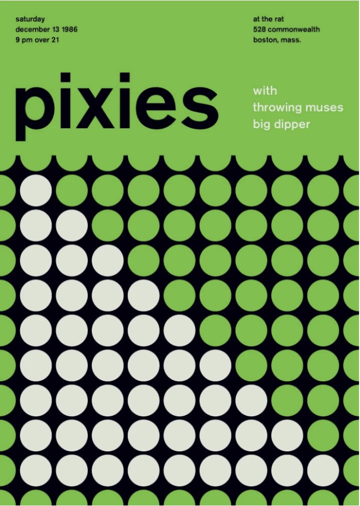
This tutorial will cover the re-creation of a poster with straight up HTML, CSS and JavaScript. We'll use [GSAP](https://greensock.com/) to animate elements of our poster and also learn how to load a custom font. The poster in question can be seen below, it is created by Mike Joyce and taken from their site.
The finished project can be view here: css-grid-and-gsap-poster-layout.netlify.app.
The source code can be viewed here: github.com/molebox/css-grid-and-gsap-poster-layout

We are not going to need to install anything, open vscode (or your choice of IDE) and create the following:
- A
fontfolder - A
stylesfolder. Inside here create an index.scss file - An index.html file
- An index.js file
We'll be making use of an extension called live server, I suggest installing that as a vscode extension. It will enable you to check on your progress with live updates on every file save.
Html
Let's begin by scaffolding out our html page.
<!DOCTYPE html>
<html lang="en">
<head>
    <meta charset="UTF-8">
    <meta name="viewport" content="width=device-width, initial-scale=1.0">
    <title>Bring a poster to life with CSS grid and GSAP</t
itle>
    <link rel="stylesheet" href="./styles/index.css">
</head>
<body>
    <!-- main container -->
    <div class="outer-container">

        <!-- grid layout -->
        <main class="main-grid">

            <!-- the top info text -->
            <section class="info-section">

                <!-- text on the left -->
                <section class="section-left">

                </section>

                <!-- text on the right -->
                <section class="section-right">

                </section>

            </section>

            <!-- the main title section -->
            <section class="title-section">

                <!-- the main title -->
                <h1 class="title">pixies</h1>

                <!-- the subtitle -->
                <section class="subtitle">

                </section>

            </section>

            <!-- circles grid layout -->
            <section class="circles-grid">

            <!-- our circles will be added dynamically -->

            </section>

        </main>
    </div>

    <script src="index.js"></script>
</body>
</html>
We begin by linking our index.cssfile in the header and doing the same with our index.js at the bottom of the body tag. We have given our htmla basic structure of how we want the poster to be laid out.
Styling
Before we start implementing our classes to define how our poster will look we can do a global reset of the margin, padding and box size. We'll also add our posters colours as css variables so that we can access them within our file in differtent places without having to repeat ourselves.
/* global reset */
* {
    margin: 0;
    padding: 0;
    box-sizing: border-box;
}

:root {
    --white-color: #dee2d5;
    --green-color: #5ebd44;
}
Thinking about our poster we will want it to have the shape of a poster, that means that it wont take up the whole width of our viewport. The outer-container class will take care of sizing our poster.
outer-container
/* set this to the dimensions of an A4 sheet of paper */
.outer-container {
    max-width: 21cm;
    height: 100vh;
    margin: 0 auto;

    background-color: var(--green-color);
    overflow: hidden;
}
After a little googling I found that the size of an A4 sheet of paper is roughly 21cm so we set that to the width of our poster. We want it to be the height of the viewport and the margin centers our content. We have set the overflow to hidden as we will be doing some positioning later on and this will hide some of the overflowing elements.
main-grid
Looking at the poster we could go for a flexbox layout and use a direction of column, stacking all the elements vertically. That would be a viable solution, but to have a little more control over the size of each column and its placement we can instead use the grid. We are setting an explicit height on the top section and the title section then saying the rest (which is made up of the circles) should take up the rest of the available space, or 1 fractional unit.
.main-grid {
    display: grid;
    grid-template-rows: 50px 200px 1fr;
}
info-section
The top section of the poster, with the two paragraphs of text will also utilize the grid. Flexbox would indeed be a good solution here, we could have used justify-content: space-between and then a padding on the horizontal of each text section to push them to the edges of the pages but with some padding from the actual edge. In keeping with using grid however, we can use a nifty feature of the autocloumn size to set a defined width on the elements on the edges but an auto size in between, pushing the outer elements apart. The left and right section of text use flexbox with a direction of column.
.info-section {
    grid-row: 1;
    display: grid;
    grid-template-columns: 300px auto 300px;
    padding: 1em;

    p {
        font-size: 0.8em;
    }

    .section-left {
        grid-column: 1;
        display: flex;
        flex-direction: column;
        padding: 1em;
    }
    .section-right {
        grid-column: 3;
        display: flex;
        flex-direction: column;
        padding: 1em;
    }
}
title-section
We are on a roll with grid! Let's use another one. Here we will be defining the width of each text section whilst also setting the rows height to that of the given second section in the main-grid class. The subtitle, that is, the text on the right which is split into three rows, was a little more fiddly to get right. Our final result is ok but it's not 100% acurate.
Due to the size of the title text on the left we use a cheeky margin-top to push the three rows down a tad, this gives our eyes the impression that these three rows are centered to the big text on the left. That's not actually true due to the dots on the i raising the height of the title text.
.title-section {
    grid-row: 2;
    display: grid;
    grid-template-columns: 400px auto 300px;
    grid-template-rows: 200px;
    align-items: center;
    padding: 1em;
    height: 100%;

    .title {
        grid-column: 1;
        font-size: 10em;
        font-weight: 500;
        letter-spacing: 3px;

    }
    .subtitle {
        grid-column: 3;
        color: var(--white-color);
        display: flex;
        flex-direction: column;
        padding: 1em;
        font-size: 1.3em;
        font-weight: 100;
        justify-content: space-evenly;
        height: 150px;
        margin-top: 1em;
    }
}
circles-grid
Our final class is the most "complicated". If we take a look at the original poster we can count how many circles we see, it's an 11x11 grid. The repeat() function allows us to set a repeating pattern of sizes in one short statement. For the columns we are saying that there should be 11 columns, each taking up the available space until they reach each end of the perant container. We do the same for the rows except that we explicitly state the height of the rows so that the child elements sizing more closely resemble that of the original poster.
Remember we set the overflow: hidden on the outer-cointainer? Here we can see why. When looking at the original poster we can see the circles on the horizontal edges are cut off, they are semi-circles. Now, rather than creating some special semi-circle shapes we set the width of this section (this grid) to be slightly larger than the parent container, and by hiding the overflow we give the illusion that the circles are semi-circles contained within our bounderies.
We use another little trick with the before pseudo element to give the illusion that the top of the grid is cut off and thus the circles look like semi-circles. The pseudo element here is creating a 20px high block which has the same colour as the poster. It's got an absolute position and lays on top of the circles-grid.
The nested circle class is the base circle that will be used to generate a circle dynamically using JavaScript. The white-circle will be used as an override to colour the white circles on the poster.
.circles-grid {
    grid-row: 3;
    display: grid;
    grid-template-columns: repeat(11, 1fr);
    grid-template-rows: repeat(11, 65px);
    place-items: center;
    background-color: black;
    min-width: 23.5cm;
    position: relative;
    left: -5.25%;

    // add a pseudo element to cut off the top of the grid
    &:before {
        content: '';
        width: 100%;
        height: 20px;
        background-color: var(--green-color);
        position: absolute;
        top: 0;
    }

    .circle {
        border-radius: 50%;
        width: 60px;
        height: 60px;
        background-color: var(--green-color);
    }
    /* when we add this to the circle class it will override the bg-color */
    .white-circle {
        background-color:  var(--white-color);
    }
}
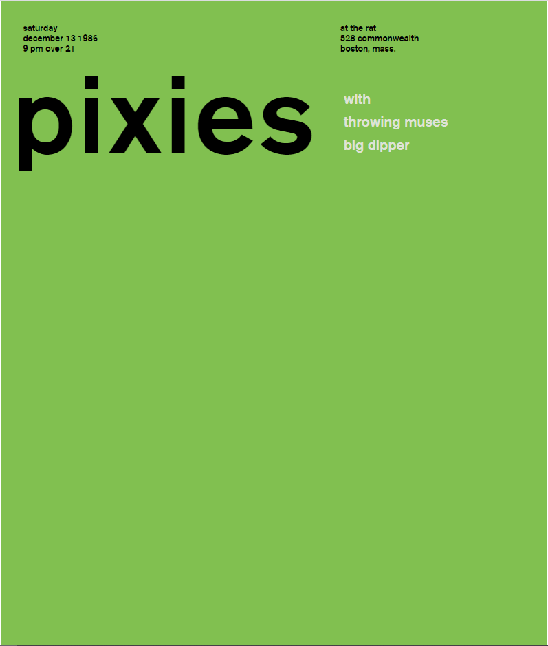
Adding the text to the Html
We can now add the text we see on the poster to our sections on the html page.
                        <!-- the top info text -->
            <section class="info-section">
                <!-- text on the left -->
                <section class="section-left">
                    <p>saturday</p>
                    <p>december 13 1986</p>
                    <p>9 pm over 21</p>
                </section>
                <!-- text on the right -->
                <section class="section-right">
                    <p>at the rat</p>
                    <p>528 commonwealth</p>
                    <p>boston, mass.</p>
                </section>

            </section>
            <!-- the main title section -->
            <section class="title-section">
                <!-- the main title -->
                <h1 class="title">pixies</h1>
                <!-- the subtitle -->
                <section class="subtitle">
                    <p>with</p>
                    <p>throwing muses</p>
                    <p>big dipper</p>
                </section>
            </section>
Bringing it all together
If you havent already, start the live server by clicking the go live that sits on the bottom of vscode. You will see that we have our top two section but no circles are displayed yet. That is because we are going to create then dynamically and have them whizz onto the poster using some gsap magic.
But before we go ahead and do that, let's add out cusomt font. If we check the swissed site we can read that Mike Joyce uses the same font for all the posters, Berthold Akzidenz-Grotesk. The font can be downloaded from here: www.azfonts.net/load_font/berthold-akzidenz-grotesk-be-medium.html. This will give you the font in ttf format. We will want to convert that to woff (see here and here) We can do the conversion online via fontsquirrel.com/tools/webfont-generator.
Now that we have our font in woff format we can drag both the woff and woff2 fonts to our font folder. Then inside the index.scss folder we can load the font using @font-face. We can then add the font family to the outer-containerclass which will cascade down to the elements that use text.
/* load font */
@font-face {
    font-family: 'berthold_akzidenz_grotesk_bRg';
    src: url('../font/berthold-akzidenz-grotesk-be-medium-webfont.woff2') format('woff2'),
         url('../font/berthold-akzidenz-grotesk-be-medium-webfont.woff') format('woff');
    font-weight: normal;
    font-style: normal;
}

.outer-container {
        ...other stuff
    font-family: 'berthold_akzidenz_grotesk_bRg';
}
Next we need to import gsap into our project. We'll use the CDN. At the bottom of the body tag add these two script tags above the script that imports our own js file.
<script src="https://cdnjs.cloudflare.com/ajax/libs/gsap/3.5.1/gsap.min.js"></script>
<script src="https://cdnjs.cloudflare.com/ajax/libs/gsap/3.5.1/EasePack.min.js"></script>
index.js
We have created space for our circles on our poster, in fact we have even given them a lovely grid to sit in. But they don't exist yet, let's change that.
First we can grab a reference to our circel-grid then we will be creating an array of circles that matches the grid dimentions we specified earlier (11x11). From each element we will create a div and attach our circleclass.
// get the circle grid from the DOM
let circleGrid = document.querySelector(".circles-grid");

// create 121 (11x11) circle elements and attach the circle class
const circles = Array.from(Array(121)).map((circle) => {
    // create the circle as a div
    circle = document.createElement("div");
    // attach the css class
    circle.className = 'circle';
    return circle;
});
The next step is for us to figure out which circles will be white and which wont so that we get that triangle effect. I took the liberty of counting these out so you can relax! Lets add a new whiteCirclesIndices array to our file. We will use this by looping over our newly created circles array and checking if the indexes match up, if they do we will override the circle class with the white-circle class. We then add all of our circles to the circle-grid.
// the indexes of the circles to be displayed as white
const whiteCirclesIndices = [12,23,24,34,35,36,45,46,47,48,56,57,58,59,60,67,68,69,70,71,72,78,,79,80,81,82,83,84,,89,,90,91,92,93,94,95,96,100,101,102,103,104,105,106,107,108];

// add the circles to our circle grid
circles.forEach((circle, index) => {
    // loop over the indexes that should be white
    for (const whiteIndex of whiteCirclesIndices) {
        // if the circles index matches the white index then add the new css class to it.
        if (whiteIndex === index) {
            circle.classList.add('white-circle')
        }
    }
    // add the circle to the grid
    circleGrid.append(circle)
})
If you have the live server running you should now see the correct font being used and the circles filling up their grid, with a white triangle formed on the left-center of the grid.
Animate!
Posters are cool to look at, but they don't do much else. Us being web devs, we can makes stuff move for no other reason apart from we want too and it will look cool. So lets bring our poster to life!
At the top of our index.js file get the gsap object formt he window. We will then create a timline. Because we are going to be running a few animations one after the other it makes sense to use a timeline as this will fire off the animations sequentially. We'll start be animating in our info-section , title and subtitle sections.
const {gsap} = window;

let TL = gsap.timeline({delay: 0.5});

...creatingCircles...

// animate the intro text down from the top
TL.from(".info-section", {
    y: window.innerHeight * -1,
    duration: 1.5,
    ease: 'elastic.out(1, 1)'
})

// animate the title in from the left
TL.from(".title", {
    x: window.innerWidth * -1,
    duration: 1.5,
    ease: 'elastic.out(1, 1)'
}, "-=1");

// animate the subtitle in from the right
TL.from(".subtitle", {
    x: window.innerWidth * 1,
    duration: 1.5,
    ease: 'elastic.out(1, 1)'
}, "-=1")
We use the timeline variable TL to target the class names of each section we want to animate. We use the from method as that means that we animate from the given values to their originally set positions. Notice the -=1 ? Our timeline runs each of our animations sequentially, that is, one after the other. What we are doing here is saying to the timeline that we want that animation to overlap the previous one by 1 second. This gives our animations a smoother, more natural feel.
Next up we can animate in the grid itself. This won't be anything fancy, a simple opacity will do. The reaosn for this is that in a second we are going to make our circles fly in from an angle and they will be flying onto a black square. It will look alot nicer if the black square appears around the same time they start flying in.
// gentle opacity animation of the grid background
TL.from(".circles-grid", {
    opacity: 0,
    duration: 2,
}, "-=1") // "-=1" will overlap the end of the last tween by 1 second. It makes them appear smoother
Lastly we will bring in our circles. We'll make use of the stagger animation which can take a grid of elements and animate them from which ever way you like. You can explicitly tell it what the grid dimentions are (which we will do) or you can let it guess, seeing as we know our grids dimentions we'll use them. The from property tells the stagger from where the animation should begin. I like random, you can play about with it. You options are:
- center
- end
- edges
- random
// stagger and animate in the circles from the bottom left of the poster
TL.from(".circle", {
    y: window.innerHeight * 1,
    x: window.innerWidth * -1,
    duration: 1.2,
    ease: "bounce.out",
    stagger: {
        grid: [11, 11],
        from: 'random',
        amount: 1.5
    }
}, "-=1")
The finished poster
Fin
That as they say, is that. I think we have created a fairly acurate representation of the poster. We have use css grid in different ways, including dynamically populating it. We have looked at how to add a cusotm font to our css and finally we have added some cool animations. This is a great foundation from which to start creating your own animated layouts, everything you have learnt here can be iterated on and scaled up for use in any project.


Oldest comments (0)