Quick Synopsis:
In this article, you will learn about a wrapper component in react, its utility, and how to make a wrapper component.
What's a wrapper component in react?
Wrapper components are components that surround unknown components and provide a default structure to display the child components.
A wrapper component may be used to create user interface (UI) components that are used frequently throughout a design, such as modals, template pages, and information tiles.
Code example of a modal react wrapper component.
export const Modal = (props) => {
  const { visible, cancel, children } = props;
  const modalRef = useRef(null);

  useEffect(() => {
    const checkIfClickedOutside = (e) => {
      // If the modal is open and the clicked target is not within the modal,
//then close the modal
      if (visible && modalRef.current && !modalRef.current.contains(e.target)) {
        cancel();
      }
    };

    document.addEventListener("mousedown", checkIfClickedOutside);

    // Cleanup the event listener
    return () => {
      document.removeEventListener("mousedown", checkIfClickedOutside);
    };
  }, [visible]);

  return (
    <>
      {visible && (
        <div className="modal-bg">
          <div ref={modalRef} className="modal-container">
            <button onClick={cancel}>close modal</button>
            {children}
          </div>
        </div>
      )}
    </>
  );
};
The preceding code demonstrates a react modal component.
The modal component is given the following properties to make it reusable anywhere a modal is needed.
visibleA Boolean value that controls the visibility of the modals.cancelA handler function that negates thevisibilevalue.childrendisplays whatever you include between the opening and closing tags when invoking the modal wrapper.
The modal component then transforms into a wrapper component, wrapping the children prop and giving it a modal view.
The modal component can be utilized anywhere a modal is required.
function App() {
const [modalVisble, setModalVisble] = useState(false);
const handleOpenModal = () => {
setModalVisble(true);
};
const handleCloseModal = () => {
setModalVisble(false);
};
return (
<div className="App">
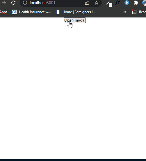
<button type="button" onClick={handleOpenModal}>
Open modal
</button>
<Modal visible={modalVisble} cancel={handleCloseModal}>
<h1>Hello World</h1>
<p>I am a modal</p>
</Modal>
</div>
);
}
.modal-bg {
  background-color: rgba(0, 0, 0, 0.2);
  height: 100vh;
  width: 100%;
  position: fixed;
  top: 0;
  left: 0;
  display: flex;
  justify-content: center;
  align-items: center;
}

.modal-container {
  background-color: white;
  padding: 20px;
  width: 70%;
  margin: 0 auto;
}
Conclusion
React wrapper is a must-have approach for every professional react developer.
In this article we learned how we can create a react wrapper component and its use cases.


Oldest comments (0)