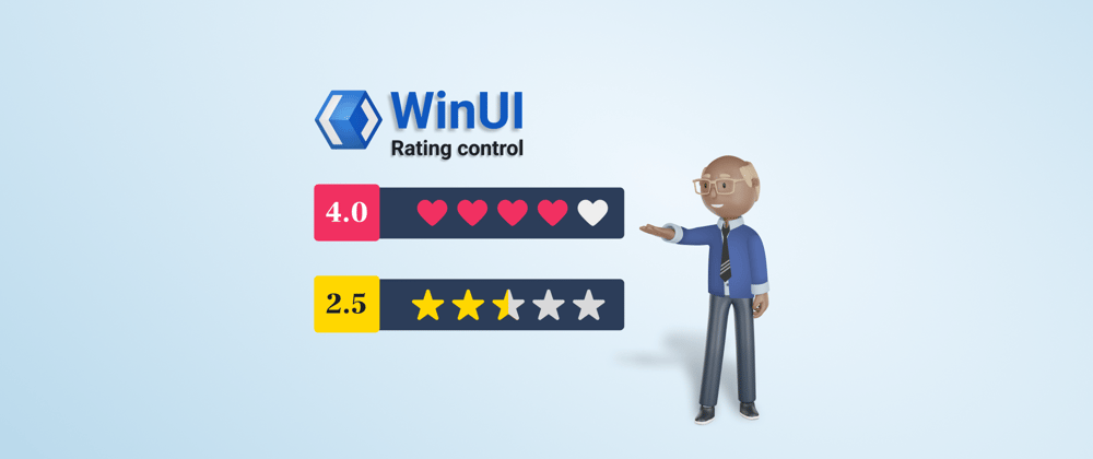
We are glad to introduce the new WinUI Rating control in the 2022 Volume 3 release. It is used to provide or view ratings on a numeric scale for any service provided, such as movies, applications, and products.
The key features of the WinUI Rating control are:
Let’s look at these features and see how you can use the new WinUI Rating control in your app.
Precision
The WinUI Rating control provides accuracy levels for ratings, with flexible precision to handle full, half, or exact values:
- Full —To round to the nearest value.
- Half —To set the nearest half-value for ratings.
- Exact —To set the exact value for ratings.


Read-only
Design the Rating control in read-only mode to restrict the users from selecting the rating items. This mode allows users only to view the rating value.

Tooltip
You can show the exact rating value as a tooltip when the user hovers the mouse over any rating item.

Template
Our WinUI Rating control has template support to add rating items such as images, paths, font icons, and other elements.


Customization
You can easily customize the WinUI Rating control with different styles for rated and unrated items, custom item count, and size options.
Style
Customize the styles of rated and unrated items in the control.

ItemsCount
Specify the number of items to be displayed in the Rating control.

Example:
ItemSize
Customize the size of each rating item in the control.

Getting started with the WinUI Rating control
We have seen the marvelous features of the WinUI Rating control. Let’s see how to add it to your app and use these features.
Step 1: Create a WinUI application.
First, create a simple WinUI project using the guidelines in the Create app with Windows App SDK documentation.
Step 2: Add the Syncfusion.Editors.WinUI NuGet package.
Then, install the latest Syncfusion.Editors.WinUI NuGet package in your project from the NuGet Gallery or installed location, C:\Program Files (x86)\Syncfusion\Essential Studio\WinUI\xx.x.x.xx\NuGetPackages.
Note: xx.x.x.xx denotes the version of the installed Syncfusion WinUI Editors package.
Step 3: Add the namespace.
Now, include the Syncfusion.UI.Xaml.Editors namespace in your XAML file with the following code.
xmlns:syncfusion="using:Syncfusion.UI.Xaml.Editors"
Step 4: Initialize the WinUI Rating control.
Initialize the WinUI Rating control by adding the rating items, as shown in the following code example.
<Page
    x:Class="GettingStarted.MainPage"
    xmlns="http://schemas.microsoft.com/winfx/2006/xaml/presentation"
    xmlns:x="http://schemas.microsoft.com/winfx/2006/xaml"
    xmlns:local="using:GettingStarted"
    xmlns:d="http://schemas.microsoft.com/expression/blend/2008"
    xmlns:mc="http://schemas.openxmlformats.org/markup-compatibility/2006"
    xmlns:syncfusion="using:Syncfusion.UI.Xaml.Editors"
    mc:Ignorable="d"
    Background="{ThemeResource ApplicationPageBackgroundThemeBrush}">

    <Grid>
     <syncfusion:SfRating Value="3">
      <syncfusion:SfRating.Items>
       <syncfusion:SfRatingItem />
       <syncfusion:SfRatingItem />
       <syncfusion:SfRatingItem />
       <syncfusion:SfRatingItem />
       <syncfusion:SfRatingItem />
      </syncfusion:SfRating.Items>
     </syncfusion:SfRating>
    </Grid>

</Page>
You can also initialize the Rating control using the ItemsCount property like in the following code example.
…
  <Grid>
  <syncfusion:SfRating Value="3" ItemsCount="5" />
 </Grid>
…
After executing these code examples, we will get a rating control like in the following image.

Note: For more details, refer to the WinUI Rating control getting started documentation.
Conclusion
Thanks for reading! We have seen the features of the new Syncfusion WinUI Rating control rolled out in the 2022 Volume 3 release. To see all the available new upgrades in this release, take a look at our Release Notes and What’s New pages. Try the new features out and share your thoughts in the comments section below.
You can also download and check out our WinUI demo app in the Microsoft Store.
For current customers, the new version is available for download from the License and Downloads page. If you are not yet a Syncfusion customer, you can try our 30-day free trial to check out our newest features.
For questions, you can contact us through our support forums, support portal, or feedback portal. We are always happy to assist you!


Top comments (0)