
A ComboBox is a crucial UI element that most mobile app developers use in their projects. We at Syncfusion understand the wide-ranging utility of this control and have now delivered a .NET MAUI ComboBox control in our 2022 Volume 3 release.
In this article, I will summarize the key features of the .NET MAUI ComboBox control and how to get started with it.
.NET MAUI ComboBox
The .NET MAUI ComboBox control is a selection component that allows users to type a value or choose an option from a list of predefined options. It has many features, such as data binding, editing, searching, a clear button, and dropdown button customization.
Getting started with .NET MAUI ComboBox
Let’s see how to get started with the .NET MAUI ComboBox control, populate it with data, and load items.
Step 1 : Syncfusion .NET MAUI components are available on the NuGet Gallery. To add the SfComboBox to your project, open the NuGet package manager in Visual Studio. Search for the Syncfusion.Maui.Inputs NuGet package and then install it.
Step 2 : Register the handler for the Syncfusion Core package in the MauiProgram.cs file.
using Syncfusion.Maui.Core.Hosting;
using Syncfusion.Maui.ListView.Hosting;
public static class MauiProgram
{
  public static MauiApp CreateMauiApp()
  {
     var builder = MauiApp.CreateBuilder();
     builder
       .UseMauiApp<App>()
       .ConfigureSyncfusionCore()
       .ConfigureSyncfusionListView()
       .ConfigureFonts(fonts =>
        {
           fonts.AddFont(“OpenSans - Regular.ttf”, “OpenSansRegular”);
           fonts.AddFont(“OpenSans - Semibold.ttf”, “OpenSansSemibold”);
        });

     return builder.Build();
  }
}
Step 3 : Import the SfComboBox namespace on the XAML page.
xmlns:inputs=”clr-namespace:Syncfusion.Maui.Inputs;assembly=Syncfusion.Maui.Inputs”
Step 4 : Initialize an empty ComboBox control as shown in the following code.
<inputs:SfComboBox x:Name=“combobox” WidthRequest=”200″/>
Step 5 : Let’s create the data required to populate the suggestion list. This includes the creation of the example Person class and PersonsViewModel with a list of Person objects.
public class Person
{
  public string Name { get; set; }
  public string SecondName { get; set; }
}
public class PersonsViewModel : INotifyPropertyChanged
{
  readonly IList<Person> source;
  Person selectedPerson;
  private string selectedItem;
  public ObservableCollection<Person> Persons { get; private set; }
  public List<string> Items { get; private set; }
  public Person SelectedPerson
  {
    get
    {
      return selectedPerson;
    }
    set
    {
      if (selectedPerson != value)
      {
        selectedPerson = value;
        OnPropertyChanged(“SelectedPerson”);
      }
    }
  }

  public string SelectedItem
  {
    get
    {
      return selectedItem;
    }
    set
    {
      if (selectedItem != value)
      {
        selectedItem = value;
        OnPropertyChanged(“SelectedItem”);
      }
    }
  }

  public PersonsViewModel()
  {
    source = new List<Person>();
    CreatePersonCollection();

    SelectedPerson = Persons.Skip(3).FirstOrDefault();
  }

  void CreatePersonCollection()
  {
    for (int i = 0; i < 1; i++)
    {

      source.Add(new Person { Name = “Adam”, SecondName = “A” });
      source.Add(new Person { Name = “Bob”, SecondName = “A” });
      source.Add(new Person { Name = “John”, SecondName = “D” });
      source.Add(new Person { Name = “Alan”, SecondName = “E” });
      source.Add(new Person { Name = “Alex”, SecondName = “F” });
      source.Add(new Person { Name = “Jacob”, SecondName = “R” });
      source.Add(new Person { Name = “Peter”, SecondName = “J” });
      source.Add(new Person { Name = “Clark”, SecondName = “L” });
      source.Add(new Person { Name = “Ben”, SecondName = “A” });
      source.Add(new Person { Name = “Dave”, SecondName = “S” });
    }

    Persons = new ObservableCollection<Person>(source);
  }

  #region INotifyPropertyChanged
  public event PropertyChangedEventHandler PropertyChanged;

  void OnPropertyChanged([CallerMemberName] string propertyName = null)
  {
    PropertyChanged?.Invoke(this, new PropertyChangedEventArgs(propertyName));
  }
  #endregion
}
Step 6 : Set the binding context to the PersonsViewModel , bind the ItemsSource with the Persons list , and bind the DisplayMemberPath property with the Name property.
<ContentPage.BindingContext>
  <local:PersonsViewModel/>
</ContentPage.BindingContext>
<inputs:SfComboBox WidthRequest=”200″
                   ItemsSource=”{Binding Persons}”
                   DisplayMemberPath=”Name”/>
That’s it. Our .NET MAUI ComboBox control is now ready.

Customization in .NET MAUI ComboBox
You can perform the following customizations in the .NET MAUI ComboBox control:
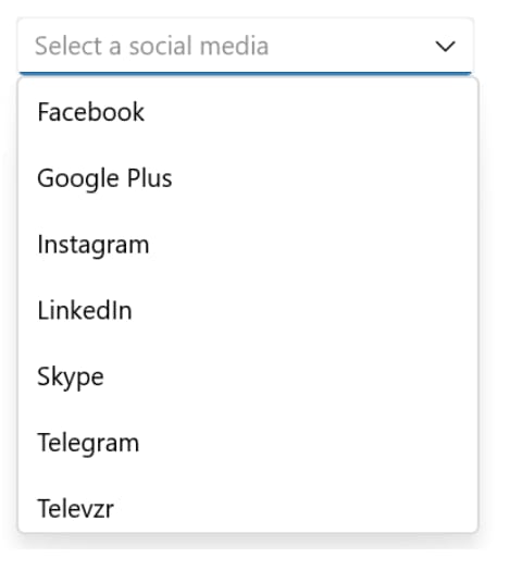
Placeholder text
You can prompt the user with any information using the PlaceholderText property. This text will be displayed only if no items are selected or the edit text field is empty. The default value of the PlaceholderText property is string.Empty (no string will be displayed).
Refer to the following code example.
<editors:SfComboBox x:Name="comboBox"
                      WidthRequest="250"
                      ItemsSource="{Binding SocialMedias}"
                      DisplayMemberPath="Name"
                      TextMemberPath="Name"
                      Placeholder="Select a social media" />
Color customization
You can also customize the color of the ComboBox border, placeholder text, item text, clear button, dropdown icon, and more.
Refer to the following code example where we have customized the border and dropdown icon color.
<editors:SfComboBox x:Name="combobox"
                      WidthRequest=”250”
                      ItemsSource="{Binding SocialMedias}"
                      DisplayMemberPath="Name"
                      TextMemberPath="Name"
                      DropDownIconColor="Red"
                      BorderColor="Red" />

Upcoming features
This is the initial version of our.NET MAUI ComboBox control. You can expect the following features in our upcoming releases:
- Multiselection with chip UI.
- Diacritic sensitivity.
- Item templates.
- Text match highlights.
- Dropdown header and footer.
- Custom filtering.
Conclusion
Thanks for reading! In this blog, we have seen the vivid features of the new .NET MAUI ComboBox control available in our 2022 Volume 3 release. Check out our Release Notes and What’s New pages to see the other updates in this release.
You can also download our free evaluation to see all our .NET MAUI controls in action.
If you have any questions or comments, you can reach us through our support forum, support portal, or feedback portal. We are always happy to assist you!


Latest comments (0)