Howdy! As the proverb says, practice makes perfect. You can improve and become a master in designing XAML UIs if you practice a lot. In this blog, we’ll see how to replicate a camping app UI in .NET MAUI based on this this Dribbble design.
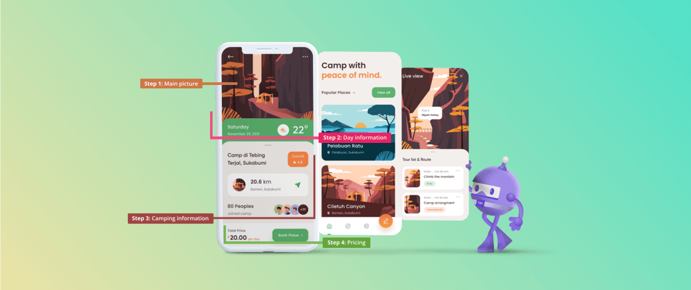
We are going to develop the UI by following the steps listed in this image.
Before starting, let’s highlight some important points. In the course of this blog post, we will learn to:
- Implement the Syncfusion .NET MAUI Avatar View and ListView controls.
- Add shadows in .NET MAUI.
- Replicate an amazing UI to continue improving our XAML skills!
Let’s code!
Main layout
Let’s start designing the main layout of the UI.
Here, we will use a ScrollView to make layouts scrollable. Inside it, add a Grid with four rows to organize each of the frames that are shown in the design.
Refer to the following code example.
<ScrollView VerticalScrollBarVisibility="Never">
 <Grid RowDefinitions="Auto,Auto,*,Auto">
  <!-- Add all your UI content here -->
 </Grid>
</ScrollView>
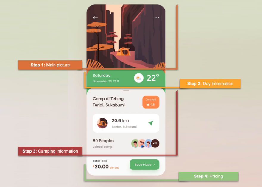
Step 1: Main picture
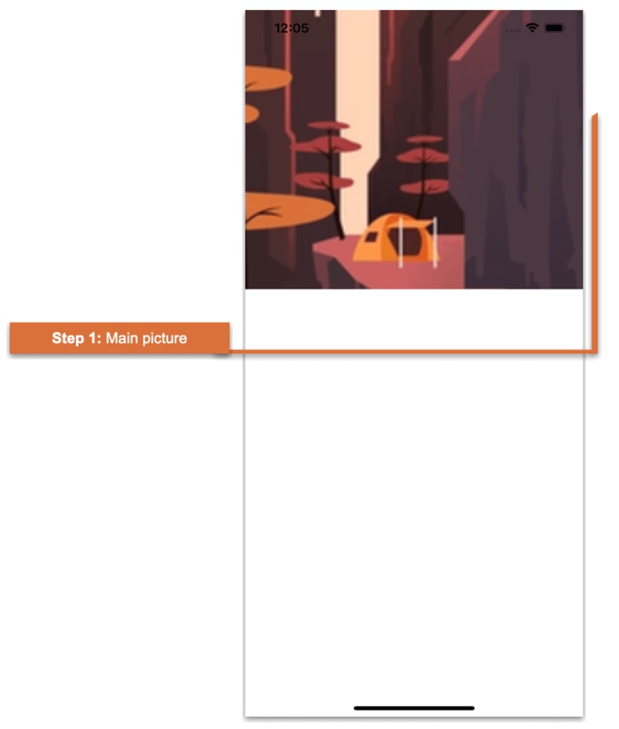 This is one of the simplest steps. Here, we only have to add the main photo to the design. Refer to the following code example.
<!-- Step 1: Main picture-->
<Image Grid.Row="0" Grid.Column="0" Source="forest" HeightRequest="360" Aspect="AspectFill" Margin="0,-50,0,0"/>
<!-- You must write here what is explained in the next step -->
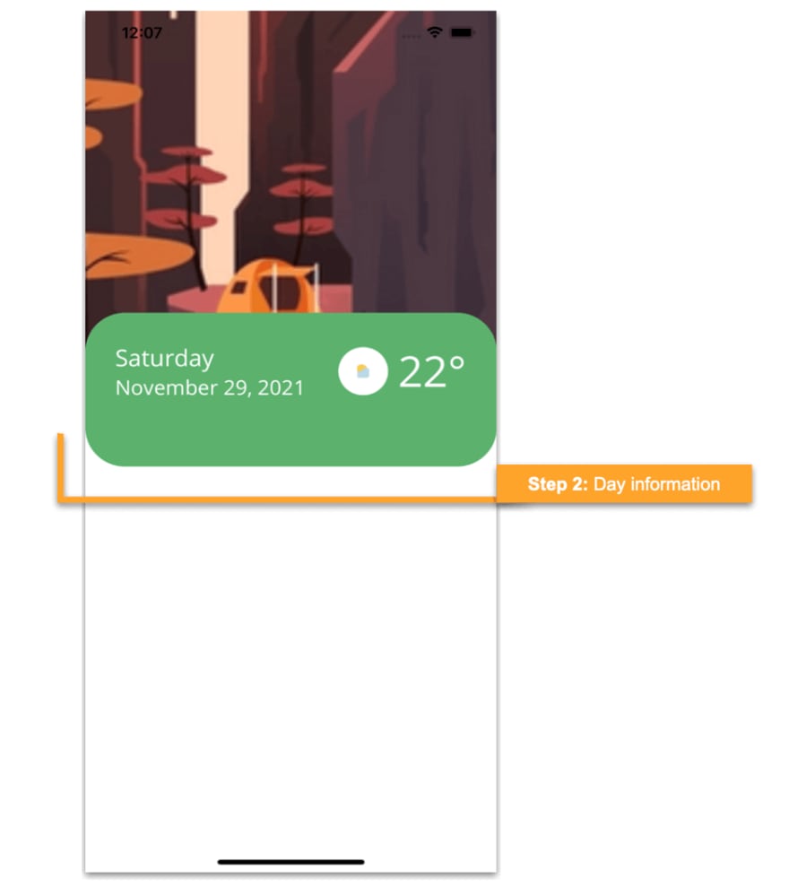
Step 2: Day information
 To understand the code in this step clearly, we have divided this step into the following substeps:
Step 2.a: Frame overlapping the image
First, we are going to design a frame that slightly overlaps the main image. To do so, add the frame as usual. Then, add the Margin property and make sure to mark the top value position as negative. (For example: Margin=”0,-40,0,0″). Also, add a layout (in this case, a Grid) inside the frame to organize the required information.
Refer to the following code example.
<!-- Step 2: Day information-->
<Frame Grid.Row="1" BackgroundColor="#5cb26e" CornerRadius="40" HasShadow="False" HeightRequest="160" Margin="0,-40,0,0">
 <Grid RowDefinitions="Auto,Auto" ColumnDefinitions="*,Auto,Auto" Padding="10">
  <!-- You must write here what is explained in step 2.b -->
 </Grid>
</Frame>
<!-- You must write here what is explained in step 3 -->
Step 2.b: Adding day content information
Within the previously added frame, add the following information:
- Day
- Date
- Temperature
Refer to the following XAML code example.
<!--Day-->
<Label Grid.Row="0" Grid.Column="0" Text="Saturday" TextColor="White" FontSize="22"/>
<!--Time-->
<Label Grid.Row="1" Grid.Column="0" Text="November 29, 2021" TextColor="White" FontSize="19"/>
<!--Weather button-->
<Button Grid.Row="0" Grid.Column="1" Grid.RowSpan="2" ImageSource="sun" HeightRequest="50" WidthRequest="50" CornerRadius="25" BackgroundColor="White"/>
<!--Weather description-->
<Label Grid.Row="0" Grid.Column="2" Grid.RowSpan="2" Text="22°" FontAttributes="Bold" FontSize="40" TextColor="White" Padding="10,0,0,0"/>
Step 3: Camping information
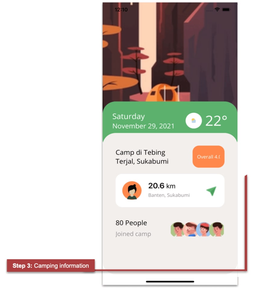 An important point here is that this frame covers a large part of the remaining vertical space of the device. To achieve this, assign a proportional value (*) to this row in the Grid.
<!-- Step 3: Camping information-->
<Frame Grid.Row="2" VerticalOptions="FillAndExpand" HasShadow="False" CornerRadius="40" BackgroundColor="#f3efec" Margin="0,-60,0,0">
 <Grid RowDefinitions="Auto,Auto,Auto,Auto" ColumnDefinitions="*,Auto" Padding="20" VerticalOptions="FillAndExpand">
  <!-- You must write here what is explained in the next code block-->
 </Grid>
</Frame>
<!-- You must write here what is explained in step 4 -->
Now, let’s add the camping information contained in this block.
Title and Overall button
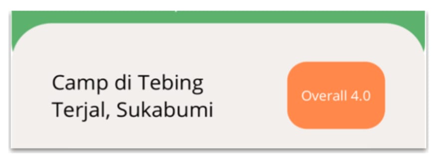 Refer to the following code to render the title and Overall button.
<!--Title and Overall button-->
<Label Grid.Row="0" Grid.Column="0" Text="Camp di Tebing
Terjal, Sukabumi" TextColor="Black" FontSize="19" FontAttributes="Bold" VerticalTextAlignment="Center"/>
<Button Grid.Row="0" Grid.Column="1" BackgroundColor="#ff884a" TextColor="White" Text="Overall 4.0" WidthRequest="98" HeightRequest="70" HorizontalOptions="End" CornerRadius="20" VerticalOptions="Center"/>
<!-- You must write here what is explained in the next code block -->
Location card
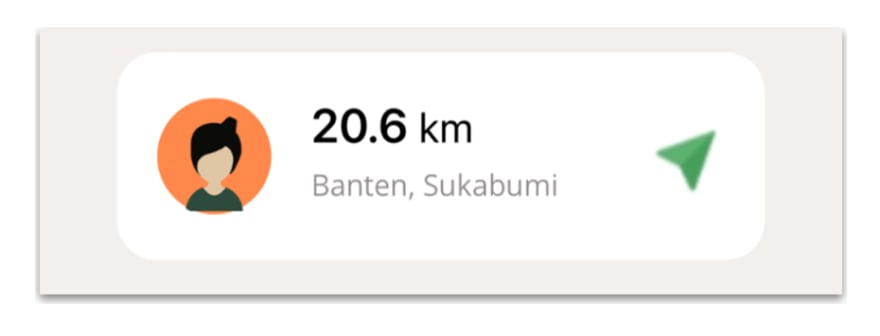 To design the location card, we’ll use another frame, which contains different information such as an avatar image, distance in kilometers, location, and an arrow icon.
Frame details
Let’s design the complete frame details by adding the following code.
<!--Location card-->
<Frame Grid.Row="1" Grid.Column="0" Grid.ColumnSpan="2" HasShadow="False" CornerRadius="20" HorizontalOptions="FillAndExpand" HeightRequest="105" Margin="0,20,0,35">
 <Grid RowDefinitions="Auto,Auto" ColumnDefinitions="Auto,*,Auto" VerticalOptions="Center">
 <!-- Add here the Avatar View code explained in the next step-->"
 <!--Km information-->
  <Label Grid.Row="0" Grid.Column="1" TextColor="Black">
    <Label.FormattedText>
     <FormattedString>
        <Span Text="20.6 " FontAttributes="Bold" FontSize="22"/>
        <Span Text="km" FontSize="19"/>
     </FormattedString>
    </Label.FormattedText>
  </Label>
  <!--Location-->
  <Label Grid.Row="1" Grid.Column="1" Text="Banten, Sukabumi" TextColor="#938e8f"/>
  <!--Arrow icon-->
  <Image Grid.Row="0" Grid.Column="2" Grid.RowSpan="2" Source="arrow"/>
 </Grid>
</Frame>
AvatarView
To design the avatar image, we use the Syncfusion .NET MAUI Avatar View control. To implement it, add the Syncfusion.Maui.Core NuGet package.
Handler registration
Now, go to your MauiProgram.cs file and register the handler for the Syncfusion Core. To do so, go to the CreateMauiApp method and just below the line .UseMauiApp(), add the .ConfigureSyncfusionCore() method. ** **
Add the namespace
Then, add the Syncfusion.Maui.Core namespace in your XAML file.
xmlns:sfControl="clr-namespace:Syncfusion.Maui.Core;assembly=Syncfusion.Maui.Core"
Adding Syncfusion .NET MAUI AvatarView
Let’s add the Syncfusion .NET MAUI AvatarView control using the following code.
<sfControl:SfAvatarView Grid.Row="0" Grid.Column="0" Grid.RowSpan="2" Margin="0,0,20,0"
                        ContentType="Default"
                        VerticalOptions="Center"
                        HorizontalOptions="Center"
                        BackgroundColor="#ff884a"
                        BorderColor="Transparent"
                        WidthRequest="60"
                        HeightRequest="60"
                        CornerRadius="30"/>
People counter
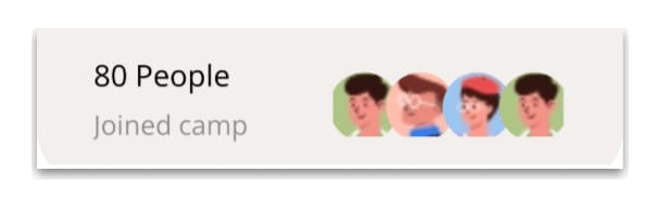 In this part, we will render the information about the people who have joined the camp. ** **
People information
Refer to the following code to render the people’s information. ** **
<!-- People information-->
<Label Grid.Row="2" Text="80 People" TextColor="Black" FontAttributes="Bold" FontSize="19"/>
<Label Grid.Row="3" Text="Joined camp" TextColor="#938e8f" FontSize="17"/>
<!-- You must write here what is explained in the next code block -->
Avatar collection
To design the Avatar View collection of the people who joined the camp, we use the Syncfusion .NET MAUI ListView Control. To implement it, add the Syncfusion.Maui.ListView NuGet package. ** **
Handler registration
Now, go to your MauiProgram.cs file and register the handler for the Syncfusion .NET MAUI ListView. To do so, go to the CreateMauiApp method and just before the line return builder.Build();, add the builder.ConfigureSyncfusionListView(); method.
Add the namespace
Then, add the namespace Syncfusion.Maui.ListView in your XAML file.
xmlns:syncfusion="clr-namespace:Syncfusion.Maui.ListView;assembly=Syncfusion.Maui.ListView"
Adding Syncfusion .NET MAUI ListView
Refer to the following code to add the Syncfusion .NET MAUI ListView control.
<!--Avatar collection-->
<syncfusion:SfListView x:Name="listView" Grid.Row="2" Grid.RowSpan="2" Grid.Column="1"
                         ItemsSource="{Binding UserInfo}"
                         ItemSize="40"
                         ScrollBarVisibility="Never"
                         HeightRequest="70"
                         HorizontalOptions="End"
                         WidthRequest="165"
                         Orientation="Horizontal">
 <syncfusion:SfListView.ItemTemplate>
  <DataTemplate>
   <StackLayout VerticalOptions="Center" HorizontalOptions="EndAndExpand">
    <sfControl:SfAvatarView
               ContentType="Default"
               ImageSource="{Binding UserPicture}"
               VerticalOptions="Center"
               HorizontalOptions="Center"
               BorderColor="Transparent"
               WidthRequest="50"
               HeightRequest="50"
               CornerRadius="25"/>
   </StackLayout>
  </DataTemplate>
 </syncfusion:SfListView.ItemTemplate>
</syncfusion:SfListView>
To fill the ListView data, we have created examples for the Model and ViewModel on GitHub. Please refer to them.
Note: For more details about the Syncfusion .NET MAUI ListView control, refer to its getting started documentation.
Step 4: Pricing
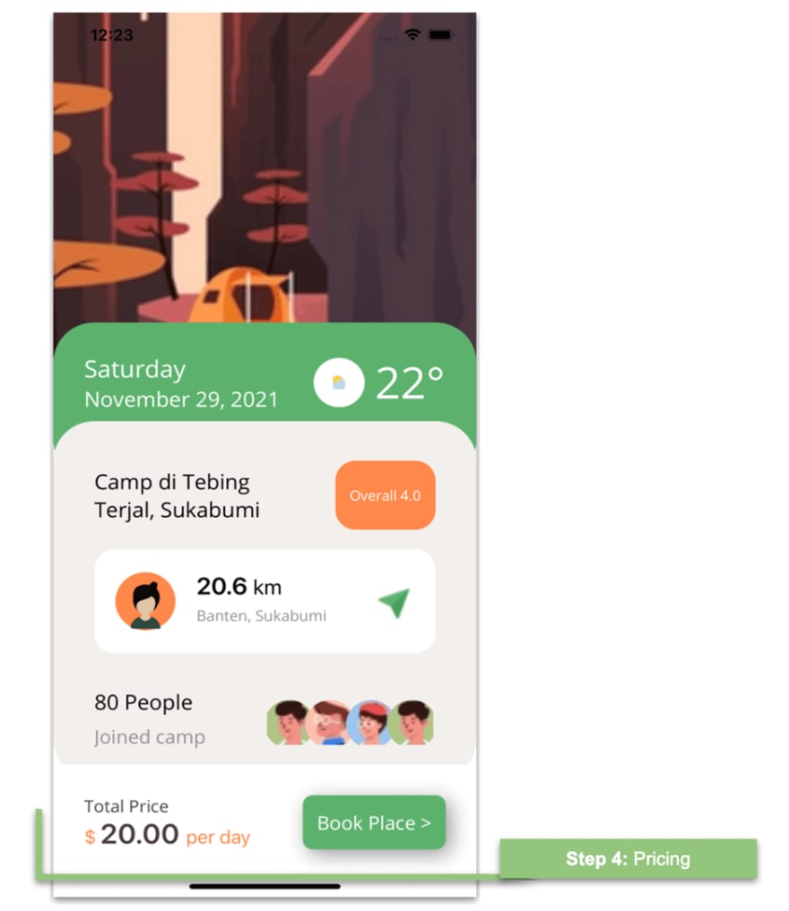 Finally, add the pricing information. To do so, first, add a Grid.
<!--Step 4: Pricing-->
<Grid Grid.Row="3" RowDefinitions="Auto,Auto" ColumnDefinitions="*,Auto" HeightRequest="80" BackgroundColor="White" Margin="0,-15,0,20" Padding="30" VerticalOptions="CenterAndExpand">
 <!-- You must write here what is explained in the next code block -->
</Grid>
Title
Refer to the following code to render the title.
<!--Title-->
<Label Grid.Row="0" Grid.Column="0" Text="Total Price" TextColor="#4a3c3d" FontSize="16"/>
<!-- You must write here what is explained in the next code block -->
Price
As you can see in the sample UI, we have a price label that contains text in different formats (colors, sizes, etc.). To design it, here I have used the FormattedText property.
In this way, in a single label, you can add text with different characteristics without having to add a separate label for each of these styles.
Note: For more details about the FormattedText property, refer to the Label in .NET MAUI documentation.
<!--Price-->
<Label Grid.Row="1" Grid.Column="0">
 <Label.FormattedText>
  <FormattedString>
   <Span Text="$ " TextColor="#ff884a" FontSize="17"/>
   <Span Text="20.00 " FontSize="26" TextColor="#4a3c3d" FontAttributes="Bold"/>
   <Span Text="per day" TextColor="#ff884a" FontSize="17"/>
  </FormattedString>
 </Label.FormattedText>
</Label>
<!-- You must write here what is explained in the next code block -->
Book Place button
Let’s render the Book Place button and add shadow effects to it. Refer to the following code example.
<!--Book Place Button-->
<Button Grid.Row="0" Grid.Column="1" Grid.RowSpan="2" Text="Book Place >" TextColor="White" CornerRadius="10" HeightRequest="55" FontSize="17" WidthRequest="140" BackgroundColor="#5cb26e">
  <Button.Shadow>
    <Shadow Brush="Black"
            Offset="5,5"
            Radius="10"
            Opacity="0.4"/>
  </Button.Shadow>
</Button>
Note: For more details, refer to the Shadow in .NET MAUI documentation.
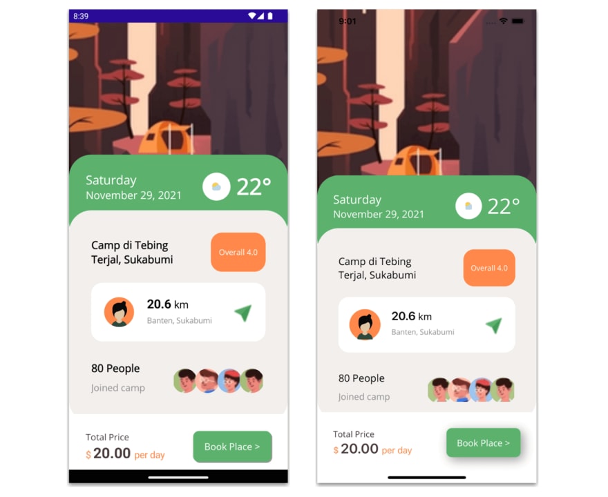
Finally, I present you the results for both iOS and Android platforms!
GitHub reference
To see the complete code structure of this project, refer to our Camping UI in .NET MAUI demo on GitHub.
Summary
Thanks for reading! In this blog, we have seen how to replicate a camping app UI using Syncfusion .NET MAUI controls. Try out the steps here and let us know what you think!
Syncfusion .NET MAUI controls were built from scratch using .NET MAUI, so they feel like framework controls. They are fine-tuned to work with a huge volume of data. Use them to build your cross-platform mobile and desktop apps!
For current customers, the new Essential Studio version is available for download from the License and Downloads page. If you are not yet a Syncfusion customer, you can always download our free evaluation to see all our controls in action.
If you have questions, you can contact us through our support forum, support portal, or feedback portal. We are always happy to assist you!
See you next time!


Top comments (0)