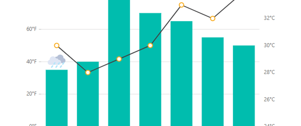
Learn how easily you can customize the Syncfusion React Charts axes. This video explains how to display a title, multiple axes, and an inversed axis, as well as how to set axis crossing, an opposed position, tick lines, and gridlines.
Download the example from GitHub:
https://bit.ly/3wbwQ3Z
Refer to the following documentation to customize the axis in the Syncfusion React Charts:
https://bit.ly/3AhrjfF
Check out this online example of multiple axes in the Syncfusion React Charts:
https://bit.ly/3yrEYPF
Check out this online example of inversed axis in the Syncfusion React Charts:
https://bit.ly/363TNLN
Check out this online example for setting the axis intersection point in the Syncfusion React Charts:
https://bit.ly/3y5gPy2


Top comments (0)