
Our Syncfusion JavaScript UI controls suite is the only suite you will ever need to build an application. It contains over 65 high-performance, lightweight, modular, and responsive UI components in a single package. In this blog, we are going to see how to configure Syncfusion JavaScript UI controls in the Lightning component framework to use them in the Salesforce Lightning App Builder tool.
What is Salesforce?
Salesforce is a cloud computing software as a service (SaaS) company that specializes in customer relationship management (CRM). Its services allow business users to use cloud technology to better connect with their customers and partners.
In the Lightning version of Salesforce, we can create custom components and use them in the Lightning App Builder tool which contains everything you need for a custom app, such as custom and standard objects, and custom tabs. It also includes Lightning page tabs and utilities like Lightning Voice.
Note: The Lightning Apps Builder tool isn’t available in Salesforce Classic.
Creating a custom component in Salesforce
To create a custom component in Salesforce, first you need to log in to your Salesforce account. If you don’t have one, use the free trial option. Then, follow these steps:
From the Settings option, open the Developer console as shown in the following screenshot.

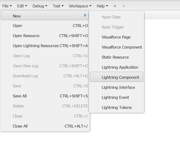
Then, in the Developer Console window, select File> New> Lightning Component.
-
Now, provide a name (I’m using the name EJ2SalesComponent) and a description for the component. Then, select the following options:
- Lightning Tab
- Lightning Page
- Lightning Record Page
Click the Submit button.

Now, we have created our custom Lightning component in Salesforce and now, let’s proceed with adding Syncfusion JavaScript UI controls to it!
Adding Syncfusion controls in the custom UI component
If you are new to our JavaScript UI controls, you can find demos and documentation at the following links:
To add Syncfusion UI controls in the newly created Lightning component, follow these steps:
- First, we need to load the required scripts and styles in the static resources. To do so, follow the steps listed in the Defining Static Resources documentation.We recommend you use the Syncfusion Custom Resource Generator (CRG) utility to download the required component scripts and styles. Refer to the CRG documentation page for information on how to use the utility. The following image shows the loaded script and CSS files for the DataGrid and Button components.

- Next, add the script and style refrence from the static resources to the EJ2SalesComponent.cmp (component) file. Refer to the following code example.
<ltng:require scripts="{!$Resource.ej2}" styles="{!$Resource.ej2Css}"
                  afterScriptsLoaded="{!c.doInit}"/>
- Then, add the necessary HTML tags for the controls in the component file. Here, we are going to add the code for the Button and Grid controls in the EJ2SalesComponent.cmp file.
// EJ2SalesComponent.cmp
<aura:component implements="flexipage:availableForRecordHome" access="public">
    <ltng:require scripts="{!$Resource.ej2}" styles="{!$Resource.ej2Css}"
                  afterScriptsLoaded="{!c.doInit}"/>
    <p>EJ2 Components</p>
     <div>
          <hr/>
           <h1>Grid Component</h1>
         <div id='grid'></div>
         <h1>Button Component</h1>
        <button id=’btn’>
        </button>
    </div>
</aura:component>
- Now, add a controller page (EJ2SalesComponentController.js) by using the right sidebar. Refer to the following screenshot.
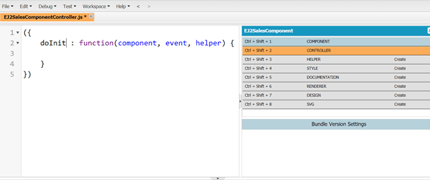
- The following control intializes the DataGrid and Button UI controls in the controller.js file.
// EJ2SalesComponentController.js
({
    doInit : function(component, event, helper) {
        // dataSoruce for Grid
        var data = [{ OrderID: 10248, CustomerID: 'VINET', Freight: 32.38, OrderDate: new Date(8364186e5) },
            { OrderID: 10249, CustomerID: 'TOMSP', Freight: 11.61, OrderDate: new Date(836505e6) },
            { OrderID: 10250, CustomerID: 'HANAR', Freight: 65.83, OrderDate: new Date(8367642e5) },
            { OrderID: 10251, CustomerID: 'VICTE', Freight: 41.34, OrderDate: new Date(8368506e5) },
            { OrderID: 10252, CustomerID: 'SUPRD', Freight: 51.3, OrderDate: new Date(8367642e5) },
            { OrderID: 10253, CustomerID: 'HANAR', Freight: 58.17, OrderDate: new Date(836937e6) },
            { OrderID: 10254, CustomerID: 'CHOPS', Freight: 22.98, OrderDate: new Date(8370234e5) },
            { OrderID: 10255, CustomerID: 'RICSU', Freight: 148.33, OrderDate: new Date(8371098e5) },
            { OrderID: 10256, CustomerID: 'WELLI', Freight: 13.97, OrderDate: new Date(837369e6) }];
        //control intialization
        var Button = new ej.buttons.Button({content:'snm',cssClass:'e-primary'},'#snm');
        var Grid = new ej.grids.Grid({dataSource: data},'#grid')
    }
})
- Now, the custom UI Lightning component with Syncfusion UI controls is created and ready to be used in the Lightning App Builder tool. We can test the created component in the developer console itself using the Lightning App Builder. To do this, you need to create your own Lightning App and add the reference for the component as shown in the following code example.
<aura:application >
  <c:EJ2SalesComponent />
</aura:application>
After that, click the Preview button in the right pane.
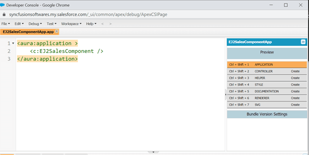
Then, the preview of the component will be loaded in the browser like in the following screenshot. Here, we can verify the component structure and alignment.

To use the custom Lightning UI component as a tab or within a page, refer to the instructions provided in the Add Lightning Components as Custom Tabs in a Lightning App documentation.
Now, we have succesfully configured the Syncfusion JavaScript DatGrid and Button UI controls into the newly created custom Lightning component in Salesforce.
Conclusion
I hope you now have a clear idea of how to create a custom Lightning UI component with Syncfusion JavaScript UI controls in Salesforce. We look forward to you trying out this integration and providing your feedback in the comments section below.
Syncfusion has 1,600 components and frameworks for WinForms, WPF, WinUI(Preview), ASP.NET(Web Forms, MVC, Core), UWP, Xamarin, Flutter, JavaScript, Angular, Blazor, Vue, and React. As proven in this blog post, you can also integrate these UI components into Salesforce and build astonishing customer relationship management apps!
For existing Syncfusion customers, the newest version of our components is available for download from the License and Downloads page. If you are not yet a Syncfusion customer, you can try our 30-day free trial to check out our available features. You can also try our samples from this GitHub location.
You can also contact us through our support forums, Direct-Trac, or feedback portal. We are always happy to assist you!
If you liked this blog post, we think you’ll like the following articles too:


Top comments (0)