
The Syncfusion WinUI Radial Gauge is a multipurpose data visualization control that displays numerical values on a circular scale. Its rich feature set includes axes, ranges, pointers, and annotations that are fully customizable and extendable. We can use the Radial Gauge to create speedometers, temperature monitors, dashboards, meter gauges, multi-axis clocks, watches, activity gauges, compasses, and more.
In this article, we’ll see how to design a car dashboard application with the vivid features of the WinUI Radial Gauge control.
Basic requirements
To create a car dashboard, we need the following features of the WinUI Radial Gauge control:
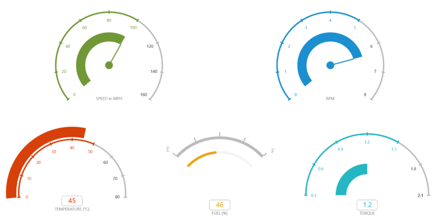
- Axes to define the speed, revolutions per minute (RPM), fuel level, temperature, and torque values in numbers from start to end with tick marks.
- Ranges to indicate the safe speed scope, alerts, etc. using multicolored range indicators.
- Pointers to point out the current speed, RPM, fuel level, temperature, and torque values.
- Annotations to show the current speed, RPM, fuel, temperature, torque values, and info about the design.
We are going to design a speed indicator dashboard for a car by customizing the appearance of the WinUI Radial Gauge control.
Designing a speed indicator dashboard for a car with WinUI Radial Gauge
Follow these steps to design a speed indicator dashboard using the WinUI Radial Gauge control.
Step1: Creating a Radial Gauge
First, create a Radial Gauge by referring to the WinUI Radial Gauge getting started documentation.
<gauge:SfRadialGauge>
 <gauge:SfRadialGauge.Axes>
  <gauge:RadialAxis>
  </gauge:RadialAxis>
 </gauge:SfRadialGauge.Axes>
</gauge:SfRadialGauge>
The gauge elements, such as axes, ranges, pointers, and annotations, are arranged relatively using the custom position option to make the gauge responsive in all window sizes.
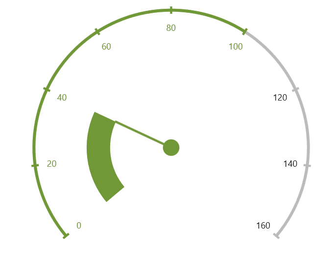
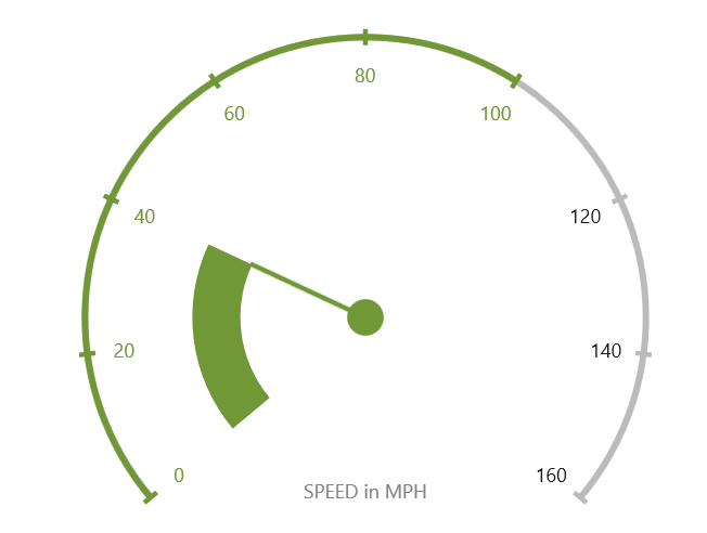
Step 2: Add speed scale
Then, design a speed scale by adding axis values as numbers from the minimum, 0, to the maximum, 160, with a specific interval. This is implemented using the axis feature in the WinUI Radial Gauge.
Axes contain a collection of RadialAxis elements. You can add any number of radial axes inside the Radial Gauge. An axis contains labels and tick marks, the positions and values of which can be easily customized. In the Radial Gauge, you can display the speed labels from 0 to 160 using the Minimum and Maximum properties.
RadialAxis supports two types of tick marks:
- Major ticks : Support displaying labels and help us to specify the primary value intervals.
- Minor ticks : Don’t support displaying labels and help us to define the space inside the primary value intervals.
The WinUI Radial Gauge allows you to customize the ticks’ appearance using the MajorTickStyle and MinorTickStyle properties.
You can customize the intervals of the labels and major ticks using the Interval property. The number of minor ticks can be set per interval in an axis using the MinorTicksPerInterval property.
Also, you can customize the position of axes, ticks, and labels using the corresponding offset properties. Values for offset properties are either set as factors from 0 to 1 (gauge center position to edge) or in pixels, and they are determined by the OffsetUnit property.
Refer to the following code example.
<gauge:SfRadialGauge x:Name="SpeedGauge">
 <gauge:SfRadialGauge.Axes>
  <gauge:RadialAxis UseRangeColorForAxis="True"
                    AxisLineFill="#FFBBBBBB"
                    AxisLineWidth="4"
                    TickPosition="Cross"
                    StartAngle="140"
                    MinorTicksPerInterval="0"
                    EndAngle="400"
                    Minimum="0"
                    Maximum="160"
                    Interval="20"
                    MajorTickLength="10">

   <gauge:RadialAxis.MajorTickStyle>
    <Style TargetType="Line">
     <Setter Property="Stroke"
             Value="#FFBBBBBB"></Setter>
     <Setter Property="StrokeThickness"
             Value="3"></Setter>
    </Style>
   </gauge:RadialAxis.MajorTickStyle>
  </gauge:RadialAxis>
 </gauge:SfRadialGauge.Axes>
</gauge:SfRadialGauge>

Note: For more details, refer to the Axis in WinUI Radial Gauge documentation.
Step 3: Add speed range indicator
Once the speed axis design is completed, add the safe speed range indicator. To do so, we’ll use the range support in the WinUI Radial Gauge.
A range is a visual element that helps you see where a value falls on a radial axis. It contains a collection of range elements. You can add any number of ranges inside the axis.
We can use ranges to display speeds with different color indicators. In our project, we will use a single range on the axis to indicate the safe speed level.
You can specify the start and end values of a range using the StartValue and EndValue properties. Also, you can customize the width of a range using the StartWidth and EndWidth properties.
Refer to the following code example.
<gauge:RadialAxis.Ranges>
 <gauge:GaugeRange StartValue="0"
                   EndValue="100"
                   StartWidth="4"
                   EndWidth="4"
                   Background="#FF719836" />
</gauge:RadialAxis.Ranges>

Note: For more details, refer to the Range in WinUI Radial Gauge documentation.
Step 4: Add speed indicators
Next, we’ll add a needle pointer to indicate the current speed value. To achieve this, use the pointer support in the WinUI Radial Gauge.
Pointers contain a collection of pointer elements, and you can add any number of pointers inside the axis. There are four types of pointers available in the WinUI Radial Gauge:
- Range
- Needle
- Shape
- Content
The value of a pointer is set using the Value property.
A needle pointer is a highly customizable element that takes the appearance of a needle and points out an exact value in the axis. It is represented with knob (rounded ball) and tail (rectangle at the end of the knob) elements. We can customize the length of the needle pointer using the NeedleLength and NeedleLengthUnit properties.
In this car dashboard design, we’ll also use a range pointer to point out the current speed. A range pointer shades in the area from the gauge’s start value to the current value.
You can customize the width and position of the pointer using the PointerWidth, WidthUnit, PointerOffset, and OffsetUnit properties.
Refer to the following code example.
<gauge:RadialAxis.Pointers>
 <gauge:NeedlePointer x:Name=”SpeedPointer”
                        KnobSizeUnit=”Pixel”
                        KnobRadius=”12.5”
                        KnobFill=”#FF719836”
                        NeedleFill=”#FF719836”
                        NeedleStartWidth=”3”
                        NeedleEndWidth=”3”
                        NeedleLength=”0.44”
                        Value=”{Binding Speed}”
                        NeedleLengthUnit=”Factor” />

 <gauge:RangePointer PointerWidth=”0.15”
                     WidthUnit=”Factor”
                     Background=”#FF719836”
                     OffsetUnit=”Factor”
                     Value=”{Binding Speed}”
                     PointerOffset=”0.4” />
</gauge:RadialAxis.Pointers>
Note: For more details, refer to the Pointers in WinUI Radial Gauge documentation.
Step 5: Annotate the unit of measurement
Finally, we need to display the unit of measurement details on the gauge. To do so, use the annotation support in the WinUI Radial Gauge.
Annotations contain a collection of annotation elements, and you can add any number of annotations inside the Radial Gauge. To display the speed unit, use the TextBlock control to display the text value over the radial gauge.
You can customize the position of annotations using the PositionFactorand DirectionValue properties. The PositionFactor property is used to move annotations from the center of the gauge to the specified distance from it. The DirectionValue property places the annotation in the specified angle direction or axis value based on the DirectionUnit property.
Refer to the following code example.
<gauge:RadialAxis.Annotations>
 <gauge:GaugeAnnotation PositionFactor="0.6"
                        DirectionValue="90">
  <TextBlock Foreground="#FF8B8181"
             FontSize="12"
             Text="SPEED in MPH" />
 </gauge:GaugeAnnotation>
</gauge:RadialAxis.Annotations>
Note: For more details, refer to the Annotation in WinUI Radial Gauge documentation.
Repeat this procedure to add other gauges to the dashboard that measure things like RPM, temperature, fuel, and torque values.
GitHub reference
You can download the complete example code for designing a car dashboard using the Syncfusion WinUI Radial Gauge control on GitHub.
Conclusion
Thanks for reading! In this blog, we learned how easy it is to design a speedometer for a car dashboard using the Syncfusion WinUI Radial Gauge control. Try out the instructions provided in this blog and leave your feedback in the comments section below.
For more details, check out the Radial Gauge documentation and examples in this GitHub location. Additionally, you can check out our demo app in the App Center.
The Syncfusion Radial Gauge is also available for Angular, ASP.NET (Core, MVC, Web Forms), Blazor, Flutter, JavaScript, .NET MAUI, React, UWP, Vue, WinForms, WPF, and Xamarin platforms.
For current customers, the new Essential Studio version is available for download from the License and Downloads page. If you aren’t a customer yet, you can try our 30-day free trial to check out these features.
You can also contact us through our support forums, support portal, or feedback portal. We are always happy to assist you!


Oldest comments (0)