
This is the second part of our blog series about creating different circular progress bars in Flutter. If you missed the first one where we discussed determinate-type circular gauges, you can check it out at this link: Create Stunning Circular Progress Bars with Flutter Radial Gauge: Part 1. In this blog post, we are going to focus on creating indeterminate styles of animated circular progress indicators using the Syncfusion Flutter Radial Gauge.
The Syncfusion Flutter Radial Gauge widget is a multipurpose data visualization widget. It can be used to visualize different types of data and display the progress of various processes in a circular format.
Refer to the Part 1 blog to configure a Radial Gauge widget in your Flutter app. Now, let’s focus on creating charming circular progress bars.
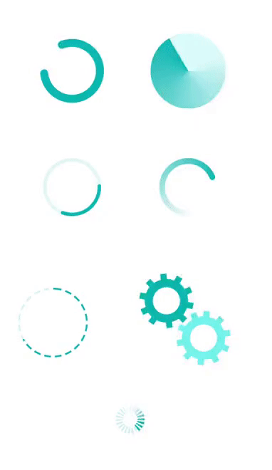
Various styles in indeterminate-type circular progress bars
An indeterminate style of progress bar is used when the progress of a task cannot be estimated or calculated. We’ll see how to design the following styles in an indeterminate progress bar by using the Flutter Radial Gauge:
- Basic indeterminate progress bar.
- Filled-track-style progress bar.
- Easing-style indeterminate progress bar.
- Easing with gradient style
- Gear-style progress bar.
- Segmented indeterminate progress bar.
For each of these designs we need to customize the radial axis and range pointer in the Radial Gauge, along with Tween animations.
Basic indeterminate progress bar

To design a basic indeterminate progress bar, we need to disable the labels, ticks, and axis line properties in the RadialAxis class and set the axis range values in the minimum and maximum properties as 0 and 360 respectively. We can also add a pointer to the progress bar by customizing the position and size of the range pointer.
Refer to the following code example.
SfRadialGauge(axes: <RadialAxis>[
  RadialAxis(
    minimum: 0,
    maximum: 360,
    showAxisLine: false,
    showLabels: false,
    showTicks: false,
    radiusFactor: 0.55,
    pointers: <GaugePointer>[
      RangePointer(
        value: 330,
        width: 0.25,
        cornerStyle: CornerStyle.bothCurve,
        sizeUnit: GaugeSizeUnit.factor,
      )
    ],
  )
To show indeterminate or continuous progress, we need to dynamically change the startAngle and endAngle properties of the radial axis by using the animation value. In all the indeterminate progress styles, we will use explicit Flutter animations with the help of the Animation, AnimationController, and CurvedAnimation properties as shown in the following code.
linearAnimationController = AnimationController(
    duration: const Duration(milliseconds: 1500),
    vsync: this);

linearAnimation =
    CurvedAnimation(parent: linearAnimationController, curve: Curves.linear)
      ..addListener(() {
        setState(() {
          animationValue = linearAnimation.value * 360;
        });
      });
linearAnimationController.repeat();
In the previous code, the linearAnimationController animation object generates a new value whenever the hardware is ready for a new frame. It linearly produces the values from 0.0 to 1.0 during a given time duration, and that value is multiplied by 360 on the setState() callback. The calculated animation value is set to the startAngle and endAngle properties of the radial axis to complete the 0 to 360 degree rotation on each forward direction. The animation is restarted by calling the repeat method of the controller when it completes.
Refer to the following code.
RadialAxis(
  ...
  startAngle: animationValue,
  endAngle: animationValue + 360,
  ...
)
Filled-track-style progress bar

To fill the track color, set the axis line thickness to 1, thicknessUnit to GaugeSizeUnit.factor , and the gradient color used for the axis line to fill the entire gauge radius. The start and end angle of the radial axis is dynamically changed by using the animation value as explained in the previous section to show the indeterminate progress style.
Refer to the following code.
RadialAxis(
  minimum: 0,
  maximum: 100,
  showLabels: false,
  showTicks: false,
  startAngle: animationValue,
  endAngle: animationValue + 359,
  showAxisLine: true,
  radiusFactor: 0.65,
  axisLineStyle: AxisLineStyle(
    thickness: 1,
    gradient: const SweepGradient(
        colors: <Color>[Color(0xFFd9f8fa), Color(0xFF00A8B5)],
        stops: <double>[0.25, 1.0]),
    thicknessUnit: GaugeSizeUnit.factor,
  ),
)
Easing-style indeterminate progress bar

To create this style of progress bar, add two radial axes with the help of axis line support and disable the other axis elements. The first axis is used as a track line and other axis is used as the progress line. The start and end angle of the secondary radial axis is changed using the animation value as shown in the following code.
axes: <RadialAxis>[
  RadialAxis(
    showLabels: false,
    showTicks: false,
    startAngle: 0,
    endAngle: 360,
    radiusFactor: 0.5,
    axisLineStyle: AxisLineStyle(
      thickness: 0.12,
      color: const Color.fromARGB(30, 0, 169, 181),
      thicknessUnit: GaugeSizeUnit.factor,
    ),
  ),
  RadialAxis(
    showLabels: false,
    showTicks: false,
    startAngle: animationValue,
    endAngle: animationValue + 120,
    radiusFactor: 0.5,
    axisLineStyle: AxisLineStyle(
      thickness: 0.12,
      cornerStyle: CornerStyle.bothCurve,
      color: const Color.fromARGB(255, 0, 169, 181),
      thicknessUnit: GaugeSizeUnit.factor,
    ),
  )
]
To add easing-in to the indicated progress, set the easing curve animation as shown in the following code. You can also choose other types of easing effects based on your application needs.
CurvedAnimation(parent: firstAnimationController, curve: Curves.easeIn)
  ..addListener(() {
    setState(() {
        animationValue = firstAnimation.value * 360;
    });
  })
Easing with gradient style

To apply a gradient to the progress bar, set the SweepGradient with its appropriate colors and offset values to the gradient property of the radial axis line and disable the other axis elements. The start and end angle of the radial axis is changed by the easing animation value as shown in the following code.
RadialAxis(
  showLabels: false,
  showTicks: false,
  startAngle: animationValue,
  endAngle: animationValue + 350,
  radiusFactor: 0.5,
  axisLineStyle: AxisLineStyle(
    thickness: 0.2,
    cornerStyle: CornerStyle.bothCurve,
    gradient: const SweepGradient(
        colors: <Color>[Color(0xFFFFFFFF), Color(0xFF00A8B5)],
        stops: <double>[0.25, 1.0]),
    thicknessUnit: GaugeSizeUnit.factor,
  ),
)
Gear-style progress bar

To create the gear-style progress bar, you need to use two radial axes and customize the axis line and major tick styles in both axes. Adjust the position of the radial axes in diagonal order by setting the required offset position value to the centerX and centerY properties. The first axis is rotated from 360 to 0, and the secondary axis is rotated from 0 to 360 by using the start and end angle of the radial axis with the animation value.
Refer to the following code.
axes: <RadialAxis>[
  RadialAxis(
    minimum: 0,
    interval: 1,
    maximum: 10,
    showLabels: false,
    showTicks: true,
    showAxisLine: true,
    showLastLabel: false,
    ticksPosition: ElementsPosition.outside,
    offsetUnit: GaugeSizeUnit.factor,
    minorTicksPerInterval: 0,
    startAngle: 360 - animationValue,
    endAngle: (360 - animationValue) + 360,
    centerX: 0.36,
    centerY: 0.36,
    isInversed: false,
    radiusFactor: 0.35,
    majorTickStyle: MajorTickStyle(
      length: 0.2,
      thickness: 8,
      color: const Color(0xFF00A8B5),
      lengthUnit: GaugeSizeUnit.factor,
    ),
    axisLineStyle: AxisLineStyle(
      thickness: 0.3,
      color: const Color(0xFF00A8B5),
      thicknessUnit: GaugeSizeUnit.factor,
    ),
  ),
  RadialAxis(
    ...
    centerX: 0.6,
    centerY: 0.6,
    startAngle: animationValue,
    endAngle: animationValue + 360,
    ...
  ),
]
Segmented indeterminate progress bar
The segmented circular progress bar style allows you to divide a progress bar into multiple segments to visualize the progress of multisequence tasks.

We can design the segmented indeterminate progress bar by customizing the radial axis and the range pointer. In addition, you need to add another radial axis over the first axis to create the segmented line in the progress bar. The segmented lines are generated by enabling the major ticks for the secondary radial axis with a certain interval and disabling the other axis elements. The range pointer value is dynamically updated by the animation value to show the indeterminate progress.
Refer to the following code example.
axes: <RadialAxis>[
  // Create primary radial axis
  RadialAxis(
    minimum: 0,
    interval: 1,
    maximum: 360,
    showLabels: false,
    showTicks: false,
    startAngle: 270,
    endAngle: 270,
    radiusFactor: 0.6,
    axisLineStyle: AxisLineStyle(
      thickness: 0.05,
      color: const Color.fromARGB(40, 0, 169, 181),
      thicknessUnit: GaugeSizeUnit.factor,
    ),
    pointers: <GaugePointer>[
      RangePointer(
        value: animationValue,
        width: 0.05,
        sizeUnit: GaugeSizeUnit.factor,
      )
    ],
  ),
  // Create secondary radial axis for segmented line
  RadialAxis(
    minimum: 0,
    interval: 1,
    maximum: 20,
    showLabels: false,
    showTicks: true,
    showAxisLine: false,
    tickOffset: -0.05,
    offsetUnit: GaugeSizeUnit.factor,
    minorTicksPerInterval: 0,
    startAngle: 270,
    endAngle: 270,
    radiusFactor: 0.6,
    majorTickStyle: MajorTickStyle(
        length: 0.1,
        thickness: 5,
        lengthUnit: GaugeSizeUnit.factor,
        color: Colors.white),
  )
]
GitHub reference : You can download the complete sample code of all the indeterminate circular progress bar types from this GitHub location. In that repo, we have added each progress bar as a separate widget. You can directly integrate the progress bar you need as a widget in your own application.
Conclusion
I hope you have enjoyed reading this blog. Now, you have a clear idea about how to create various styles for an indeterminate-type circular progress bar with the help of developer-friendly APIs in our Syncfusion Flutter Radial Gauge.
You can find the complete user guide here, and you can also check out our other samples in this GitHub location. Additionally, you can download and check out our demo app on Google Play, the App Store, and our website.
If you have any questions about this control, please let us know in the comments section below. You can also contact us through our support forums, Direct-Trac, or feedback portal. We are always happy to assist you!


Top comments (0)