
The Syncfusion Flutter Radial Gauge widget is a multi-purpose data visualization widget. It can be used to visualize different types of data and display the progress of various processes in circular format.
We have already published blogs on different use cases, such as the creation of a speedometer and temperature monitor, using the Flutter Radial Gauge. To continue these use-case series posts, we are now going to create different styles of animated circular progress indicators using the Syncfusion Flutter Radial Gauge.
The circular progress bar is used to visualize the progress of work or an operation such as a download, file transfer, or installation. It can be used for showing different progress states such as:
- Determinate
- Indeterminate
- Segmented progress
I’ve separated designing various styles for circular progress bars into a two part blog. In this first part, you will learn about building different styles of a determinate-type circular progress bar.

Let’s get started!
Configuring the Radial Gauge widget
Creating a Flutter project
First, we need to configure the Radial Gauge widget in our application. Follow the instructions provided in the Getting Started documentation to create a basic project in Flutter.
Add Radial Gauge dependency
Include the Syncfusion Flutter Radial Gauge package dependency in the pubspec.yaml file of your project.
syncfusion\_flutter\_gauges: ^18.2.44
Get packages
To get the package to the local disk, run the following command in the terminal window of your project.
| $ flutter pub get |
Import package
Import the Radial Gauge package in main.dart using the following code example.
import 'package:syncfusion\_flutter\_gauges/gauges.dart';
Add Radial Gauge widget
After importing the Radial Gauge package to the sample, initialize the Radial Gauge widget and add it to the widget tree as shown in the following code example.
@override
  Widget build(BuildContext context) {
    return Scaffold(
      body: Center(
        child: SfRadialGauge(),
      ),
    );
  }
Now, we have configured the Radial Gauge widget in our application. Let’s see the magical ways to create charming styles in it.
Various styles in determinate-type circular progress bar
A determinate-type progress bar is used when it is possible to estimate the completion percentage of a process. Let’s see how to design the following styles in a determinate progress bar by using the Flutter Radial Gauge:
- Normal progress bar
- Filled-track and filled-style progress bar
- Gradient progress bar with marker
- Semi-circular progress bar style
- Buffer progress bar
- Segmented circular progress bar
You need to use the radial axis, range pointer, and annotation features in the Radial Gauge to achieve all these determinate-type circular progress bar designs.
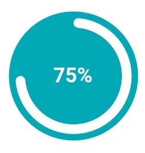
Normal progress bar style

To get the normal progress bar style, we need to disable the labels and ticks properties in the RadialAxis class and set the axis range values in the minimum and maximum properties based on your design needs.
To show 100 percent progress, you need to define the axis’s minimum value as 0 and maximum as 100. You can also show the progress line (track) of the progress bar by customizing the axisLineStyle , as shown in the following code example.
SfRadialGauge(axes: <RadialAxis>[
                      RadialAxis(
                        minimum: 0,
                        maximum: 100,
                        showLabels: false,
                        showTicks: false,
                        axisLineStyle: AxisLineStyle(
                          thickness: 0.2,
                          cornerStyle: CornerStyle.bothCurve,
                          color: Color.fromARGB(30, 0, 169, 181),
                          thicknessUnit: GaugeSizeUnit.factor,
                        ),
                      )
                    ]),

You can add a pointer to the progress bar by customizing the position and size of the RangePointer class. To show progress, the pointer Value should be updated with a delay action, such as a timer. Then, the pointer value will be dynamically updated by a timer for a specific duration of time. Refer to the following code example.
pointers: <GaugePointer>[
  RangePointer(
  value: progressValue,
  cornerStyle: CornerStyle.bothCurve,
  width: 0.2,
  sizeUnit: GaugeSizeUnit.factor,
   )
  ],

To add custom content to the center of the circular progress bar in order to indicate the completion of a progression or to convey the current status of it, you can use the annotations feature. To display the current updated progress value, set the pointer value to the annotation text.
annotations: <GaugeAnnotation>[
  GaugeAnnotation(
  positionFactor: 0.1,
  angle: 90,
  widget: Text(
  progressValue.toStringAsFixed(0) + ' / 100',
  style: TextStyle(fontSize: 11),
  ))
  ])

Filled-track and filled-style progress bar
To fill the track color, set the axis line thickness to 1, thicknessUnit to GaugeSizeUnit.factor, and the color of the axis line to fill the entire gauge radius. Add the range pointer with the offset position to show the progression.
adialAxis(
                        minimum: 0,
                        maximum: 100,
                        showLabels: false,
                        showTicks: false,
                        startAngle: 270,
                        endAngle: 270,
                        axisLineStyle: AxisLineStyle(
                          thickness: 1,
                          color: const Color.fromARGB(255, 0, 169, 181),
                          thicknessUnit: GaugeSizeUnit.factor,
                        ),
                        pointers: <GaugePointer>[
                          RangePointer(
                            value: progressValue,
                            width: 0.15
                            color: Colors.white,
                            pointerOffset: 0.1,
                            cornerStyle: CornerStyle.bothCurve,
                            sizeUnit: GaugeSizeUnit.factor,
                          )
                        ],
Add an annotation with the current progress value, as explained in the example of the previous code.
To fill the progress color, set the range pointer width to 0.95, sizeUnit to GaugeSizeUnit.factor, and the color of the pointer to fill the entire gauge radius. Add an axis line with appropriate thickness to show the track color.
RadialAxis(
                      minimum: 0,
                      maximum: 100,
                      showLabels: false,
                      showTicks: false,
                      startAngle: 270,
                      endAngle: 270,
                      axisLineStyle: AxisLineStyle(
                        thickness: 0.05,
                        color: const Color.fromARGB(100, 0, 169, 181),
                        thicknessUnit: GaugeSizeUnit.factor,
                      ),
                      pointers: <GaugePointer>[
                        RangePointer(
                          value: progressValue,
                          width: 0.95,
                          pointerOffset: 0.05,
                          sizeUnit: GaugeSizeUnit.factor,
                        )
                      ],
                    )

Gradient progress bar with marker style
To apply a gradient to the progress bar, set the SweepGradient with its appropriate colors and offset values to the gradient property of the range pointer. Also, add the MarkerPointer and the range pointer and use the same progress value to update both pointers, as shown in the following code example.
pointers: <GaugePointer>[
                        RangePointer(
                            value: progressValue,
                            width: 0.1,
                            sizeUnit: GaugeSizeUnit.factor,
                            cornerStyle: CornerStyle.startCurve,
                            gradient: const SweepGradient(colors: <Color>[
                              Color(0xFF00a9b5),
                              Color(0xFFa4edeb)
                            ], stops: <double>[
                              0.25,
                              0.75
                            ])),
                        MarkerPointer(
                          value: progressValue,
                          markerType: MarkerType.circle,
                          color: const Color(0xFF87e8e8),
                        )
                      ],

Semi-circular progress bar style
You can customize the startAngle and endAngle properties of the radial axis to design full and semi-circular progress bars. To make a semi-circle progress bar, set the startAngle value to 180 and endAngle value to 0, as shown in the following code example.
RadialAxis(
                      showLabels: false,
                      showTicks: false,
                      startAngle: 180,
                      endAngle: 0,
                      radiusFactor: 0.7,
                      canScaleToFit: true,
                      axisLineStyle: AxisLineStyle(
                        thickness: 0.1,
                        color: const Color.fromARGB(30, 0, 169, 181),
                        thicknessUnit: GaugeSizeUnit.factor,
                        cornerStyle: CornerStyle.startCurve,
                      ),
                      pointers: <GaugePointer>[
                        RangePointer(
                            value: progressValue,
                            width: 0.1,
                            sizeUnit: GaugeSizeUnit.factor,
                            cornerStyle: CornerStyle.bothCurve)
                      ],

Buffer-style progress bar
In this buffer-style progress bar, you can use a secondary progress indicator to denote the primary progression, which is dependent on the secondary progression. This style will allow you to visualize both primary and secondary progressions simultaneously. To add primary and secondary progress pointers, use two range pointers with different progress values.
pointers: <GaugePointer>[
                      RangePointer(
                          value: secondaryProgressValue,
                          width: 0.1,
                          sizeUnit: GaugeSizeUnit.factor,
                          color: const Color.fromARGB(120, 0, 169, 181),
                          cornerStyle: CornerStyle.bothCurve),
                      RangePointer(
                          value: progressValue,
                          width: 0.1,
                          sizeUnit: GaugeSizeUnit.factor,
                          cornerStyle: CornerStyle.bothCurve)
                    ],

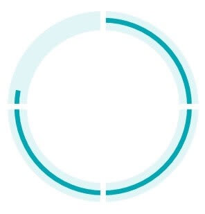
Segmented circular progress bar style
The segmented circular progress bar style allows you to divide a progress bar into multiple segments to visualize the progress of multi-sequence tasks.

Design the segmented progress bar by customizing the RadialAxis and the RangePointer. In addition, you need to add one more RadialAxis over the first axis to create the segmented line in the progress bar. The segmented lines are generated by enabling the major ticks for the secondary radial axis with a certain interval and disabling the other axis elements.
axes: <RadialAxis>[
                    // Create primary radial axis
                    RadialAxis(
                      minimum: 0,
                      maximum: 100,
                      showLabels: false,
                      showTicks: false,
                      startAngle: 270,
                      endAngle: 270,
                      radiusFactor: 0.7,
                      axisLineStyle: AxisLineStyle(
                        thickness: 0.2,
                        color: const Color.fromARGB(30, 0, 169, 181),
                        thicknessUnit: GaugeSizeUnit.factor,
                      ),
                      pointers: <GaugePointer>[
                        RangePointer(
                            value: progressValue,
                            width: 0.05,
                            pointerOffset: 0.07,
                            sizeUnit: GaugeSizeUnit.factor,
                            )
                      ],
                    ),
                    // Create secondary radial axis for segmented line
                    RadialAxis(
                      minimum: 0,
                      interval: 1,
                      maximum: 4,
                      showLabels: false,
                      showTicks: true,
                      showAxisLine: false,
                      tickOffset: -0.05,
                      offsetUnit: GaugeSizeUnit.factor,
                      minorTicksPerInterval: 0,
                      startAngle: 270,
                      endAngle: 270,
                      radiusFactor: 0.7,
                      majorTickStyle: MajorTickStyle(
                          length: 0.3,
                          thickness: 3,
                          lengthUnit: GaugeSizeUnit.factor,
                          color: Colors.white),
                    )
                  ]
Animate progression with real-time data
We have looked at applying different styles to the circular progress bar. Now, let’s see how to update real-time data in it.
In the real-time application, the progress value will be fetched from a service and updated in the pointer. This demo uses a timer to stimulate the progress updates with a duration of 100 milliseconds. The app state will be changed to rebuild the widgets.
The progressValue variable is used to set the pointer value and the annotation’s text value. In each timer tick, the progressValue variable is incremented by 1 in the setState callback, as shown in the following code. This is to update the pointer and annotation text values.
_timer = Timer.periodic(const Duration(milliseconds: 100),(_timer)
{
  setState(() {
    _progressValue++;
  });
});
In the RangePoiner, set the animationType property to linear and set the timer duration to the pointer’s animationDuration property to make the animated progression.
pointers: <GaugePointer>[
                        RangePointer(
                            value: _value1,
                            width: 0.05,
                            sizeUnit: GaugeSizeUnit.factor,
                            enableAnimation: true,
                            animationDuration: 100,
                            animationType: AnimationType.linear)
                      ],
GitHub reference: You can download the entire sample code of all the explained circular progress bar types from this GitHub location.
Conclusion
I hope you have enjoyed reading this blog and have a clear idea about how to create various styles for a determinate-type circular progress bar. In the upcoming part 2 blog, you can expect some more beautiful styles.
The Syncfusion Flutter Radial Gauge widget has been designed with flexible UI customization options to adapt to your app easily. It includes developer-friendly APIs to increase your productivity.
You can find the complete user guide here, and you can also check out our other samples in this GitHub location. Additionally, you can download and check out our demo app in Google Play, the App Store, and our website.
The Radial Gauge is also available for our Xamarin, UWP, WinForms, WPF, Blazor, ASP .NET (Core, MVC, Web Forms), JavaScript, Angular, React, and Vue platforms.
Check them out and create stunning circular progress bars!
If you have any questions about this control, please let us know in the comments section below. You can also contact us through our support forum, Direct-Trac, or feedback portal. We are always happy to assist you!


Top comments (0)