
Blazor TextBox is a component for editing, displaying, and adding plain text in forms to capture usernames, phone numbers, email addresses, and more. This component is an extended version of the HTML 5 TextBox (input type text) component with icons, floating labels, custom sizing, grouping, validation states, and more. This article explains how to perform customization in the Syncfusion Blazor TextBox. Here, you will learn how to easily create a new custom component using our Blazor TextBox with simple code examples.
What is a custom component?
Any component created by extending an existing component is a custom component. Using a custom component allows code reusability. Usually, a custom component is created to achieve a new level of functionality and reuse it across an application.
In a Blazor application, a Razor custom component is usually created in a shared or custom folder. Then, the custom component can be used just like other components in the HTML tag.
Prerequisites
Steps to create a custom component
1. Create a Blazor server application
First, create a Blazor server app and add the required packages by following the steps provided in the Getting Started with Syncfusion Blazor components documentation.
2. Create a custom component Razor page.
Then, create a Razor page under the Pages folder and name it CustomTextbox.razor.

3. Add TextBox and custom properties
Now, add the Blazor TextBox component in the Razor page. By default, the TextBox has the Value, ReadOnly, Placeholder, Width, and many other properties. In addition to these, we are going to add some more custom functionalities such as casing, special characters, spaces, and value types (alphanumeric, numeric, and alphabet only).
Refer to the following code example.
@using Syncfusion.Blazor.DropDowns;
@using Syncfusion.Blazor.Inputs

<SfTextBox @ref="Textbox" ID="@Id" Value="@CustomValue" Readonly="@PreventType" Placeholder="@Placeholder" Width="@Width"></SfTextBox>

@code {

    public SfTextBox Textbox { get; set; }

    [Parameter]
    public CaseType TextCase { get; set; } = CaseType.Normal;

    [Parameter]
    public bool AllowSpaces { get; set; } = true;

    [Parameter]
    public bool AllowSpecialCharacters { get; set; } = true;

    [Parameter]
    public bool PreventType { get; set; }

    [Parameter]
    public CharacterType ValueType { get; set; } = CharacterType.AlphaNumeric;

    [Parameter]
    public string Id { get; set; }

    [Parameter]
    public string CustomValue { get; set; }

    [Parameter]
    public string Placeholder { get; set; }

    [Parameter]
    public string Width { get; set; }

    public enum CaseType
    {
        UpperCase,
        LowerCase,
        Normal
    }

    public enum CharacterType
    {
        AlphaNumeric,
        Numeric,
        Alpha
    }
}
4. Add event handlers
Now, bind the TextBox events to the new custom component, create variables with EventCallback types, and assign them to the event properties (such as CreatedEvent).
<SfTextBox @ref="Textbox" ID="@Id" Value="@CustomValue" Readonly="@PreventType" Placeholder="@Placeholder" Width="@Width" Created="CreatedEvent" ></SfTextBox>

@code {

    [Parameter]
    public EventCallback CreatedEvent { get; set; }
}
5. Add the custom component in the Razor page
Now, include the custom TextBox component in the Index.razor page with custom properties. Refer to the following code example.
<CustomTextbox @ref="TextboxInstance" Id="textbox"
    TextCase="CustomTextbox.CaseType.UpperCase" PreventType="false" AllowSpaces="false" AllowSpecialCharacters="false" ValueType="CustomTextbox.CharacterType.AlphaNumeric" Placeholder="Enter a value" CreatedEvent="OnCreated" Width="200px"></CustomTextbox></div>
6. Use JSInterop call for script processing
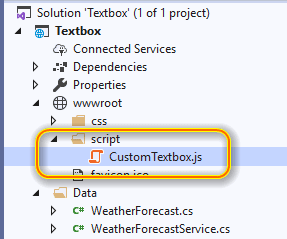
We validate the text using JavaScript, so invoke the JavaScript using JSInterop. First, add the JavaScript file CustomTextbox.js in the script folder and add a reference to it in the _Host.cshtm file.
[_Host.cshtm]

<head>
    <link href="_content/Syncfusion.Blazor/styles/bootstrap4.css" rel="stylesheet" />
    <script src="~/script/CustomTextbox.js"></script>
</head>
This script code handles the key down event and validates the text on typing.
var textBoxInstance;
window.validateTextBox = function (elementRef) {
    var element = document.getElementById(elementRef.id);
    textBoxInstance = elementRef;
    element.addEventListener('keydown', function (e) {
        if ((e.keyCode === 8 || e.keyCode === 46 || (e.keyCode >= 37 && e.keyCode <= 40))) {
            return
        }
        if (textBoxInstance.textCase == 0) {
            if (!/[A-Z]/.test(e.key)) {
                e.preventDefault()
                return false
            }
        }
        if (textBoxInstance.textCase == 1) {
            if (!/[a-z]/.test(e.key)) {
                e.preventDefault()
                return false
            }
        }
        if (!textBoxInstance.allowSpaces) {
            if (e.keyCode == 32) {
                e.preventDefault()
                return false
            }
        }
        if (!textBoxInstance.allowSpecialCharacters) {
            if (!/[a-z]|[A-Z]|[0-9]/.test(e.key)) {
                e.preventDefault()
                return false
            }
        }
        if (textBoxInstance.valueType == 1) {
            if (!/[0-9]/.test(e.key)) {
                e.preventDefault()
                return false
            }
        }
        if (textBoxInstance.valueType == 2) {
            if (!/[a-z]|[A-Z]/.test(e.key)) {
                e.preventDefault()
                return false
            }
        }
    }, false);
}
After executing the previous code examples, we’ll get output like the following screenshot.

Resource
For more information, refer to this Blazor TextBox Customization project.
Conclusion
I hope you now have a clear idea of how to create a custom component to completely customize the Blazor TextBox component. I encourage you to also explore the live demo of our Blazor TextBox.
Try our Blazor components by downloading a free 30-day trial or by downloading our NuGet package. Feel free to have a look at our online examples and documentation to explore other available features.
If you have any questions, please let us know in the comments section below. You can also contact us through our support forums or Direct-Trac. We are always happy to assist you!


Top comments (0)