Syncfusion Essential JS 2 provides a multiselect component that supports all functionality out of the box to create a Facebook-like multiselect component. This UI enhances the user experience of finding, selecting, and removing items in an interactive way, a way that is preferred in almost all apps nowadays. The Essential JS 2 multiselect component is an extended version of HTML select with selection mode, checkboxes, sorting, grouping, templates, custom values, etc.
In this blog, you are going to learn how to get started with multiselect component and explore its most important features.
Get started with multiselect component
The multiselect component can be configured by following these steps in TypeScript:
1.Clone the Essential JS 2 quickstart seed repository and configure the drop-down package in the system.config.js file.
"@syncfusion/ej2-dropdowns": "syncfusion:ej2-dropdowns/dist/ej2-dropdowns.umd.min.js"
2.Install the NPM packages using the following command.
$ npm install
3.Add the HTML input element that needs to be initialized as a component in index.html file.
<body>
   <div id='container' style="margin:0 auto; width:250px;">
      <input type="text" id='multi-select' />
   </div>
</body>
4.Initialize the component in the app.ts file as shown in the following.
import { MultiSelect } from '@syncfusion/ej2-dropdowns';

// initialize MultiSelect component
let msObject: MultiSelect = new MultiSelect();

// render initialized MultiSelect
msObject.appendTo('#multi-select');
Populate data
Multiselect is a data-bound component and can be bound to data from arrays of primitive data, JSON data collections, or remote data sources such as OData, OData V4, URL, and Web API to display data. You can map the data source in the form of DataManager or collection type directly.
To bind remote services, create the DataManager with a service URL and bind it to the component as shown in the following.
import { MultiSelect } from '@syncfusion/ej2-dropdowns';
import { Query, DataManager, ODataAdaptor } from '@syncfusion/ej2-data';

let listObj: MultiSelect = new MultiSelect({
    dataSource: new DataManager({
        url: 'https://js.syncfusion.com/demos/ejServices/Wcf/Northwind.svc/Customers',
        adaptor: new ODataAdaptor,
        crossDomain: true
    }),
    query: new Query().select(['ContactName', 'CustomerID']).take(25),
    fields: { text: 'ContactName', value: 'CustomerID' }
});
listObj.appendTo('#multi-select');

Configuring selection mode
The selected items can be visualized in a text box with different modes:
- Default
- Box (chip)
- Delimiter
- Checkbox
Box (chip)
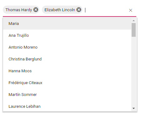
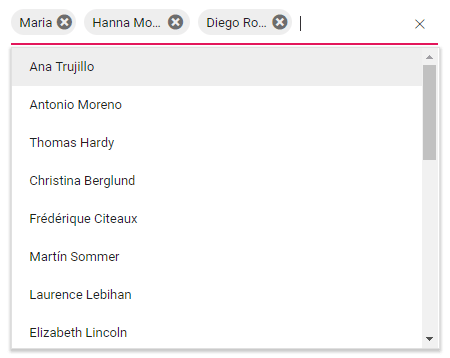
The selected items are displayed with box (chip) and associated with a close icon. Users can remove each box (chip) with the close button, and can navigate through boxes (chips) using arrow keys. To enable this multiselection mode, set the mode property to Box. How to customize the appearance of a box is described in this documentation section.
let msObj: MultiSelect = new MultiSelect({

    // --- Initialize component with data source, query, and fields

    mode:"Box"
});
Delimiter
When selecting multiple items, the selected items can be divided with the desired character as a delimiter. By default, the delimiter character is set to comma. The delimiter character is customizable using the delimiterChar property. To enable this multiselection mode, set the mode property to Delimiter.
let msObj: MultiSelect = new MultiSelect({

    // --- Initialize component with data source, query, and fields

    mode:" Delimiter"
});

Default
When the component gets focus, the selected items are displayed with Box (chip) mode. Once the component gets focus-out, the selected items are changed with the delimiter.
Component gets focus:
Component gets focus-out:

Check box
The multiselect component allows you to select multiple items using checkboxes. The list of items populates with checkboxes when this mode is enabled. To enable this multiselection mode, set the mode property to CheckBox.
Note: Import the CheckBox module from the ej2-buttons package and CheckBoxSelection from the ej2-dropdowns package to enable this option in multiselect component.
import { MultiSelect,CheckBoxSelection } from '@syncfusion/ej2-dropdowns';
import { CheckBox, ChangeEventArgs } from '@syncfusion/ej2-buttons';
import { Query, DataManager, ODataAdaptor } from '@syncfusion/ej2-data';

MultiSelect.Inject(CheckBoxSelection);

let listObj: MultiSelect = new MultiSelect({
    dataSource: new DataManager({
        url: 'https://js.syncfusion.com/demos/ejServices/Wcf/Northwind.svc/Customers',
        adaptor: new ODataAdaptor,
        crossDomain: true
    }),
    query: new Query().select(['ContactName', 'CustomerID']).take(25),
    fields: { text: 'ContactName', value: 'CustomerID' },
    mode:"CheckBox"
});
listObj.appendTo('#multi-select');

Adding a custom value (tagging)
The user can dynamically add new items with an existing data source. The items don’t have to match exactly with existing pop-up list items. The added new items append at the end of the list. To add a custom value to the existing collection of data, enter the custom value and press the Enter key.
let msObj: MultiSelect = new MultiSelect({

    // --- Initialize component with data source, query, and fields

    allowCustomValue: true
});

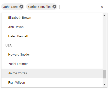
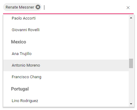
Grouping the collection
We can arrange logically related items as groups in a pop-up list. The group’s header is displayed both inline and statically above groups of items. To enable the grouping feature, map the groupBy field on data binding.
import { MultiSelect } from '@syncfusion/ej2-dropdowns';
import { Query, DataManager, ODataAdaptor } from '@syncfusion/ej2-data';

let listObj: MultiSelect = new MultiSelect({
    dataSource: new DataManager({
        url: 'https://js.syncfusion.com/demos/ejServices/Wcf/Northwind.svc/Customers',
        adaptor: new ODataAdaptor,
        crossDomain: true
    }),
    query: new Query().select(['ContactName', 'CustomerID', 'Coun-try']).take(50),
    fields: { text: 'ContactName', value: 'CustomerID', groupBy: 'Country' },
    mode:"Box"
});
listObj.appendTo('#multi-select');
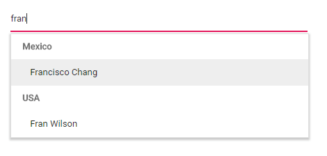
Filter configuration
Data items can be filtered and rebound to the multiselect component. The component provides a way to achieve this:
- The filtering is not enabled by default, so enable it by setting allowFiltering to true.
- Define the filtering event to filter the data based on parameters.
import { MultiSelect, FilteringEventArgs  } from '@syncfusion/ej2-dropdowns';
import { Query, DataManager, ODataAdaptor } from '@syncfusion/ej2-data';

let listObj: MultiSelect = new MultiSelect({
    dataSource: new DataManager({
        url: 'https://js.syncfusion.com/demos/ejServices/Wcf/Northwind.svc/Customers',
        adaptor: new ODataAdaptor,
        crossDomain: true
    }),
    query: new Query().select(['ContactName', 'CustomerID', 'Coun-try']).take(50),
    fields: { text: 'ContactName', value: 'CustomerID', groupBy: 'Country' },
    mode:"Box",
    allowFiltering: true,
    filtering: function (e: FilteringEventArgs) {

    }

});
listObj.appendTo('#multi-select');
Customization using template
This section explains customizing the default appearance of data items, selected values, group headers, headers, and footers.
Value template
The multiselect component provides the flexibility to customize the visualization of each selected item using a value template. The value template is applicable to customize box appearance.
let msObj: MultiSelect = new MultiSelect({

    // --- Initialize component with data source, query, and fields

    valueTemplate:"${ ContactName} - ${ Country}"
});

Item template
You can specify how every individual item is displayed in a pop-up.
let msObj: MultiSelect = new MultiSelect({

    // --- Initialize component with data source, query, and fields

itemTemplate: "${ ContactName} — ${ Country}", });

Header template
You can enable a header section for multiselect’s pop-up, which displays at the top of a pop-up. The headerTemplate property is used to provide header content that accepts both string and HTML content.
let msObj: MultiSelect = new MultiSelect({

    // --- Initialize component with data source, query, and fields

    headerTemplate:"<span class="head"><span class="name">Name</span><span class="city">City</span></span>"

});

Footer template
You can include a footer section, which displays at the bottom of multiselect’s pop-up. The footerTemplate property is used to provide footer content that accepts both string and HTML content.
let msObj: MultiSelect = new MultiSelect({

    // --- Initialize component with data source, query, and fields

    footerTemplate:"<span class="foot"> Total list items: 50 </span>"

});

No records template
When the data source that binds to multiselect component has empty records or no matches found on filtering results, the no records template is displayed in multiselect component. Use the noRecordsTemplate property to define a custom appearance for the no records pop-up.
let msObj: MultiSelect = new MultiSelect({

    // --- Initialize component with data source, query, and fields

    noRecordsTemplate: "<span class="norecord"> NO DATA AVAILABLE </span>"

});

Action failure template
When you bind multiselect component with remote data and the data fetch actions fail, the action failure template is displayed in a pop-up.
let msObj: MultiSelect = new MultiSelect({

    // --- Initialize component with data source, query, and fields

    actionFailureTemplate:" <span class="action-failure">Data fetch get fails </span>"

});

Group template
When the list items are grouped with logical order, a group header is displayed above each group. A group’s header content can be customized using the groupTemplate property.
let msObj: MultiSelect = new MultiSelect({

    // --- Initialize component with data source, query, and fields

    groupTemplate:"${City}"

});
Customize box (chip) appearance
By default, the chips have styles based on the current applied theme. But you can customize the chip appearance by adding your own CSS classes using the tagging events of multiselect component. Import TaggingEventArgs from the ej2-dropdowns package to configure the tagging event.
let msObj: MultiSelect = new MultiSelect({

    // --- Initialize component with data source, query, and fields

    tagging: (e: TaggingEventArgs) => {

        // Customize code here

    }

});
Conclusion
You have learned how to get started with multiselect component and other important features in this blog. You can learn about this control further in the following resources. Please try multiselect yourself and if you have any questions on using the component, or if you would like to provide feedback, please do so in the comments section.
GitHub source: https://github.com/syncfusion/ej2-javascript-ui-controls/tree/master/controls/dropdowns
Demos: https://ej2.syncfusion.com/demos/#/material/multiselect/default.html
User guide documentation: https://ej2.syncfusion.com/documentation/multi-select/?lang=typescript
The post Add A Multiselect Dropdown into Your JavaScript Application appeared first on Syncfusion Blogs.


Top comments (0)