
This is the last blog in our series on design tips. If you missed the previous blogs, you could check them out at these links:
- 7 Tips and Tricks to Improve Your Chart’s Readability
- 15 Tips and Tricks to Make Your Charts More Understandable
In this blog, we will share with you some useful tips to choosing the right colors for your chart to make it more aesthetic.
Colors are the most important factor in charts to make them more visually appealing. So, always choose a good set of eye-catching colors that will highlight your story for the user. The following tips in this blog post will convey various factors to take into consideration and common mistakes we often make while choosing the colors in a palette.
I have used the Syncfusion Flutter Charts widget to illustrate the tips in this post. But they are not limited to Flutter charts and are applicable to charts in any other platform as well.
Tip #1: Choose a color palette
You should choose a color palette based on the type of data you have. Color palettes can be commonly divided into three categories:
- Qualitative palette
- Sequential palette
- Diverging palette
Qualitative palette: This can be preferred when your data has different sets. For example, we can consider the case-multiple series, in which one series of data points does not rely on another series of data points. For this scenario, qualitative palettes are highly suitable.

The Flutter Charts palette colors can be changed by specifying values to the palette property. Refer to the following code example.
[Dart]
SfCartesianChart(
  palette: <Color>[Colors.grey, Colors.green]
  //...
)
Sequential palette: As the name implies, sequential palettes are meant to have sequential colors in the palette. The hue is the same, but the intensity and brightness of the color differs. For example, forming a color palette with light green, green, and dark green forms a sequential palette.
In a chart, this is suitable for a scenario in which the data points are in a sequence (months, years, days, etc.)
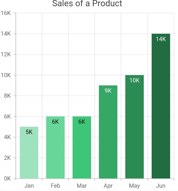
This can be achieved in Flutter Charts by using the pointColorMapper property in the series. Refer to the following code example.
[Dart]
SfCartesianChart(
  series: <ChartSeries<ChartData, double>>[
    ColumnSeries<ChartData, double>(
      dataSource: <ChartData>[
        ChartData('Jan', 5000, Color.fromRGBO(159, 227, 190, 1)),
        ChartData('Feb', 6000, Color.fromRGBO(104, 214, 153, 1)),
        //...
      ],
      pointColorMapper: (ChartData sales, _) => sales.color
    )
  ]
  //...
)
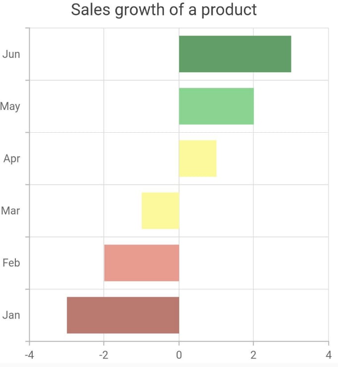
Diverging palette: This can be formed when the data is numerically comparative. Colors are formed for a set of numeric ranges. If a data point value falls in that range, that specific color will be applied to it. This forms the diverging palette.

This can be achieved in Flutter Charts. Refer to the following code example.
[Dart]
SfCartesianChart(
  series: <ChartSeries<ChartData, double>>[
    BarSeries<SalesData, String>(
      onCreateRenderer: () {
        return CustomBarSeriesRenderer();
      }
    )
  ]
)

class CustomBarSeriesRenderer extends BarSeriesRenderer {
  @override
  ChartSegment createSegment() {
    return CustomPainter();
  }
}

class CustomPainter extends BarSegment {
  @override
  Paint getFillPaint() {
    Paint _paint = Paint();
    if (series.dataSource[currentSegmentIndex].sales > 2)
      _paint.color = Color.fromRGBO(98, 158, 103, 1);
    //...
    _paint.style = PaintingStyle.fill;
    return _paint;
  }
}
There are a great number of sites available online for forming color palettes. You can use one of them for further study.
Also, refer to this link for more details. https://material.io/design/color/the-color-system.html
Tip #2: Use standard colors for standard elements
Always be sure that you apply meaningful colors for standard elements in a chart. For example, specifying red for positive values and green for negative values is not correct. Another good example is bear and bull fill color in financial charts (OHLC, candle, etc.).

Tip #3: Use contrast color for labels
If an element is placed over another element in a chart, then we should consider its color saturation and use a contrasting color. Otherwise, it will result in readability issues. Consider the following screenshot in which the text ‘David 30%’ is clearly visible in the right chart, but not in the left chart.

In our Flutter Charts, this works fine by default and no customization is required at the application level.
Refer to this link for more details about choosing colors. https://material.io/design/usability/accessibility.html#color-and-contrast
Tip #4: Minimize the usage of different colors
Try avoiding the use of many colors in a chart. Use the same colors for the same set of data, i.e. for all the data points in same series. Applying multiple colors for the same type of data unnecessarily might confuse the user.

Also, it is not correct if you apply the same color for all the series in a chart. Each series should be rendered with different colors, which will be helpful in differentiating the data points in both series.
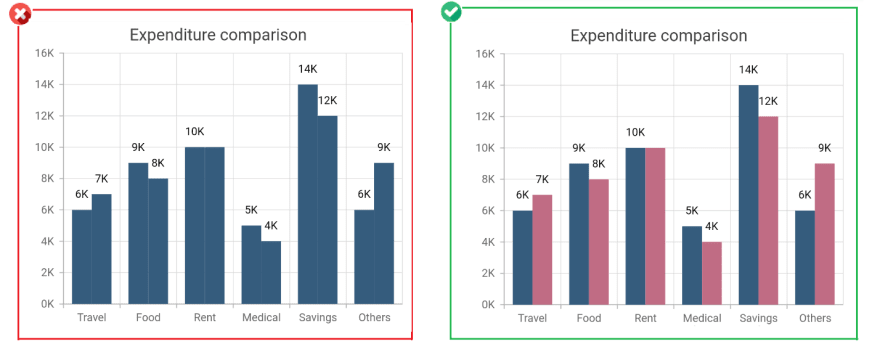
In our Flutter Charts, this also works fine by default and no customization is required at the application level.
Tip #5: Choose colors wisely
While deciding the colors in a color palette, choose colors with the same intensity. Some colors will stand out more than others and this may wrongly portray a normal data point as a special point.
In the following screenshot, in the left chart, the travel data point stands out among other data points, as its color intensity is different from the others. This may wrongly denote the travel data point as special data.

Tip #6: Maintain consistent color all over the app
Maintaining common color palette for all the elements in the app will bring rich appearance and will be more visually appealing. Applying different colors for different elements in an app will degrade the appearance and also raise difficulties in understanding.

In our Flutter Charts, common customizations can be applied to the charts wrapped inside the SfChartTheme widget. Refer to the following code example.
Widget build(BuildContext context) {
  return Scaffold(
    body: SfChartTheme(
      data: SfChartThemeData(
        backgroundColor: Colors.grey
      ),
      child: Column(
        children: <Widget>[
          SfCartesianChart(),
          SfCartesianChart()
        ]
      )
    )
  );
}
Tip #7: Apply meaningful colors
Rather than applying some random color palettes to a chart, apply meaningful colors if possible. For example, in the following screenshot, we have applied gold, silver, and bronze colors to portray medals. Another good example is choosing blue for representing Facebook and red for YouTube, colors that are recognizably part of their logos.

Tip #8: Design charts to support both light and dark themes
These days, most modern apps support both light and dark themes and some even inherit system themes, too. Keeping this in mind, we should design charts that look good in both themes by:
- Making a common design that looks good in both themes.
- Changing the design based on the theme chosen.

Our Flutter Charts will automatically change the color of various chart elements like title, axis title, axis labels, data label, grid lines, legend text, and tooltip, based on the app’s brightness property. Therefore, no separate customization is needed at the application level. Refer to the following code example to see how to change the app’s theme.
[Dart]
Widget build(BuildContext context){
  return MaterialApp(
    theme: ThemeData(
      brightness: Brightness.dark
    )
  );
}
Also see this KB article for more details regarding this.
Tip #9: Check that the colors are consistent in both themes
Based on the previous tip, if you are planning to keep a common design, irrespective of the theme, ensure that the specified colors are appropriate for both themes. For example, consider this screenshot, in which the specified series color is not properly visible in dark theme.
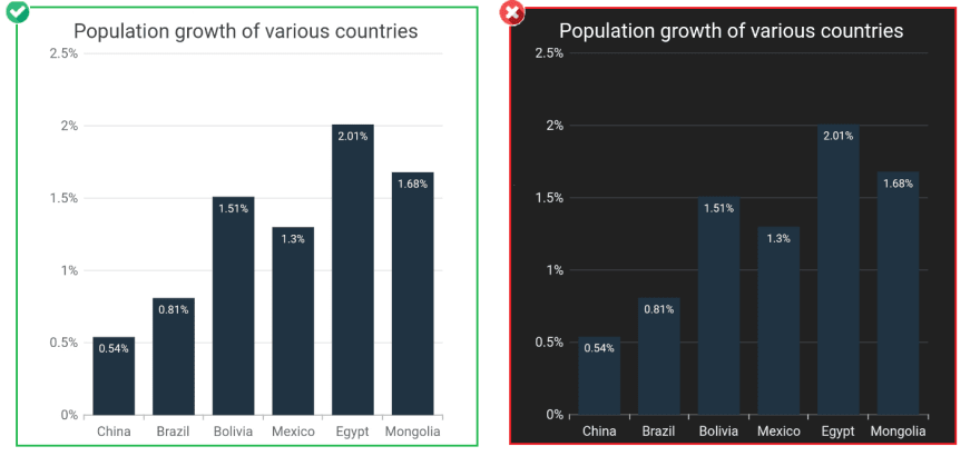
In the following screenshot, the specified single solid color works for both themes.

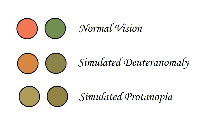
Tip #10: Remember color blindness
As we are speaking of choosing colors for a chart, we should also keep in mind the vision of people with color blindness. Some of them may confuse red and green colors and some others confuse blue and yellow. For this reason, instead of making a palette just by changing the hue value of a color, we can try changing the saturation and intensity.
Many tools are available online to check this for your color choices.
Tip #11: Make elements transparent in necessary places
In some scenarios, a series may overlap another series in a chart, which will hide the series placed behind it. To avoid this, specify the series colors with reduced opacity. For example, in the following screenshot, Product A’s 2004 y-value is not visible in the left chart, but it is clearly visible in the chart on the right side.

This can be achieved by specifying the RGBO value to the color property or by using the opacity property in the series. Refer to the following code example.
[Dart]
SfCartesianChart(
  series: <ChartSeries<ChartData, double>>[
    AreaSeries<ChartData, double>(
      color: const Color.fromRGBO((53, 92, 125, 0.6),
      // opacity: 0.6
    )
  ]
  //...
)
Tip #12: Use gradient colors
Gradient colors make charts more aesthetic when compared with solid colors. You can use gradient colors to enrich your chart’s appearance and to convey some additional information.
In the following screenshot, gradient color is applied by replacing the solid color just to elevate the appearance.

In the next screenshots, gradient color is applied to convey some additional information. This gradient conveys 0 to 60 is good by being green, 60 to 120 is okay by being yellow, and 120 to 180 is bad by being red.

Gradients can be applied to a series by specifying values to the gradient property. Refer to the following code example.
[Dart]
SfCartesianChart(
  series: <ChartSeries<ChartData, double>>[
    AreaSeries<ChartData, double>(
      gradient: const LinearGradient(colors: <Color>[
        Color.fromRGBO(136, 196, 130, 1),
        Color.fromRGBO(216, 222, 104, 1),
        Color.fromRGBO(237, 120, 100, 1)
      ],
      stops: <double>[0.0, 0.4, 0.8],
      begin: Alignment.bottomCenter,
      end: Alignment.topCenter
      )
    )
  ]
  //...
)
Conclusion
We hope that these tips will help you make your charts more visually appealing. Check out our Charts component for other platforms besides Flutter, including:
If you wish to send us feedback or would like to submit any questions, please feel free to post them in the comments section of this blog post. You can also contact us through our support forum, Direct-Trac, or feedback portal.
The post 12 Tips to Make Your Charts More Aesthetic appeared first on Syncfusion Blogs.


Top comments (0)