
I was wondering to add a sidebar to one of my project so first I searched if there are any already built components and I did't find any that I liked. So I decided to build one and after that I published it like a npm package in order other people to contribute and use it.
Here I will explain how to use it and I will be thankful if you give a star in github. There is a link to the repo at the bottom of the page.
Install
npm install --save react-sidebar-ui
Usage
import React from 'react'
import {Sidebar, InputItem, DropdownItem, Icon, Item, Logo, LogoText} from 'react-sidebar-ui'
import 'react-sidebar-ui/dist/index.css';
const App = () => {
return (
<div>
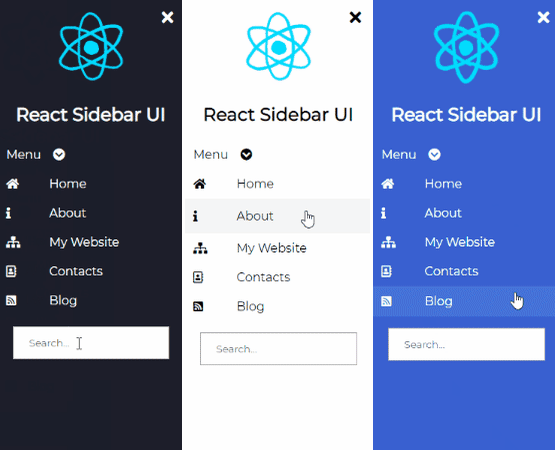
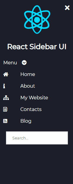
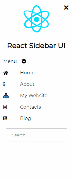
<Sidebar bgColor='black' isCollapsed={false}>
<Logo
image='https://media2.giphy.com/media/eNAsjO55tPbgaor7ma/source.gif'
imageName='react logo'/>
<LogoText>React Sidebar UI</LogoText>
<DropdownItem
values={['First', 'Second', 'Third']}
bgColor={'black'}>
Menu
</DropdownItem>
<Item bgColor='black'>
<Icon><i className="fas fa-home"/></Icon>
Home
</Item>
<Item bgColor='black'>
<Icon><i className="fas fa-info"/></Icon>
About
</Item>
<Item bgColor='black'>
<Icon><i className="fas fa-sitemap"/></Icon>
My Website
</Item>
<Item bgColor='black'>
<Icon><i className="far fa-address-book"/></Icon>
Contacts
</Item>
<Item bgColor='black'>
<Icon><i className="fas fa-rss-square"/></Icon>
Blog
</Item>
<InputItem type='text' placeholder={'Search...'}/>
</Sidebar>
</div>
)
};
You should import FontAwesome in order to use the icons.
Props
Common props you may want to specify include:
Sidebar
-
bgColor- change the color of the sidebar it can beblack,light,blue,purple,aqua,peach -
isCollapsed- add start position of the sidebar if it will be collapsed or not -
classes- add your custom classes if you want to add custom style to the component
DropdownItem
-
bgColor- change the color of the sidebar it can beblack,light,blue,purple,aqua,peach -
values- items that will be displayed -
classes- add your custom classes if you want to add custom style to the component
Item
-
bgColor- change the color of the sidebar it can beblack,light,blue,purple,aqua,peach -
classes- add your custom classes if you want to add custom style to the component
Logo
-
image- url to the image -
imageText- alt tag of the image -
classes- add your custom classes if you want to add custom style to the component
InputItem
-
type- type of the input field -
placeholder- placeholder of the input field -
classes- add your custom classes if you want to add custom style to the component
Contribute
Contributions are always welcome! Any moderation, feature/pull requests are welcome if you want to contribute!
 Svetloslav15
/
react-sidebar-ui
Svetloslav15
/
react-sidebar-ui
⚛️ The Sidebar Component for React.js
react-sidebar-ui
Sidebar component for React projects with customizable design


Install
npm install --save react-sidebar-uiUsage
import React from 'react'
import {Sidebar, InputItem, DropdownItem, Icon, Item, Logo, LogoText} from 'react-sidebar-ui'
import 'react-sidebar-ui/dist/index.css'
const App = () => {
return (
<div>
<Sidebar bgColor='black' isCollapsed={false}>
<Logo
image='https://media2.giphy.com/media/eNAsjO55tPbgaor7ma/source.gif'
imageName='react logo'/>
<LogoText>React Sidebar UI</LogoText>
<DropdownItem
values={['First', 'Second', 'Third']}
bgColor={'black'}>
Menu
</DropdownItem>
<Item bgColor='black'>
<Icon><i className="fas fa-home"/></Icon>
Home
</Item>
<Item bgColor…


Top comments (6)
Great job! I also suggest you to create a video which shows how to implement this component by creating a simple project and put it on YouTube, so that it will easy for beginners to implement in their projects.
can i make this as "sticky sidebar"?
Great Job!! I just wanted to ask a question. After implementing your code I cant find the button to close and open the side nav. If I change it from the code it works but when I start the website the side nav is either open or closed (Depending if isCollapsed is true or false). Should I import FontAwesome for it to work?
This helps a lot coz react dont have built in components for sidebar, either bootstrap.
Thanks a lot .
Hey Svet,
Nice job with the sidebar. Could you please share some more info how can i make it collapse?
Hi, Thanks, I am really happy to hear that. Well you just need to pass boolean to the property isCollapsed to the sidebar and it should work.