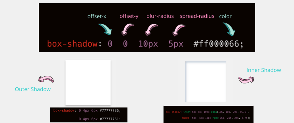
The CSS box-shadow property can be used to give block elements a drop shadow or an inner shadow. Let’s take a close look at this CSS property.
Examples
There will be few examples where we discuss on box shadow property.
1. Adding box shadow to a div.
<div class='one'>One</div>
// CSS
.one {
    /* offset-x | offset-y */
  box-shadow: 5px 5px;
}
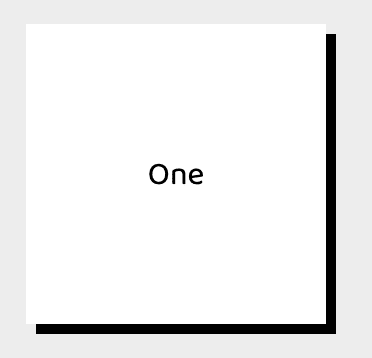
In the above snippet, You have not given any drop shadow color, then by default it will be black color.
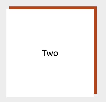
2. Adding colour to drop-shadow:
<div class='two'>Two</div>
// CSS
.two {
    /* offset-x | offset-y | color */
  box-shadow: 5px 5px red;
}
3. Adding blur-radius to the drop-shadow:
<div class='three'>Three</div>
// CSS
.three {
    /* offset-x | offset-y | blur-radius | color */
 box-shadow: 5px 5px 20px red;
}

4. Adding spread-radius to the drop shadow:
<div class='four'>Four</div>
// CSS
.four {
/* offset-x | offset-y | blur-radius | spread-raidus | color */
box-shadow: 0 0 10px 5px #ff000066;
}

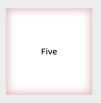
5. Adding inset to the div for drop shadow:
<div class='five'>Five</div>
// CSS
.five {
/* inset || offset-x | offset-y | blur-radius | spread-raidus | color */
  box-shadow: inset 0px 0px 13px 4px pink;
}
If you don’t explicitly state a color value for your box shadow — the shadow’s color will be equal to the color value of the HTML element the box-shadow property is being applied to. For instance, if you have a div that has the color of red, the box shadow’s color will also be red:
<div class='six'>Six</div>
// CSS
.six {
  color: blue;
  box-shadow: 0px 0px 3px 2px;
}

If you want a different shadow color, then you’ll need to specify it in the box-shadow property value declaration. Below you can see that even though the foreground color of the div is still red, the box shadow color is blue.
<div class='seven'>Seven</div>
// CSS
.seven {
  color: red;
  box-shadow: 0px 0px 3px 2px blue;
}

Multiple Box Shadows
This is where you can get really creative with this CSS property: You can apply more than one box shadow on an element.
box-shadow: [box shadow properties 1], [box shadow properties 2], [box shadow properties n];
In other words, you can have multiple box shadows by separating each property value group with commas (,).
In the below example, there are two box shadows.
<div class='eight'>Eight</div>
// CSS
.eight {
   box-shadow: 5px -7px 2px 2px blue, -5px 5px 5px 5px pink;
}

I hope you find the article helpful.
Let's try to solve below problem 😜
❓❓Create a circle inside circle using single div. ❓❓
Output:

You can find the solution here.
You can find all above examples here, added few more examples 😜
Thanks for reading this article ♥️
If you have any question please reach out to me on @suprabhasupi 😋
| 👩🏻💻 Suprabha.me |


Top comments (0)