
In this tutorial, you will know how to use WrapPixel’s Ample React Dashbard Lite Template for React which is a free template housing the necessary things needed for your personal or a commercial project.
Here’s how the entire tutorial is laid up for you in different sections:
- Template overview
- Download, install and setup
- Examining the project structure
- Deep dive into important files and dependencies
- A quick look at components
Ready to use the Ample React Dashboard Lite Template, let’s go!
Template Overview
The entire template is free to use. It’s great for you if you are just starting to look out for a suitable theme for your next project be it personal or a professional one. It is entirely modular so you can easily configure and change every content you desire.
Keeping in mind that most of the beginners will use it, there aren’t many technologies or frameworks used here. For starters, the template deals with React as its main library to build all the dashboard components and it is styled with Sass and CSS.
If you are one of those developers who fear of having a bad user interface in your applications, then fret not. The Ample template was built to be an elegant yet beautiful solution for stunning interfaces. Be to about the page layout, the choice of icons or even the fonts and colors. There is no need to think more about UI/UX choices for you. It’s all covered.
Now let’s take a quick look at what all you will get in this template:
- 1 basic dashboard
- 7 page templates
- 10 UI components
- Integrated plugin support
- 6 months of free updates
- A few ready-to-use widgets
- 100+ font icons
- Sass base CSS
- 1 or 2 chart options
- Reactstrap version 6.4.0
If you feel you have a project that needs more features and customisations than the Ample free version, then you can always opt for Ample React Dashboard premium version. It includes a truckload of features with advanced components, widgets, elements and tools.
Download, Install and Setup
Let’s start with the download and installation. For this, you need to have a WrapPixel account. Simply head over to the website and create one. After your account is created, follow these simple steps:
- Open the Ample Free React Dashboard Template page and click on the ‘Download’ button. It will take you to the comparison table between the free and the premium version. Choose the ‘free’ one. This will download a .zip file in your local directory.
- Extract the compressed file and you are now left with a folder named ‘ample-react-dashboard-lite’.
- Open your favourite code editor like VSCode and then either drag-and-drop the entire folder or go to ‘File > Open’ and locate the folder you just extracted. This will open the folder and its files inside your editor.
- Before we even start writing any code for customisation, let us take a look at what the default template looks like in the browser.
- Make sure you have NPM and Node.js installed. You can get it from here. Then open up your command prompt or a terminal window and from the root directory, run the following command:
npm i
This will install all the required dependencies and libraries or tooling required in order to run the template properly in your machine. When it’s finished you can then head on to run another command which will eventually start the React script to run the app:
npm start
Wait for a few seconds and it will open up the React development server in your browser at the address http://localhost:3000/.
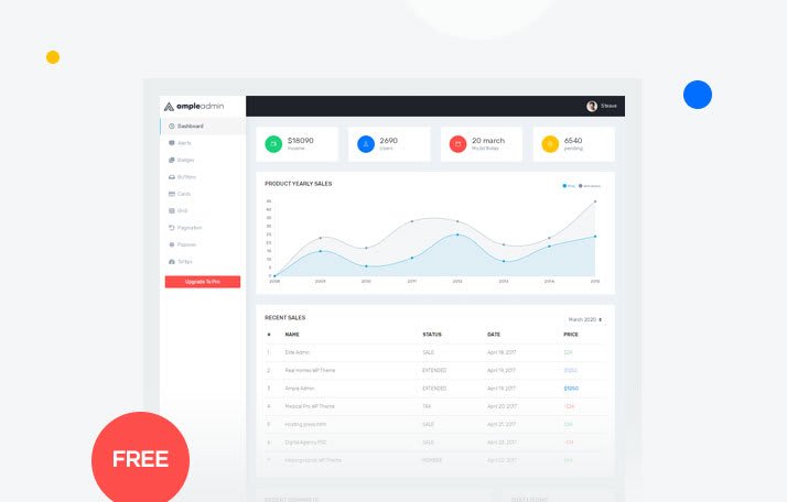
If you have successfully completed the steps above you will see something like this:
Congratulations! With just 5 easy steps you have setup the React template to work according to your needs.
Examining The Project Structure
Time to take a close look at how everything is setup inside this folder. If you see, the overall project structure looks like any other React application:
ample-react-dashboard-lite
│   package.json
│   package-lock.json
│
└───src
│   │   index.js
│   │   logo.svg
|   |   registerServiceWorker.js
│   │
│   └───assets
│       │   file1
│       │   file2
│       │   ...
│   └───components
│       │   file1
│       │   file2
│       │   ...
│   └───layouts
│       │   file1
│       │   file2
│       │   ...
│   └───routes
│       │   file1
│       │   file2
│       │   ...
│   └───views
│       │   file1
│       │   file2
│       │   ...
│
└───public
    │   index.html
    │   ...
Let’s see what each sub-folder means:
-
src: probably the most important of them all, the src folder, as the name suggests contains all the different assets, components, layouts, routes and views used in to make the entire template. It houses the .js, .jsx, .css, .scss and asset files like .png.
If you want to update contents, add new styling, change the fonts or icons, the you do all of that in this folder.
assets: you can see here you will get all the images and the Sass style files. Want to update the logo to match your brand or a product? Simply replace the logo-icon.png file with yours. Inside the scss sub-holder there are two files named style.css and style.scss. These two control the global styling of the entire application.
components: from the chart one to the footer or header, all of the components interface are coded here in JSX. Choose any of the sub-folders and then open the corresponding .jsx file to made any modifications on the component you need. The index.js file at the root of this directory simply exports all of the required components. If you are planning to add a new one done forget to add it to the list!
layouts: this contains the overall layout of the entire theme. You are free to change the layout setting from here.
routes: this folder is dedicated to house all the route paths when navigating between the application components. Each component has a
path,name,iconandcomponentproperties associated with it.views: it comes with all the UI components like a tooltip, badge, alert etc. and arranges then in a clean layout. The code is split between the starter and ui-components sub-folders.
Deep Dive Into Important Files and Dependencies
Onto the sweet stuff! Let’s see what some of the important files you will be using thoroughly while customising the template by yourself along with the dependencies used by default.
-
fulllayout.jsx: whenever you feel like changing the overall layout including the header, sidebar or to enable/disable dark layout, you can modify it all here in this file.
Let’s say you need to enable the sidebar on a certain viewport width. To achieve this all you need to do is modify the following code:
    useEffect(() => {
            const updateDimensions = () => {
                let element = document.getElementById('main-wrapper');
                setWidth(window.innerWidth)
                if (width < 1170) {
                    element.setAttribute("data-sidebartype", "mini-sidebar");
                    element.classList.add("mini-sidebar");
                } else {
                    element.setAttribute("data-sidebartype", "full");
                    element.classList.remove("mini-sidebar");
                }
            }
            if (document.readyState === "complete") {
                updateDimensions();
            }
            window.addEventListener("resize", updateDimensions.bind(this));
            window.addEventListener("load", updateDimensions.bind(this));
            return () => {
                window.removeEventListener("load", updateDimensions.bind(this));
                window.removeEventListener("resize", updateDimensions.bind(this));
            };
        }, [width]);
This essentially uses the useEffect() hook under-the-hood to call the updateDimensions function which in turn, enable or disable the sidebar as needed.
-
routing.jsx: this file is an object of
ThemeRoutesneeded to have al the specific routes in the entire application. It has everything you want from/dashboardto/ui-components/tooltip.If you want to add a new route to your liking, you need to provide it with a route
name, thecomponentto render at that route, theiconand the actualpathin the directory where it lives. Here’s a quick example:
   {
        path: "/slider",
        name: "Slider",
        icon: "fa fa-sliders",
        component: SliderComponent,
      },
-
starter.jsx: it houses most of the ReactStrap UI components ranging from
CardTexttoButtonalong with the dashboard components stored in the /components directory.If you need to apply a new UI component like Breadcrumb, you first need to import it:
`import { Breadcrumb, BreadcrumbItem } from 'reactstrap';`
Then, inside the `Starter` function, you can add it under the `<Row>` component:
    <Breadcrumb>
        <BreadcrumbItem active>Home</BreadcrumbItem>
    </Breadcrumb>
-
ProductYearlySales.jsx: this and mostly all other files under the /dashboard-components directory, can be customised with a common thing, i.e. by changing the data as needed.
Let’s say you want the labels of the chart to change which display the years as an array and they also come with the
datasetsobject. You can make a new one as:
    let lineData = {
      labels: ["2011", "2012", "2013", "2014", "2015"],
      datasets: [
        {
          label: "My Income",
          borderWidth: 1.2,
          backgroundColor: "rgba(44,171,227,.1)",
          borderColor: "rgb(44,171,227)",
          pointBorderColor: "rgb(44,171,227)",
          pointBackgroundColor: "rgb(44,171,227)",
          data: [0, 6, 11, 25, 24],
        },
      ],
    };
-
_theme-colors.scss: if you want to add a new theme to the dashboard say, a sepia theme, then this file is what you are looking for. It consists of all the themes colors defined first, then the logo background according to the theme and to the end, we have a sidebar background.
You will be mainly working on two CSS properties for this: the
backgroundandcolor.
Now let’s take a look at the different third-party dependencies used:
[bootstrap](https://www.npmjs.com/package/bootstrap)and[reactstrap](https://www.npmjs.com/package/reactstrap): these two get the UI components foundation done with all the different SCSS classes for styles and elements used likeCollapseorUncontrolledDropdown.[history](https://www.npmjs.com/package/history): this helps to manage the app sessions anywhere you run it. This is good to persist state when needed.[react-chartjs-2](https://www.npmjs.com/package/react-chartjs-2): it’s a React wrapper to the popular Chart.js library.[react-perfect-scrollbar](https://www.npmjs.com/package/react-perfect-scrollbar): this is a wrapper to allow use perfect-scrollbar in React.
A Quick Look at Components
All of the components used reside under the /components folder in this template. Broadly, they are categorised under 4 types:
dashboard-components: like chats, progress, comments etc.
footer: a simple website footer
header: a website header
sidebar: containing the sub-navigation elements
Now let’s see what do we get under the dashboard-components section:
- ChatListing.jsx: this is the list of different chats and it is situated on the homepage itself -
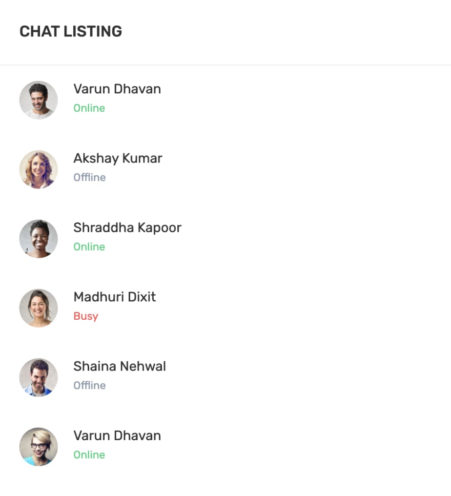
The entire interface is a child of the <Card /> component which comes from the ReactStrap library. Inside this you have the CardBody /> which houses all the necessary elements like an unordered list with links, image, name and status text. When you hover over any item on the list it will show up two icons of chat and phone. Here how it is laid in code:
    <li className="mb-3">
                <a href="/">
                  <div className="d-flex align-items-center">
                    <img src={img1} className="rounded-circle" alt="" width="40" />
                    <div className="ml-3">
                      <h5 className="mb-0 text-dark">Varun Dhavan</h5>
                      <small className="text-success">Online</small>
                    </div>
                    <div className="ml-auto chat-icon">
                      <button
                        type="button"
                        className="btn btn-success btn-circle btn-circle text-white"
                      >
                        <i className="fas fa-phone"></i>
                      </button>
                      <button
                        type="button"
                        className="btn btn-info btn-circle btn-circle ml-2"
                      >
                        <i className="far fa-comments"></i>
                      </button>
                    </div>
                  </div>
                </a>
              </li>
- ProductYearlySales.jsx: this is the forefront of the Ample template and shows you the actual interactive graph with customisable data points.
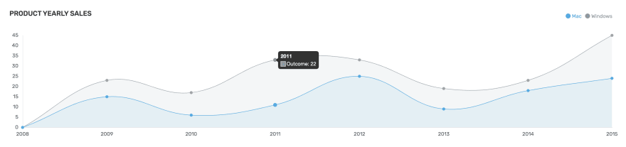
You first have to define the data as explained above and then pass on the data object as a data attribute prop of the <Line /> component used from the React Chart library. Along with that you can also pass several options to it like legend, scales etc:
    <Line
                      data={lineData}
                      options={{
                        maintainAspectRatio: false,
                        legend: {
                          display: false,
                          labels: { fontFamily: "Rubik" },
                        },
                        scales: {
                          yAxes: [
                            {
                              stacked: true,
                              gridLines: { display: false },
                              ticks: { fontFamily: "Rubik" },
                            },
                          ],
                          xAxes: [
                            {
                              gridLines: { display: false },
                              ticks: { fontFamily: "Rubik" },
                            },
                          ],
                        },
                      }}
                    />
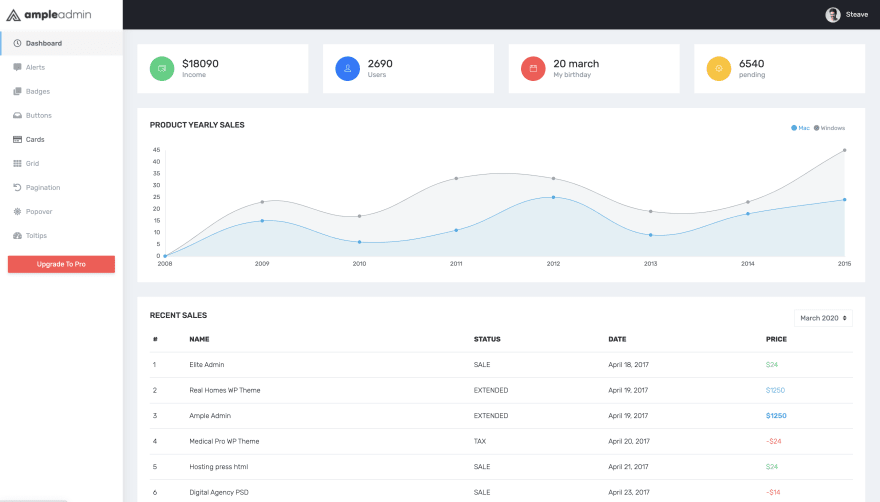
- ProgressCards.jsx: to the top of the homepage you get to see a quick glance of the progress of the logged in user, like a stats card.

These are 4 individual cards that shows the total income, number of users, birthday and the pending work to be done. Everything is contained in the <Row /> component of ReactStrap with <CardBody /> being its child. Inside this you get an icon, the text with a <h3> and <span> tags for each of them.
    <Col md={6} lg={3}>
            <Card>
              <CardBody>
                <div className="d-flex flex-row">
                  <div className="round align-self-center round-success">
                    <i className="ti-wallet"></i>
                  </div>
                  <div className="ml-3 align-self-center">
                    <h3 className="mb-0">$18090</h3>
                    <span className="text-muted">Income</span>
                  </div>
                </div>
              </CardBody>
            </Card>
          </Col>
- RecentComments.jsx: this components shows you a gist of all the different comments by multiple users in a platform.
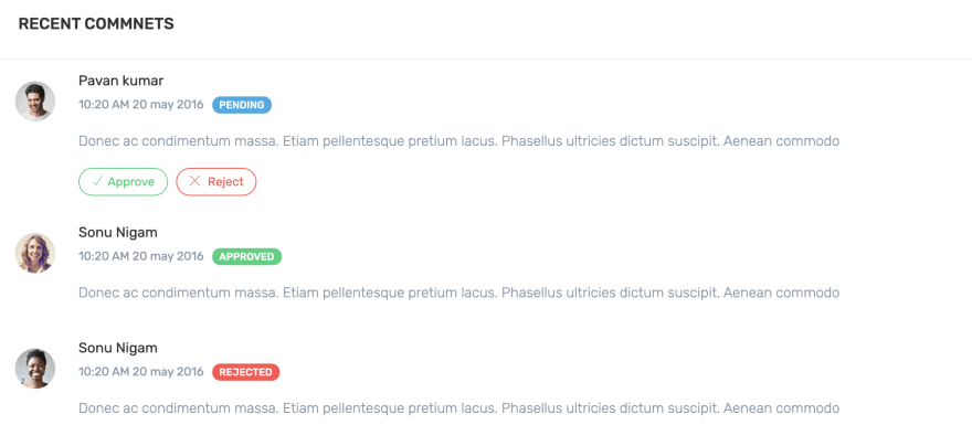
The good part is that we also get to approve or reject a comment right from the home layout. Not only that this template also comes with the status of approval next to the authors name. All in all, it uses the badge, badge-info, badge-rounded to make this happen.
    <div className="d-flex flex-row comment-row mt-0 mb-0">
                <div className="p-2">
                  <img
                    src={img1}
                    alt="user"
                    width="40"
                    className="rounded-circle"
                  />
                </div>
                <div className="comment-text w-100">
                  <h5 className="font-normal mb-1">Pavan kumar</h5>
                  <span className="text-muted mr-2 font-12">
                    10:20 AM 20 may 2016
                  </span>
                  <span className="badge badge-info badge-rounded text-uppercase font-medium">
                    Pending
                  </span>
                  <span className="mb-2 d-block font-14 text-muted font-light mt-3">
                    Donec ac condimentum massa. Etiam pellentesque pretium lacus.
                    Phasellus ultricies dictum suscipit. Aenean commodo
                  </span>
                  <div className="mt-3">
                    <a
                      href="javacript:void(0)"
                      className="btn btn btn-rounded btn-outline-success mr-2 btn-sm"
                    >
                      <i className="ti-check mr-1"></i>Approve
                    </a>
                    <a
                      href="javacript:void(0)"
                      className="btn-rounded btn btn-outline-danger btn-sm"
                    >
                      <i className="ti-close mr-1"></i> Reject
                    </a>
                  </div>
                </div>
              </div>
- RecentSales.jsx: this shows a tabular summary of the overall sale history from the username, to date of sale and the price.
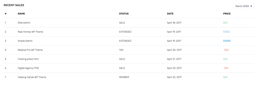
Everything comes under the Table /> ReactStrap component which defines the border type, the table headers <th> and its body <tbody>.
    <tbody>
                <tr>
                  <td>1</td>
                  <td>Elite Admin</td>
                  <td>
                    <span className="text-uppercase">Sale</span>
                  </td>
                  <td>April 18, 2017</td>
                  <td className="text-success">$24</td>
                </tr>
                <tr>
                  <td>2</td>
                  <td>Real Homes WP Theme</td>
                  <td>EXTENDED</td>
                  <td>April 19, 2017</td>
                  <td className="text-info">$1250</td>
                </tr>
                <tr>
                  <td>3</td>
                  <td>Ample Admin</td>
                  <td className="text-uppercase">EXTENDED</td>
                  <td>April 19, 2017</td>
                  <td className="text-info font-medium">$1250</td>
                </tr>
                <tr>
                  <td>4</td>
                  <td>Medical Pro WP Theme</td>
                  <td>TAX</td>
                  <td>April 20, 2017 </td>
                  <td className="text-danger">-$24</td>
                </tr>
                <tr>
                  <td>5</td>
                  <td>Hosting press html </td>
                  <td>SALE</td>
                  <td>April 21, 2017 </td>
                  <td className="text-success">$24</td>
                </tr>
                <tr>
                  <td>6</td>
                  <td>Digital Agency PSD</td>
                  <td>SALE</td>
                  <td>April 23, 2017</td>
                  <td className="text-danger">-$14</td>
                </tr>
                <tr>
                  <td>7</td>
                  <td>Helping Hands WP Theme</td>
                  <td>MEMBER</td>
                  <td>April 22, 2017</td>
                  <td className="text-success">$64</td>
                </tr>
              </tbody>
If you want to take your design skills to full extent, then you might need to make many changes with the overall layout of the template. For this, the best part would be to change all the layout settings provided in the fulllayout.jsx file which resides under the /src/layouts/ directory.
Here you can change the header, sidebar, and dark layout. For example, if you have made a completely new MyHeader.jsx component and now want to include it in the Ample template you have to follow these simple steps:
- Import the new header as:
import MyHeader from '../components/MyHeader.jsx';
- In the
return()statement of the file, add your new component before the<Sidebar />component:
    return (
            <div
                id="main-wrapper"
                data-theme="light"
                data-layout="vertical"
                data-sidebartype="full"
                data-sidebar-position="fixed"
                data-header-position="fixed"
                data-boxed-layout="full"
            >
                <MyHeader />
                ...
            </div>
        );
Sponsored:

And there you go! Now you know almost all of the features, customisation methods and a deep explanation of all the major files included in the Ample React Dashboard Lite there.
Try this free template and don't miss to also consider its Pro version which has a lot more to offer!


Latest comments (0)