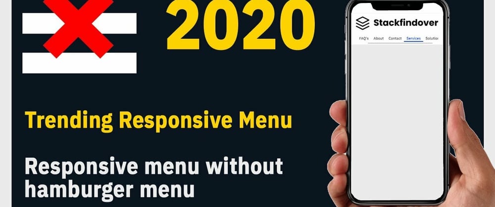
Hello guys today we will learn trending responsive menu 2020 HTML & CSS
Common query
- How to create a responsive navbar
- How to create a mobile menu
- Trending UI design for mobile menu
- Creative Mobile Menu Design 2021
Hello, guys In this tutorial we will try to solve above mention query. and also we will learn how to create a Unique mobile menu using HTML CSS & jQuery.
First, we need to create two files index.html and Style.css then we need to do code for it.
Unique Responsive Menu Design Step:1
Add below code inside index.html
<!DOCTYPE html>
<html>
<head>
  <title>Responsive Grid</title>
  <meta name="viewport" content="width=device-width, initial-scale=1.0">
  <link rel="stylesheet" type="text/css" href="style.css">
  <link href="https://fonts.googleapis.com/css2?family=IBM+Plex+Sans:wght@500&display=swap" rel="stylesheet">
</head>
<body>
  <header id="header">
    <div class="container">
      <div class="gridRow">
        <div class="branding">
          <div class="logo"><a href="#"><img src="logo.png" alt="logo"></a></div>
        </div>
        <nav class="navbar">
          <ul class="menu-list">
            <li class="menu-item"><a href="#">Home</a></li>
            <li class="menu-item"><a href="#">FAQ's</a></li>
            <li class="menu-item"><a href="#">About</a></li>
            <li class="menu-item"><a href="#">Contact</a></li>
            <li class="menu-item"><a href="#">Services</a></li>
            <li class="menu-item"><a href="#">Solutions</a></li>
          </ul>
        </nav>
      </div>
    </div>
  </header>
</body>
</html>
Unique Responsive Menu Design Step:2
Then we need to add code for style.css which code I provide in the below screen.
*{
  padding: 0;
  margin: 0;
  font-family: 'IBM Plex Sans', sans-serif;
  color: #333;
}
body {
    margin: 0;
    padding: 0;
    background: #ebebeb;
    width: 100%;
}
.container {
    width: 100%;
    max-width: 1160px;
    margin: auto;
}
.menu-list {
    list-style: none;
}
.menu-list > li {
    display: inline-block;
    padding: 0 10px;
}
.menu-list > li > a:hover {
    box-shadow: inset 0px -5px 0px #0037ff;
    color: #0037ff;
}
.menu-list > li > a {
    text-decoration: unset;
    font-size: 18px;
    line-height: 30px;
    padding: 5px 10px;
    transition: box-shadow 0.5s ease-in-out;
}
.gridRow {
    display: grid;
    grid-template-columns: 20% 80%;
    align-items: center;
    justify-content: center;
}
.logo img {
    width: 100%;
    max-width: 420px;
    display: block;
}
nav.navbar {
    text-align: end;
}
.branding {
    padding: 10px 0;
}

@media only screen and (max-width: 767px) and (min-width: 100px) {
    header#header {
        background: #fff;
    }
    .container {
        max-width: 90%;
        margin: auto;
    }
    .menu-list {
        display: flex;
        overflow: auto;
        padding: 10px 0;
    }
    header#header .gridRow {
        grid-template-columns: 100%;
    }
    .menu-list > li {
        padding: 0;
    }
    .menu-list > li > a {
        font-size: 15px;
    }
    .menu-list > li > a:hover {
        box-shadow: inset 0px -3px 0px #0037ff;
    }
}

@media only screen and (max-width: 1200px) and (min-width: 768px) {
    .container {
        max-width: 95%;
    }
     header#header .gridRow {
        grid-template-columns: 25% 75%;
    }
    .menu-list > li {
        padding: 0;
    }
    .menu-list > li > a {
        font-size: 18px;
    }
}
Unique Responsive Menu Design Video Output:
Unique Responsive Menu Design CodePen Output:


Top comments (1)
It is very confusing for the users to find there is menu items which will show after the scroll.