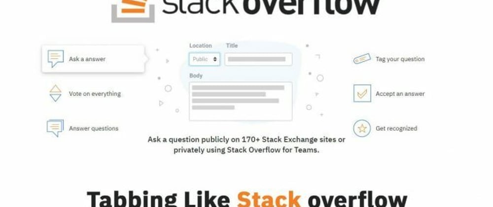
Hello guys in this tutorial we will create tabbing like Stackoverflow using Html CSS And jQuery
First we need to create two files index.html and style.css then we need to do code for it.
Step:1
Add below code inside index.html
<!DOCTYPE html>
<html lang="en">
  <head>
    <meta charset="UTF-8" />
    <title>Tour Tabbing</title>
    <meta name="viewport" content="width=device-width, initial-scale=1.0" />
    <meta http-equiv="X-UA-Compatible" content="ie=edge" />
    <link rel="stylesheet" href="style.css" />
    <link href="https://fonts.googleapis.com/css2?family=IBM+Plex+Sans:wght@400;500&family=IBM+Plex+Serif:wght@300;400&display=swap" rel="stylesheet">
    <script src="https://ajax.googleapis.com/ajax/libs/jquery/3.5.1/jquery.min.js"></script>
  </head>
  <body>
    <div class="tour-tabbing-outer">
      <div class="container">
        <header><img src="logo.png"></header>
        <div class="tour-tabbing">
          <div class="grid-col-3-6-3">
            <div class="col col-left">
              <ul class="flex-listing">
                <li data-tab="tab1" class="active">
                  <a href="#">
                    <img src="ask-a-question.svg"> Ask a question
                  </a>
                </li>
                 <li data-tab="tab2">
                  <a href="#">
                    <img src="votes.svg"> Vote on everything
                  </a>
                </li>
                 <li data-tab="tab3">
                  <a href="#">
                    <img src="answer.svg"> Answer questions
                  </a>
                </li>
              </ul>
            </div>
            <div class="col col-center">
              <div id="tab1" class="tab-content current">
                <img src="illo-feats-ask.svg">
                <h4>Ask a question publicly on 170+ Stack Exchange sites or privately using Stack Overflow for Teams.</h4>
              </div>

              <div id="tab2" class="tab-content">
                <img src="illo-feats-vote.svg">
                <h4>Upvoting helps exceptional content rise to the top and bring awareness to useful responses.</h4>
              </div>

              <div id="tab3" class="tab-content">
                <img src="illo-feats-answer.svg">
                <h4>Answer a question to share your knowledge with the world or in private with your team.</h4>
              </div>

              <div id="tab4" class="tab-content">
                <img src="illo-feats-tags.svg">
                <h4>Tags help make information searchable and find answers that are important to you.</h4>
              </div>

              <div id="tab5" class="tab-content">
                <img src="illo-feats-accept.svg">
                <h4>Accept the answer which solved your problem to let others benefit from the valuable information.</h4>
              </div>

              <div id="tab6" class="tab-content">
                <img src="illo-feats-recognize.svg">
                <h4>Our reputation system rewards both the new & experienced based on contribution and activity.</h4>
              </div>
            </div>
            <div class="col col-right">
              <ul class="flex-listing">
                <li data-tab="tab4">
                  <a href="#">
                    <img src="tags.svg"> Tag your question
                  </a>
                </li>
                 <li data-tab="tab5">
                  <a href="#">
                    <img src="accept.svg"> Accept an answer
                  </a>
                </li>
                 <li data-tab="tab6">
                  <a href="#">
                    <img src="get-recognized.svg"> Get recognized
                  </a>
                </li>
              </ul>
            </div>
          </div>
        </div>
      </div>
    </div>

    <script type="text/javascript">
      $('.flex-listing > li').click(function(){
        var tab_id = $(this).attr('data-tab');

        $('.flex-listing > li').removeClass('active');
        $('.tab-content').removeClass('current');

        $(this).addClass('active');
        $("#"+tab_id).addClass('current');
      });
    </script>
  </body>
</html>
Step:2
Then we need to add code for style.css which code i provide in below screen.
* {
    padding: 0;
    margin: 0;
    color: #242729;
    font-family: 'IBM Plex Sans', serif;
}
.container {
    width: 95%;
    max-width: 1060px;
    margin: auto;
}
header {
    margin-bottom: 20px;
    text-align: center;
}
header > img {
    max-width: 700px;
    margin: auto;
}
.tour-tabbing-outer {
    display: flex;
    align-items: center;
    justify-content: center;
    height: 100vh;
    background: #f1f2f3;
}
.grid-col-3-6-3 {
    display: grid;
    grid-template-columns: 25% 50% 25%;
    align-items: center;
    justify-content: center;
}
.flex-listing {
    list-style: none;
}
.flex-listing > li {
    margin: 20px 0;
    padding: 10px;
    border-radius: 5px;
    position: relative;
}
.flex-listing > li:hover, .flex-listing > li.active {
    background: #fff;
    box-shadow: 0 1px 4px rgba(0, 0, 0, .09),
                0 3px 8px rgba(0, 0, 0, .09),
                0 4px 13px rgba(0, 0, 0, .13);
}
.flex-listing > li > a {
    display: flex;
    align-items: center;
    text-decoration: unset;
}
.flex-listing > li > a > img {
    max-width: 50px;
    margin-right: 10px;
}
.col-left .flex-listing > li.active:after,
.col-right .flex-listing > li.active:after {
    content: '';
    position: absolute;
    top: 50%;
    right: -18px;
    width: 16px;
    height: 16px;
    background-color: #fff;
    border: 1px solid #d6d9dc;
    border-left: transparent;
    border-bottom: transparent;
    box-shadow: 2px -2px 8px rgba(59, 64, 69, .1);
    transform: translateY(-50%) translateX(-50%) rotate(45deg);
    transition: all 0.2s;
}
.col-right .flex-listing > li.active:after {
    right: unset;
    left: 0;
    border-left: 1px solid #d6d9dc;
    border-bottom: 1px solid #d6d9dc;
    border-right: transparent;
    border-top: transparent;
    box-shadow: -2px 2px 8px rgba(59, 64, 69, .1);
}
.tab-content h4 {
    font-weight: 500;
    font-size: 20px;
    text-align: center;
}
.tab-content {
    display: none;
}
.tab-content.current {
    display: block;
}
Output:
Free Tutorial With Source Code
Click on the above link to want to learn more


Top comments (3)
Nice post, three things would make it a little better though.
The link to the tutorial just takes you to the site homepage instead of the tutorial itself, it would be great if it went to the tutorial.
An inline fiddle to see the end result would have been great as playing with the end result is the most fun part.
Add 20 seconds of blank space to the end of your video if you have end cards, they stopped us seeing the best part which was seeing it in action.
Thanks for suggestion thanks for the suggestion. I will try to implement in it
Nice