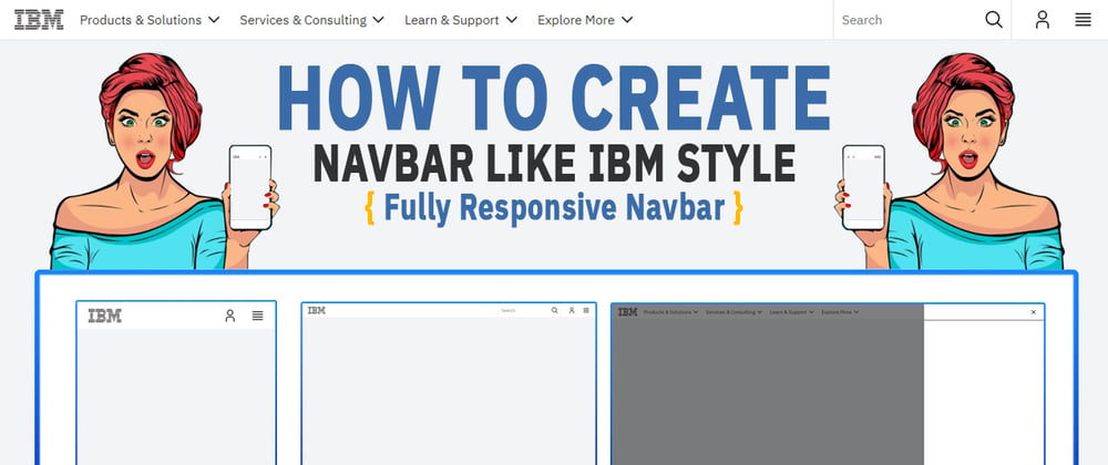
Hello, guys in this tutorial we will create a responsive top navigation menu using HTML CSS and jQuery.
Common Query
- How do you make a responsive navigation menu CSS
- How to create a CSS responsive navigation menu
- responsive navigation menu CSS free download
- navigation bar design code
Hello, guys In this tutorial we will try to solve above mention query. and also we will learn how to create a responsive top navigation menu using HTML CSS and jQuery.
First, we need to create three files index.html and style.css then we need to do code for it.
Navigation Menu Step:1
<!DOCTYPE html>
<html lang="en">
  <head>
    <meta charset="UTF-8" />
    <title>Navbar Like IBM Style</title>
    <meta name="viewport" content="width=device-width, initial-scale=1.0" />
    <meta http-equiv="X-UA-Compatible" content="ie=edge" />
    <link rel="stylesheet" href="style.css" />
    <link rel="preconnect" href="https://fonts.gstatic.com">
    <link href="https://fonts.googleapis.com/css2?family=IBM+Plex+Sans:wght@200;300;400&display=swap" rel="stylesheet">
    <script src="https://ajax.googleapis.com/ajax/libs/jquery/3.5.1/jquery.min.js"></script>
  </head>
  <body>
    <header id="ibm-header">
      <nav id="top-navbar">
        <div id="ibm-home">
          <a href="#"><img src="logo.png" alt="logo"></a>
        </div>
        <!-- menu -->
        <ul class="ibm-top-menu">
          <li class="menu-item">
            <a role="button">Products & Solutions</a>
          </li>
          <li class="menu-item">
            <a role="button">Services & Consulting</a>
          </li>
          <li class="menu-item">
            <a role="button">Learn & Support</a>
          </li>
          <li class="menu-item">
            <a role="button">Explore More</a>
          </li>
        </ul>
        <div class="ibm-top-menu-rightside">
          <div id="ibm-search-module">
            <form id="ibm-search-form">
              <input type="text" id="search" placeholder="Search">
              <button id="ibm-search-btn">Search</button>
            </form>
          </div>
          <ul id="ibm-user-burgger">
            <li class="menu-item">
              <a role="button"><img src="icons/user.svg" alt="user"></a>
            </li>
            <li class="menu-item">
              <a role="button" class="menu-toggle"><img src="icons/menu.svg" alt="menu"></a>
            </li>
          </ul>
        </div>
      </nav>
    </header>
    <div id="ibm-mobilemenu">
      <div class="ibm-mobilemenu-close">
        <button class="ibm-close-link">
          <img src="icons/close.svg" alt="closemenu">
        </button>
      </div>
      <div class="ibm-mobilemenu-section"></div>
    </div>
    <div id="ibm-mobilemenu-overlay"></div>
    <script>
      $(".menu-toggle").click(function(){
        $("#ibm-mobilemenu").addClass('ibm-mobilemenu-show');
        $("body").addClass('ibm-mobilemenu-overlay-show');
      });
      $(".ibm-mobilemenu-close").click(function(){
        $("#ibm-mobilemenu").removeClass('ibm-mobilemenu-show');
        $("body").removeClass('ibm-mobilemenu-overlay-show');
      })
    </script>
  </body>
</html>
Navigation Menu Step:2
* {
  padding: 0;
  margin: 0;
  -webkit-box-sizing: border-box;
  box-sizing: border-box;
  font-family: 'IBM Plex Sans', sans-serif;
}
* > img {
  display: block;
  width: 100%;
}
ul {
  padding: 0 0 15px;
  margin: 0;
  list-style: none;
  font-size: 1rem;
  line-height: 1.625rem;
}
nav#top-navbar {
  background: #fff;
  border-bottom: 1px solid #ececec;
  height: 50px;
  position: relative;
  z-index: 2;
}
div#ibm-home {
  float: left;
  margin-left: 20px;
  overflow: hidden;
  position: relative;
}
div#ibm-home > a {
  display: grid;
  height: 50px;
  width: 60px;
  place-items: center;
}
header#ibm-header a {
  position: relative;
}
header#ibm-header a:after {
  content: "";
  width: 100%;
  display: block;
  height: 4px;
  left: 0;
  position: absolute;
  background: #3b6caa;
  bottom: 0;
  transform: translate3d(0,4px,0);
  transition: transform 0.4s cubic-bezier(0.4,1,0.4,1);
}
ul.ibm-top-menu {
  float: left;
  margin-left: 20px;
  padding: 0;
  position: relative;
}
li.menu-item {
  display: block;
  float: left;
  padding: 0;
}
li.menu-item > a {
  padding-right: 22px;
  color: #323232;
  cursor: pointer;
  display: block;
  height: 50px;
  overflow: hidden;
  line-height: 50px;
  text-decoration: none;
}
header#ibm-header a:hover:after {
  transform: translate3d(0,0,0);
  -webkit-transform: translate3d(0,0,0);
  -moz-transform: translate3d(0,0,0);
  -ms-transform: translate3d(0,0,0);
  -o-transform: translate3d(0,0,0);
}
ul.ibm-top-menu li+li {
  margin: 0 0 0 25px;
  padding: 0;
}
ul.ibm-top-menu > li > a:before {
  content: "";
  background: url(icons/chevron--down.svg) no-repeat 100% 50% rgba(0,0,0,0);
  background-size: 22px;
  background-position: center;
  height: 50px;
  overflow: hidden;
  position: absolute;
  right: -4px;
  width: 22px;
  border: 0;
}
.ibm-top-menu-rightside {
  float: right;
  height: 50px;
  padding-right: 20px;
  position: relative;
}
input#search {
  border: none;
  border-radius: 0;
  border-left: 1px solid #e0e0e0;
  border-right: 1px solid #e0e0e0;
  color: #323232;
  height: 49px;
  line-height: 50px;
  font-size: 16px;
  outline: 0;
  padding-right: 43px;
  position: relative;
  text-indent: 10px;
  width: 220px;
  top: 0;
}
.menu-item img {
  max-width: 25px;
}
ul#ibm-user-burgger {
  display: inline-block;
  padding: 0;
  position: relative;
}
div#ibm-search-module {
  float: left;
  height: 50px;
  position: relative;
}
ul#ibm-user-burgger .menu-item > a {
  display: flex;
  padding: 0;
}
ul#ibm-user-burgger .menu-item {
  margin-left: 25px;
  position: relative;
}
button#ibm-search-btn {
  background: url(icons/search.svg) no-repeat 100% 50% rgba(0,0,0,0);
  background-size: 25px;
  background-position: center;
  cursor: pointer;
  height: 50px;
  overflow: hidden;
  position: absolute;
  right: 0;
  width: 43px;
  border: 0 none;
  text-indent: 99px;
}
div#ibm-mobilemenu {
  background: #fff;
  border-left: 1px solid #777677;
  height: 100%;
  overflow-y: auto;
  position: fixed;
  right: 0;
  top: 0;
  z-index: 905;
  width: 380px;
  transform: translate3d(100%, 0, 0);
  -webkit-transform: translate3d(100%, 0, 0);
  -moz-transform: translate3d(100%, 0, 0);
  -ms-transform: translate3d(100%, 0, 0);
  -o-transform: translate3d(100%, 0, 0);
  transition: all 0.5s cubic-bezier(0.2,1,0.2,1);
  -webkit-transition: all 0.5s cubic-bezier(0.2,1,0.2,1);
  -moz-transition: all 0.5s cubic-bezier(0.2,1,0.2,1);
  -ms-transition: all 0.5s cubic-bezier(0.2,1,0.2,1);
  -o-transition: all 0.5s cubic-bezier(0.2,1,0.2,1);
}
.ibm-mobilemenu-close {
  background: #fff;
  cursor: pointer;
  height: 50px;
  margin-right: 20px;
}
button.ibm-close-link {
  cursor: pointer;
  background: transparent;
  border: 0;
  outline: none;
}
.ibm-close-link > img {
  max-width: 25px;
}
.ibm-mobilemenu-close {
  background: #fff;
  cursor: pointer;
  height: 50px;
  margin-right: 20px;
  display: flex;
  align-items: center;
  justify-content: flex-end;
}
.ibm-mobilemenu-section {
  border-top: 2px solid #5a5a5a;
}
div#ibm-mobilemenu.ibm-mobilemenu-show {
  transform: translate3d(0,0,0);
  -webkit-transform: translate3d(0, 0, 0);
}
div#ibm-mobilemenu-overlay {
  background: rgba(0,0,0,0.5) 0 0;
  height: 100%;
  position: fixed;
  top: 0;
  left: 0;
  width: 100%;
  z-index: -1;
  will-change: transform;
  display: none;
}
body.ibm-mobilemenu-overlay-show div#ibm-mobilemenu-overlay {
  display: block;
  z-index: 900;
}
@media screen and (max-width:439px) and (min-width:200px) {
  ul.ibm-top-menu,
  div#ibm-search-module {
      display: none;
  }
  #ibm-mobilemenu {
    width: 250px;
  }
}
@media screen and (max-width:1139px) and (min-width:440px) {
  ul.ibm-top-menu {
      display: none;
  }
}
Navigation Menu Video Output:
Navigation Menu Codepen Output:


Oldest comments (0)