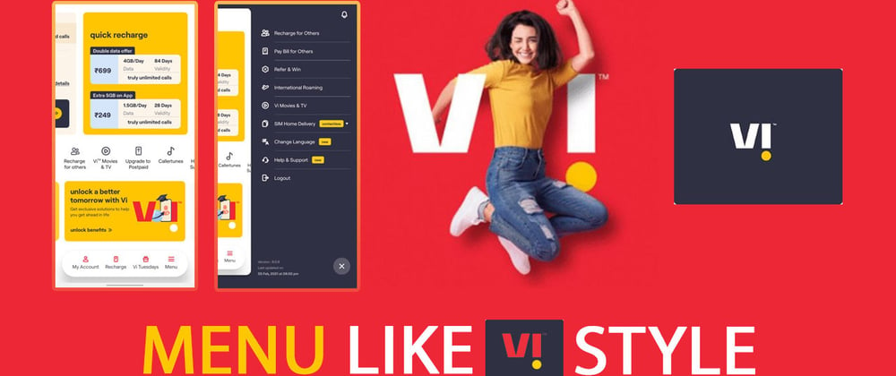
Hello, guys in this tutorial we will create a menu like VI App, Awesome Mobile Menu Design 2021
Common query
- How to create a mobile menu
- How to create a responsive navbar
- Trending UI design for mobile menu
- Creative Mobile Menu Design 2021
Hello, guys In this tutorial we will try to solve above mention query. and also we will learn how to create an awesome mobile menu using HTML CSS & jQuery.
First, we need to create three files index.html and style.css then we need to do code for it.
Step:1
Add below code inside index.html
<!DOCTYPE html>
<html lang="en">
  <head>
    <meta charset="UTF-8" />
    <title>Menu Link VI App</title>
    <meta name="viewport" content="width=device-width, initial-scale=1.0" />
    <meta http-equiv="X-UA-Compatible" content="ie=edge" />
    <link rel="stylesheet" href="style.css" />
    <link rel="stylesheet" href="https://cdnjs.cloudflare.com/ajax/libs/font-awesome/4.7.0/css/font-awesome.min.css">
    <link rel="preconnect" href="https://fonts.gstatic.com">
    <link href="https://fonts.googleapis.com/css2?family=Open+Sans:wght@300;400&display=swap" rel="stylesheet">
    <script src="https://cdnjs.cloudflare.com/ajax/libs/jquery/3.2.1/jquery.min.js"></script>
  </head>
  <body>
    <div class="mobile-style">
      <header id="header">
        <a href="#" class="logo"><img src="logo.svg" alt="logo"></a>
      </header>
      <div class="moobile_nav">
          <ul class="flex-ul listing menus">
            <li class="menu-list">
              <a href="#"><i class="fa fa-user" aria-hidden="true"></i>
                <small>My Account</small>
              </a>
            </li>
            <li class="menu-list">
              <a href="#"><i class="fa fa-bookmark" aria-hidden="true"></i>
                <small>Bookmark</small>
              </a>
            </li>
            <li class="menu-list">
              <a href="#"><i class="fa fa-shopping-basket" aria-hidden="true"></i>
                <small>Cart</small>
              </a>
            </li>
            <li class="menu-list">
              <a href="#" class="menu-toggle"><i class="fa fa-bars" aria-hidden="true"></i>
                <small>Menu</small>
              </a>
            </li>
          </ul>
      </div>
      <div class="mobile_menu">
        <ul class="slide-menu-items">
          <li class="menu-item">
            <a href="#">Home</i></a>
          </li>
          <li class="menu-item">
            <a href="#">FAQ's</i></a>
          </li>
          <li class="menu-item">
            <a href="#">About us</i></a>
          </li>
          <li class="menu-item">
            <a href="#">Services</i></a>
          </li>
          <li class="menu-item">
            <a href="#">Contact Us</i></a>
          </li>
        </ul>
        <span class="close">+</span>
      </div>
    </div>
    <script>
      jQuery( document ).ready(function() {
        jQuery(".menu-toggle").click(function(){
          jQuery(".mobile_menu").addClass("show");
        });
        jQuery(".close").click(function(){
          jQuery(".mobile_menu").removeClass("show");
        });
      });
    </script>
  </body>
</html>
Step:2
Then we need to add code for style.css which code I provide in the below screen.
* {
  padding: 0;
  margin: 0;
  outline: 0;
  font-family: 'Open Sans', sans-serif;
}
* > a {
  color: #ee2737;
}
body {
  background: #dedede;
  display: flex;
  align-items: center;
  justify-content: center;
  height: 100vh;
}
.mobile-style {
  width: 100%;
  height: calc(100% - 20vh);
  background: #fff;
  max-width: 320px;
  margin: auto;
  overflow: hidden;
  position: relative;
}
ul.flex-ul {
  display: flex;
  align-items: center;
  justify-content: space-around;
  height: 100%;
}
ul.listing {
  list-style: none;
}
.moobile_nav {
  height: 60px;
  width: 90%;
  max-width: 300px;
  margin: auto;
  background: #fff;
  border-radius: 50px;
  position: fixed;
  bottom: 14vh;
  left: 0;
  right: 0;
  box-shadow: 0px 5px 10px rgb(0 0 0 / 20%);
}
.menu-list > a {
  font-size: 20px;
  text-decoration: unset !important;
  text-align: center;
  display: flex;
  flex-direction: column;
}
.menu-list > a small {
  display: block;
  text-align: center;
  text-decoration: unset !important;
  font-size: 12px;
  color: #444;
}

.mobile_menu {
  background: #2f3043;
  position: absolute;
  top: 0;
  right: -300px;
  width: 260px;
  height: 100%;
  border-top-left-radius: 30px;
  border-bottom-left-radius: 30px;
  transition: all 0.5s linear;
  -webkit-transition: all 0.5s linear;
  -moz-transition: all 0.5s linear;
  -ms-transition: all 0.5s linear;
  -o-transition: all 0.5s linear;
}
span.close {
  width: 50px;
  height: 50px;
  background: #444;
  position: absolute;
  bottom: 20px;
  right: 20px;
  display: flex;
  align-items: center;
  justify-content: center;
  font-size: 35px;
  color: #fff;
  border-radius: 50%;
  cursor: pointer;
  transform: rotate(45deg);
  -webkit-transform: rotate(45deg);
  -moz-transform: rotate(45deg);
  -ms-transform: rotate(45deg);
  -o-transform: rotate(45deg);
}
.mobile_menu.show {
  right: 0;
}
a.logo {
  display: block;
  padding: 10px;
}
ul.slide-menu-items {
  list-style: none;
  padding: 30px;
  margin: 0;
}
ul.slide-menu-items a {
  text-decoration: unset;
  color: #fff;
  font-size: 15px;
  line-height: 25px;
}
ul.slide-menu-items > li {
  padding: 10px;
  border-bottom: 1px solid #949494;
}
A menu like VI App Output:
A Menu Like VI App CodePen Output:


Top comments (2)
It would be great If this menu has submenu items as well.
Hermoso 😍