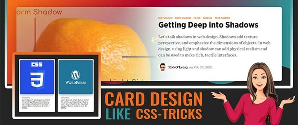
Hello, guys in this tutorial we will create an awesome card design like CSS tricks.
Common Query
- How to create CSS Card Design
- How to create awesome UI design
- How to create card Design like CSS tricks
- How to use grid CSS
Hello, guys In this tutorial we will try to solve above mention query. and also we will learn how to use grid CSS.
First, we need to create three files index.html and style.css then we need to do code for it.
Step:1
Add below code inside index.html
<!DOCTYPE html>
<html lang="en">
  <head>
    <meta charset="UTF-8" />
    <title>Card Design like css tricks</title>
    <meta name="viewport" content="width=device-width, initial-scale=1.0" />
    <meta http-equiv="X-UA-Compatible" content="ie=edge" />
    <link rel="stylesheet" href="style.css" />
    <link href="https://fonts.googleapis.com/css2?family=IBM+Plex+Sans:wght@500&display=swap" rel="stylesheet">
  </head>
  <body>
    <div class="container">
      <div class="cards card_outer">
        <div class="card">
          <div class="top image">
            <a href="#"><img src="01.jpg" alt="card"></a>
          </div>
          <div class="bottom content">
            <small>Sponsored</small>
            <p>Lorem Ipsum is simply dummy text of the printing and typesetting industry. Lorem Ipsum has been the industry's standard dummy text ever since the 1500s,</p>
          </div>
        </div>
        <div class="card">
          <div class="top image">
            <a href="#"><img src="02.jpg" alt="card"></a>
          </div>
          <div class="bottom content">
            <small>Sponsored</small>
            <p>Lorem Ipsum is simply dummy text of the printing and typesetting industry. Lorem Ipsum has been the industry's standard dummy text ever since the 1500s,</p>
          </div>
        </div>
        <div class="card">
          <div class="top image">
            <a href="#"><img src="03.jpg" alt="card"></a>
          </div>
          <div class="bottom content">
            <small>Sponsored</small>
            <p>Lorem Ipsum is simply dummy text of the printing and typesetting industry. Lorem Ipsum has been the industry's standard dummy text ever since the 1500s,</p>
          </div>
        </div>
        <div class="card">
          <div class="top image">
            <a href="#"><img src="04.jpg" alt="card"></a>
          </div>
          <div class="bottom content">
            <small>Sponsored</small>
            <p>Lorem Ipsum is simply dummy text of the printing and typesetting industry. Lorem Ipsum has been the industry's standard dummy text ever since the 1500s,</p>
          </div>
        </div>
      </div>
    </div>
  </body>
</html>
Step:2
Then we need to add code for style.css which code I provide in the below screen.
* {
  padding: 0;
  margin: 0;
  outline: 0;
  font-family: 'IBM Plex Sans', sans-serif;
}
body {
  display: flex;
  align-items: center;
  justify-content: center;
  height: 100vh;
  width: 100vw;
  background: #262626;
  overflow: hidden;
}
.container {
  width: 100%;
  max-width: 1140px;
  margin: auto;
}
.card_outer {
  display: grid;
  grid-template-columns: auto auto auto auto;
  grid-gap: 20px;
}
.card img {
  width: 100%;
  display: block;
  border-radius: 4px;
  box-shadow: 0 0 1.5rem rgb(17 17 17);
  transition: 0.15s;
  -webkit-transition: 0.15s;
  -moz-transition: 0.15s;
  -ms-transition: 0.15s;
  -o-transition: 0.15s;
}

.card {
  position: relative;
  padding: 0.5rem;
  border-radius: 8px;
  background: #fff;
}
.bottom.content {
  padding: 1rem;
}
.content p {
  font-size: 12px;
}
small {
  font-size: 10px;
  color: #264ee4;
  text-transform: uppercase;
}

.top > a:hover img {
  box-shadow: 0 0 50px rgb(17 17 17 / 50%);
  transform: rotate(-2deg) translateY(-5px) scale(1.035);
  -webkit-transform: rotate(-2deg) translateY(-5px) scale(1.035);
  -moz-transform: rotate(-2deg) translateY(-5px) scale(1.035);
  -ms-transform: rotate(-2deg) translateY(-5px) scale(1.035);
  -o-transform: rotate(-2deg) translateY(-5px) scale(1.035);
}
Card Design like CSS tricks Video Output:
Card Design like CSS tricks Codepen Output:


Top comments (1)
Using CSS grid and flexbox. Interesting.