
The accordion menu is used on websites to show important links with expanded information .It can be useful in many situations to add information to items in a list. So I am going to show you how to make an accordion menu with React.
here is an example of the finished product: 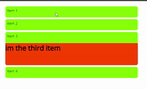
This project will use two custom react components that I will walk through the process of making and explain how they work. These two components will be called AccordionMenu and AccordionItem. They will mostly be styled components but they will also wrap a lot functionality and reusability around native JSX elements.
this is the code for the AccordionMenu component
import React, {useState, useEffect, useCallback} from 'react';

import "./Accordion.css";

const AccordionMenu = props => {
    const [children, setChildren] = useState([])
    const [openItem, setOpenItem] = useState()

    useEffect(() => {
        setChildren(() => props.children.length ? props.children : [props.children])
    }, [props.children])

    const clickHandler = useCallback(id => {
        setOpenItem(prev => {
            if(id === prev){
                return ""
            }else{
                return id
            }
        })
    }, [])

    return (
        <div className="accordion-menu">
            {children.map(elt => (
                <elt.type {...elt.props} open={elt.props.id === openItem} onClick={() => clickHandler(elt.props.id)}></elt.type>
            ))}
        </div>
    );
}

export default AccordionMenu;
The AccordionMenu component will have one or more children which are all should be AccordionItem's. The children of the AccordionMenu will receive some extra props from their parent. The two extra props are open which is pretty self explanatory, its a boolean telling if the item is open or not, and onClick which is a function that will be called whenever an item is pressed and toggle its open status. The openItem state in the AccordionMenu will keep track of which item is open and if none are open it will be null. Having an openItem in the parent and using that to tell each item whether its open or not is what will allow us to have only zero to one items open at a time
This is the code for the AccordionItem.
import React from "react";

const AccordionItem = props => {
    return (
        <div className="accordion-item">
            <div className="accordion-item--header" onClick={props.onClick}>
                {props.title}
            </div>
            <div className={`accordion-item--body ${props.open ? "open" : ""}`}>
                {props.children}
            </div>
        </div>
    );
};

export default AccordionItem;
The AccordionItem has a header and body. It takes in a title as prop and that title will be displayed in the header. All the children on the AccordionItem children will be rendered in the body. The header is what takes the onClick event from the AccordionMenu.
Now that we have the js code done all we need is the css to control the expanding of the items. I'll also add in some basic styles but I have intentionally made the styles simple so you can easily add your own styles and give it your own flare.
this code will go in Accordion.css
.accordion-menu {
    padding: 1rem;
    width: fit-content;
}

.accordion-item {
    height: fit-content;
    width: 600px;
    max-width: 600px;
    margin: 0.5rem;
    border-radius: 0.5rem;
    overflow: hidden;
}

.accordion-item--header {
    height: 50px;
    padding: 0.5rem;
    background: chartreuse;
}

.accordion-item--body {
    height: 0px;
    transition: height 0.25s;
    overflow: hidden;
    background: orangered;
}

.accordion-item--body.open {
    height: 100px;
}
And with that you now have reusable components to add an accordion menu to your website


Top comments (0)