Documentation time!
In this post, we'll add a documentation element to the Vue component library plugin using VuePress. The end state of this post will be a static site that is structured to document a component library that exists in the same project.
The component will generate its own documentation!
JavaScript is unique in that it's possible to create live documentation sites with all the available tools and frameworks. VuePress adds some extra icing 🍰. I've been surprised by how many documentation sites I've stumbled upon that use VuePress.
So, what's in the project already?
First, we created a few skeleton components as placeholders:
Then, we consolidated those into a Vue plugin in the last post. For reference, the source code for this post series is here.
 siegerts
/
vue-component-library-template
siegerts
/
vue-component-library-template
Supporting project and code for Vue Component Library post series.
If you haven't been following along in the series then I encourage you to jump back to the introduction and start from there. That will provide a better context for the content of this post.
Grab a cup of coffee (or tea) and let's get moving.
Goals
The requirements for the documentation site include:
✅ Display live component examples
✅ The component is in the same project as the documentation
✅ Changes are immediately reflected in documentation during development (i.e. hot-reload)
🎂 VuePress provides all the elements of a featured static site
Steps to achieve requirements
- Add VuePress into the project
- Customize
config.jsfor our site layout and project metadata - Register the component library plugin with the VuePress documentation site
- Create a structure to visualize and document the components in the plugin
Add VuePress
To begin, read through the getting started part of the documentation if you aren't familiar with VuePress. For our use, we'll be adding VuePress into an existing application.
Following the documentation, let's add the latest VuePress version to our project.
yarn add -D vuepress@next
If you're following along in the series, then you should already have the scripts key in the package.json. This file is in the root of the project directory.
After installing VuePress, add the required commands:
...
"scripts": {
    "serve": "vue-cli-service serve",
    "build": "vue-cli-service build",
+   "docs:dev": "vuepress dev docs",
+   "docs:build": "vuepress build docs",
    "lint": "vue-cli-service lint"
  }
}
...
Next, remove Vue as a dependency using:
yarn remove vue
...

-"dependencies": {
-    "vue": "^2.6.6"
-  },

...
VuePress already has Vue as a dependency so it isn't needed here to run or build the site. We'll add it as a peer dependency for our plugin before we publish to npm.
We'll use docs:dev to develop and test our component library, and docs:build to build the documentation site for publishing (i.e. deployment).
Next, create a docs directory in the root of the project. The VuePress configuration and content will be placed in here.
# create a docs directory
mkdir docs
Within docs, create a .vuepress directory and also create a README.md. Make sure that both of these are in the docs directory.
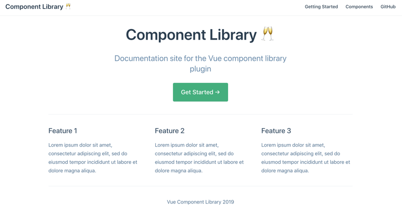
Put the following YAML front matter in README.md:
---
home: true
heroImage:
actionText: Get Started →
actionLink: /guide
features:
  - title: Feature 1
    details: Lorem ipsum dolor sit amet, consectetur adipiscing elit, sed do eiusmod tempor incididunt ut labore et dolore magna aliqua.
  - title: Feature 2
    details: Lorem ipsum dolor sit amet, consectetur adipiscing elit, sed do eiusmod tempor incididunt ut labore et dolore magna aliqua.
  - title: Feature 3
    details: Lorem ipsum dolor sit amet, consectetur adipiscing elit, sed do eiusmod tempor incididunt ut labore et dolore magna aliqua.
footer: Vue Component Library 2019
---
This will become the documentation site homepage.
The README.md file needs to be present in the docs directory!
Also, add a guide.md file in docs/. We'll use this as a placeholder for a Getting Started Guide. Go ahead and put the following line in that file:
# Getting Started

...
The project structure should look like:
.
└─ docs/
+ ├── .vuepress/
+ ├─ guide.md
+ └─ README.md
Customize config.js
Following the VuePress documentation, let's customize the structure and settings for the site.
Add a config.js file in the .vuepress directory:
.
└─ docs/
  ├── .vuepress/
+ │   └─ config.js
  ├─ guide.md
  └─ README.md
This is a subset set of the available options. This template will be helpful as a starting point. Implementing all the available options here would be a bit overwhelming.
// config.js

module.exports = {
  locales: {
    '/': {
      lang: 'en-US',
      title: 'Component Library 🥂',
      description: 'Documentation site for the Vue component library plugin'
    }
  },

  themeConfig: {
    repoLabel: 'Contribute!',
    // git repo here... gitlab, github
    repo: '',
    docsDir: 'docs',
    editLinks: true,
    docsBranch: 'dev',
    editLinkText: 'Help us improve this page!',
    search: false,
    locales: {
      '/': {
        label: 'English',
        selectText: 'Languages',
        lastUpdated: 'Last Updated',
        // service worker is configured but will only register in production
        serviceWorker: {
          updatePopup: {
            message: 'New content is available.',
            buttonText: 'Refresh'
          }
        },
        nav: [
          { text: 'Getting Started', link: '/guide' },
          { text: 'Components', link: '/components/' },
          // external link to git repo...again
          { text: 'GitHub', link: '' }
        ],
        sidebar: {
          '/components/': [
            {
              title: 'Components',
              collapsable: false,
              children: ['standard-component']
            }
          ]
        }
      }
    }
  }
}
Let's step through this a bit:
Set the root locale as
en-USwith the appropriate site title.Add the
themeConfig.The
navfield takes a list of links that will be present along the top navigation of the site. The first link will point to/guidewhich displays theguide.mdfile that we created.The second link in
navpoints to/components/directory in/.vuepressthat will contain the markdown files that document each component.The last link points to an external link, the GitHub repo link.
Next, we add
sidebar. In here, the above/componentsroute is referenced. When that route is accessed, sidebar navigation will be present showing any available children routes.We'll add one child route in
sidenavusingchildren: ['standard-component'].standard-componentrefers to the name of the markdown files in the components directory. So,/components/standard-component.md👉standard-component. This markdown file is rendered as HTML when the<root>/components/standard-componentroute is accessed.
At this point, the site should be able to run and serve with the default pages. Let's make sure that it works.
yarn docs:dev

...

VuePress dev server listening at http://localhost:8080/
The /components route will display a 404 page for now. That's okay since we will fix this in the next sections.
Great, now let's add the component library plugin.
Register the component plugin
We'll also want to create and modify enhanceApp.js in the same .vuepress/ directory.
.
└─ docs/
  ├── .vuepress/
+ │   ├─ enhanceApp.js
  │   └─ config.js
  ├─ guide.md
  └─ README.md
We'll import the library plugin from the ./../../src/main.js entry point and register as a plugin within the documentation components.
Remember the plugin we created in the last post? We're using it here!
enhanceApp.js
This allows the plugin to be available within the site. The structure of the enhancement file makes it easy to make app-level adjustments.
Other items that can be added here include:
- Additional Vue plugins
- Register global components, or
- Add additional router hooks
// enhanceApp.js

import ComponentLibrary from './../../src/main.js'

export default ({ Vue, options, router, siteData }) => {
  Vue.use(ComponentLibrary)
}
This is our component plugin ☝️!
The enhanceApp.js override allows for extra functionality to be added into the application. In this context, the application refers to the documentation site. The component library plugin is contained in the same base project but is not the application.
The components are now globally available in the documentation site. Now, we need to build out the actual documentation pages for each.
This part gets a bit tricky, so stick with me here 💪.
Visualize and document the components
The goal is to show live examples of each component in the library plugin alongside its source code.
To accomplish that, a few files are needed first.
Create an example file. This is a single file component (SFC) exhibiting the component in different states, with different
props, etc. These files will be located in.vuepress/components/examples.Create a markdown file in
/componentsfor each plugin component. These pages will become the HTML pages. In this file, we'll leverage two global presentational components,Demo.vueandSourceCode.vue, to link each plugin component and example SFC together.
We are going to create two presentation-related components, Demo.vue and SourceCode.vue, for the documentation aspects of the site. These components are not part of the Vue plugin but will be available for us to use to structure the site pages. We're going to take advantage of global components in VuePress here.
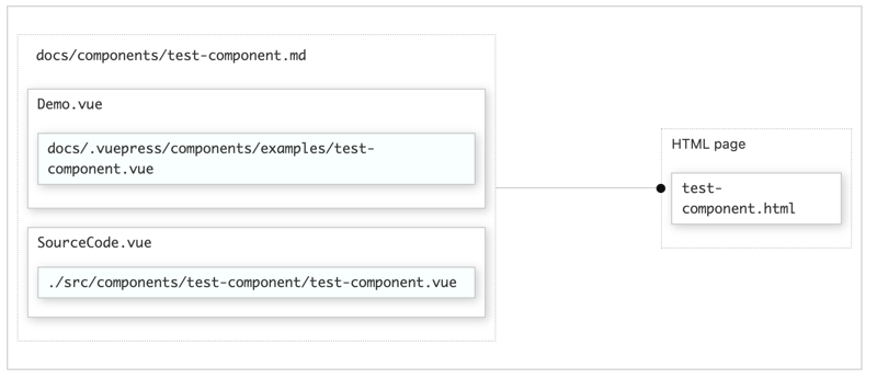
Using a hypothetical example component, test-component.
Demo.vue
This component will be included in the component's documentation markdown file, ./docs/components/*.md. It will wrap the component that is to be documented and inject it into the markdown page. In this case, it'll be set up to wrap the Vue files containing the plugin component example.
SourceCode.vue
This component will wrap a <slot></slot> that imports a code snippet. For our use, the snippet will be the source code of the component that is being documented. To do this, VuePress has a nifty feature that allows importing code snippets that we'll use.
Creating Demo.vue
We want to create a structure that allows us to render each component into its documentation page. That way, a live example of the component is shown alongside the documentation.
Add the Demo.vue component in the .vuepress/components directory:
.
└─ docs/
  ├── .vuepress/
+ │   ├─ components/
+ │   │  └─ Demo.vue
  │   ├─ config.js
  │   └─ enhanceApp.js
  ├─ guide.md
  └─ README.md
<!-- Demo.vue -->
<template>
  <div>
    <component :is="componentName" />
  </div>
</template>

<script>
  export default {
    props: {
      componentName: { type: String, required: true }
    }
  }
</script>
This is a straightforward component that takes a component filename reference as a prop and renders it as a dynamic component using the special attribute :is.
Creating SourceCode.vue
.
└─ docs/
  ├── .vuepress/
  │   ├─ components/
  │   │  ├─ Demo.vue
+ │   │  └─ SourceCode.vue
  │   ├─ config.js
  │   └─ enhanceApp.js
  ├─ guide.md
  └─ README.md
<!-- SourceCode.vue -->
<template>
  <div>
    <slot></slot>
  </div>
</template>
Adding the first documentation page
Example file
For the first component's documentation, create an example directory and a Vue component to display examples of the selected component from the plugin. In this example, create a standard-component.vue to demonstrate the standard component from earlier in the series:
-
StandardComponent.vuewith the name attributestandard-component
As a refresher, the component looks like this.
.
└─ docs/
  ├── .vuepress/
  │   ├─ components/
+ │   │  ├─ examples/
+ │   │  │  └─ standard-component-doc.vue
  │   │  ├─ Demo.vue
  │   │  └─ SourceCode.vue
  │   ├─ config.js
  │   └─ enhanceApp.js
  ├─ guide.md // refers to the `/guide` route
  └─ README.md // need to have this == homepage!
In that example file, put the following code that demonstrates standard-component with different slot content.
<template>
  <div>
    <standard-component>
      This is slot content 1.
    </standard-component>

    <standard-component>
      This is slot content 2.
    </standard-component>
  </div>
</template>
Markdown route file
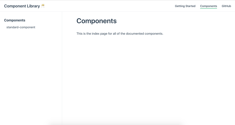
The last file needed is the markdown file to pull it all together. First, add a components directory in docs/. Then, add another README.md file to that directory as shown below. This necessary and will act as an index page for the /components route of the site.
.
└─ docs/
  ├── .vuepress/
  │   ├─ components/
  │   │  ├─ examples/
  │   │  │  └─ standard-component-doc.vue
  │   │  ├─ Demo.vue
  │   │  └─ SourceCode.vue
  │   ├─ config.js
  │   └─ enhanceApp.js
+ ├─ components/
+ │  ├─ README.md
+ │  └─ standard-component.md
  ├─ guide.md
  └─ README.md
In the README.md file, add:
# Components

This is the index page for all the documented components.
In .vuepress/config.js, the /components/ route of the site links to this markdown file with the reference children: ['standard-component'].
// config.js from earlier
...
sidebar: {
  '/components/': [
    {
      title: 'Components',
      collapsable: false,
      children: ['standard-component']
    }
  ]
}

...
This means that VuePress will look in the docs/components directory in the project root and match against the markdown file of the same name.
So, let's create the markdown file that will associate with the components/standard-component route.
Add the content below to standard-component.md in docs/components:
# standard-component

Wow! This component is awesome.

## Example

<Demo componentName="examples-standard-component-doc" />

## Source Code

<SourceCode>
<<< @/src/components/StandardComponent/StandardComponent.vue
</SourceCode>

## slots

...

## props

...
The components/standard-component.md file becomes the components/standard-component.html route of the documentation site!
Refreshing the site will activate the /components and /components/standard-component routes:
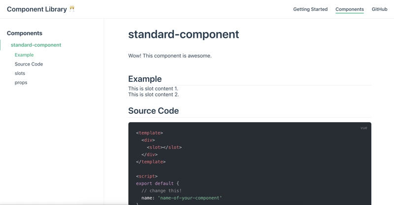
Notice anything? The markdown is using the Demo.vue and SourceCode.vue components from earlier to show the example file and source code!
-
<Demo componentName="examples-standard-component-doc" />- Be mindful of the
componentNameprop here,examples-standard-component. VuePress needs the directory structure to be hyphenated relative to the.vuepress/components/directory for global components. So,examples-standard-component-docis equivalent to the.vuepress/components/examples/standard-component-doc.vuepath.
- Be mindful of the
-
<<< @/src/components/StandardComponent/StandardComponent.vue- This line injects the source code snippet into the default
slotof theSourceCode.vueutility component.
- This line injects the source code snippet into the default
Conclusion
Wow, that escalated quickly 😉. This is a general setup that can be repeated as new components are added to the plugin - add another example Vue file and a markdown component file. Now, when you make changes in development mode, the site will immediately reflect those changes.
In the next post, we'll deploy the new documentation site to Netlify. After that, we'll publish the component library plugin available for distribution by publishing on npm.
As always, please reach out if you have any questions or advice 🐶.


Oldest comments (0)