
A post about how to build a good pricing component for a website
We'll go through some examples from over 78 (!) different versions of pricing components for Tailwind CSS available in the Shuffle Editor libraries.
Vertical and horizontal split in pricing component
Zospace UI by Shuffle - a vertical split with a clear suggestion of which package to choose. Highlighting one of the plans in a clear way is a common requirement when creating a price list.
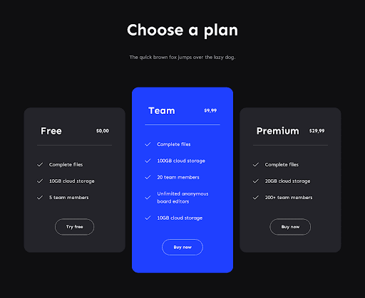
In this case, it is not done with text, but clearly communicated visually. It is impossible not to pay attention to the middle plan.
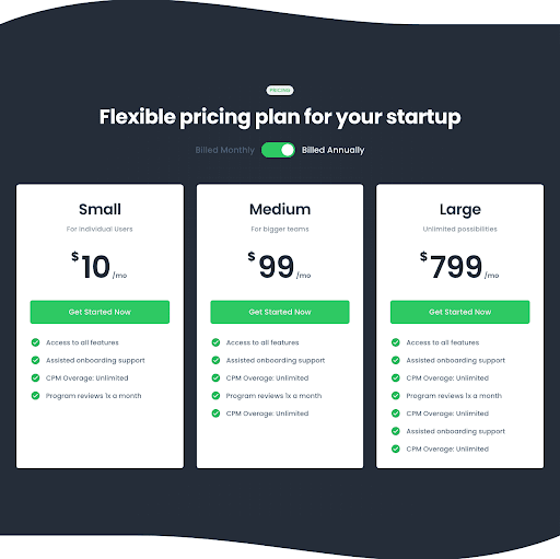
Sometimes, however, there isn't as much text and features to make it worthwhile to make columns. Then the variants can be placed horizontally, giving more space for the price. The second (of five) pricing variant within the Zospace UI by Shuffle library.

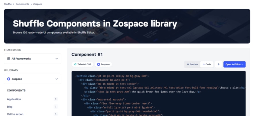
See all Zospace UI in our Tailwind components gallery with code ready to copy* and use in your project. You can see free code examples without logging in. While copying, take note, that you'll probably need to use our editor to get config files and graphic assets for components.
Using Icons in pricing components design
Things get a little more complicated when there are more plans.
Here Uinel UI by Shuffle deftly incorporates 4 possible plans to choose from, additionally giving each of them an icon. This makes it easier to instinctively see the difference between them.

This is one of the 6 pricing variations in this library. Check out all of them here: Uinel UI
Add switch when you need more options on one screen
Flex is an amazing library that has a staggering number of stylistic variations.
Below is one of the 8 basic pricing components. Each of these eight has 5 style variants.
Here there is also a montly/annualy button that allows you to blend in the payment type.
Highlight CTA with colors
Pstls UI operates with delicate pastel colors, which allows using black as an eye-catching color.
This allows it to act as both a CTA and to highlight a key component.

Backlight prefered option
The Bold UI deserves its name. The extravagance of the font, backlight, and fine lines separating the plans allows you to create a truly different website.
This makes it perfect for unconventional projects that want to stand out.

Start from basic design and add your own style
Plain UI is a library that allows you to set your own style.
Therefore, its components have a minimalist look and neutral colors.
This way, you can easily give them character without fighting the designer's intentions.
These are just a few select examples. Check out the 2700+ components for Tailwind CSS in the Shuffle editor. Each one has hundreds of matching components that will allow you to build a beautiful site in minutes.
If you want, you can also find examples of our designs in different frameworks. We have Bootstrap Components, Bulma Components, and Material-UI Components available both in gallery or in visual editor.


Top comments (0)