In the article, we will go into detail on how to use justify-self.
Justify Self
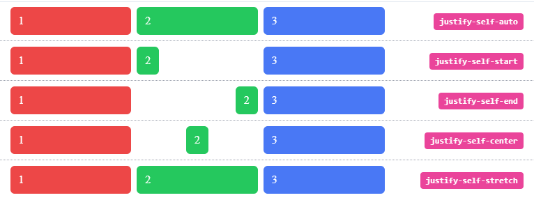
In a Tailwind CSS Grid, the align-justify-self property is used to describe the alignment of a content's location in relation to the proper axis.
Format
justify-self-{alignment}
| Alignment | Tailwind Class | CSS Property |
|---|---|---|
| Auto | justify-self-auto |
justify-self: auto; |
| Start | justify-self-start |
justify-self: start; |
| End | justify-self-end |
justify-self: end; |
| Center | justify-self-center |
justify-self: center; |
| Stretch | justify-self-stretch |
justify-self: stretch; |
let's see each of this in action,
Auto
It defaults to the normal value or the value specified by the justify-self property found in the parent element. It has the standard setting.
It is the value used to align an self according to the justify-self class value of the grid.
<li class="flex w-full items-center px-4 py-2">
  <div class="justify-self-auto grid w-full grid-cols-3 gap-2">
    <span class="rounded-md bg-red-500 px-3 py-2 text-white">1</span>
    <span class="justify-self-auto rounded-md bg-green-500 px-3 py-2 text-white">2</span>
    <span class="rounded-md bg-blue-500 px-3 py-2 text-white">3</span>
  </div>
  <div class="ml-5 w-1/3 text-right">
    <div class="rounded-2 inline-block whitespace-nowrap rounded bg-pink-500 px-2 py-1 font-mono text-xs font-semibold text-white">justify-self-auto</div>
  </div>
</li>
Output:

Start
It permits the content to align itself with the cell's left side.
<li class="flex w-full items-center px-4 py-2">
  <div class="justify-self-auto grid w-full grid-cols-3 gap-2">
    <span class="rounded-md bg-red-500 px-3 py-2 text-white">1</span>
    <span class="justify-self-start rounded-md bg-green-500 px-3 py-2 text-white">2</span>
    <span class="rounded-md bg-blue-500 px-3 py-2 text-white">3</span>
  </div>
  <div class="ml-5 w-1/3 text-right">
    <div class="rounded-2 inline-block whitespace-nowrap rounded bg-pink-500 px-2 py-1 font-mono text-xs font-semibold text-white">justify-self-start</div>
  </div>
</li>
Output:

End
It permits the content to align itself with the cell's right side.
<li class="flex w-full items-center px-4 py-2">
  <div class="justify-self-auto grid w-full grid-cols-3 gap-2">
    <span class="rounded-md bg-red-500 px-3 py-2 text-white">1</span>
    <span class="justify-self-end rounded-md bg-green-500 px-3 py-2 text-white">2</span>
    <span class="rounded-md bg-blue-500 px-3 py-2 text-white">3</span>
  </div>
  <div class="ml-5 w-1/3 text-right">
    <div class="rounded-2 inline-block whitespace-nowrap rounded bg-pink-500 px-2 py-1 font-mono text-xs font-semibold text-white">justify-self-end</div>
  </div>
</li>
Output

Center
It enables the content to align with the cell's centre.
<li class="flex w-full items-center px-4 py-2">
  <div class="justify-self-auto grid w-full grid-cols-3 gap-2">
    <span class="rounded-md bg-red-500 px-3 py-2 text-white">1</span>
    <span class="justify-self-center rounded-md bg-green-500 px-3 py-2 text-white">2</span>
    <span class="rounded-md bg-blue-500 px-3 py-2 text-white">3</span>
  </div>
  <div class="ml-5 w-1/3 text-right">
    <div class="rounded-2 inline-block whitespace-nowrap rounded bg-pink-500 px-2 py-1 font-mono text-xs font-semibold text-white">justify-self-center</div>
  </div>
</li>
Output

Stretch
It makes the content fill the entire width of the cell and is the default value for this property.
<li class="flex w-full items-center px-4 py-2">
  <div class="justify-self-auto grid w-full grid-cols-3 gap-2">
    <span class="rounded-md bg-red-500 px-3 py-2 text-white">1</span>
    <span class="justify-self-stretch rounded-md bg-green-500 px-3 py-2 text-white">2</span>
    <span class="rounded-md bg-blue-500 px-3 py-2 text-white">3</span>
  </div>
  <div class="ml-5 w-1/3 text-right">
    <div class="rounded-2 inline-block whitespace-nowrap rounded bg-pink-500 px-2 py-1 font-mono text-xs font-semibold text-white">justify-self-stretch</div>
  </div>
</li>
Output

Full code:
The overall code will be attached to repo link.
Overall Output
Resources:
tailwind.css
Thank you for reading :), To learn more, check out my blogs on Justify-Content, Responsive Navbar and Justify-Item.
If you liked this article, consider following me on Dev.to for my latest publications. You can reach me on Twitter.
Keep learning! Keep coding!! 💛


Top comments (2)
Awesome blog, Shubhangi.Keep them coming!
Thank you Pradumna for your support :)