
Hey everyone, in many apps you need a navbar which slides in if you click on a hamburger icon and which is also responsive. In this tutorial, we are going to see how to build that.
What we are building:
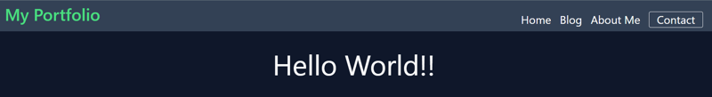
We will be building a simple navbar with HTML and CSS. We will use the below design as the guideline for our component.
Requirements
-Prior knowledge of HTML and CSS
-HTML template for navbar
-Code editor of your choice.
Implementation
Step1
Get the html code template. Install tailwind CSS however, you will need to add the tailwind CSS you have installed into our project and you can do by using the “link” tag to link the tailwind CSS file to the HTML template.
npm install -D tailwindcss postcss autoprefixer

npx tailwindcss init -p
Code:
<!DOCTYPE html>
<html lang="en">
  <head>
    <meta charset="UTF-8">
    <meta http-equiv="X-UA-Compatible" content="IE=edge">
    <meta name="viewport" content="width=device-width, initial-scale=1.0">
    <title>Navigation</title>
    <link rel="stylesheet" href="style.css">
  </head>
  <body></body>
</html>
Checkout detailed setup of tailwind here
since we know it's a navigation component we will use the nav element as our wrapping container. Let's also add a class of navbar.
<nav class="navbar"></nav>
Step 2
Next, I would review the content inside the navigation.
I would split the content into two parts:
- The brand content/body
- The navigational items
The reason I would split this up is that the brand content isn't necessarily a navigation item and I want the HTML to have the correct meaning.
Step 3
Next, let's implement option one from Step 2, The brand content. Since we know from the requirements it needs to be a link I would use the anchor tag. I will also add a class name of the brand so we can style it later.
Our code should now look like this:
<nav class="navbar">
  <a class="brand" href="#">My Portfolio</a>
</nav>
Step 4
Next, let's implement option two from Step 2, the navigational items. I would classify these as a list of links. Keeping with ensuring our HTML structure is semantic I would use a list to structure the items.
Our code should now look like this:
<nav class="navbar">
  <a class="brand" href="#">My portfolio</a>
  <ul>
    <li>
      <a href="#">Home</a>
    </li>
    <li>
      <a href="#">Blog </a>
    </li>
    <li>
      <a href="#">About Me</a>
    </li>
    <li>
      <a href="#">Contact</a>
    </li>
  </ul>
</nav>

Step 5
At this stage, we will add the necessary menu items to help users navigate around the website. Below is the code for the menu
Code
<!-- Nav menu -->
<div
  class="w-full lg:w-auto block lg:flex lg:items-center lg:inline-block hidden"
  id="navbar"
  >
  <div class="lg:flex-grow text-2xl text-center space-x-3">
    <a href="#" class="block lg:inline-block hover:text-green-400 mt-4">
    Home
    </a>
    <a href="#" class="block lg:inline-block hover:text-green-400 mt-4">
    Blog
    </a>
    <a
      href="#"
      class="block lg:inline-block hover:text-green-400 mt-4 mb-3z"
      >
    About Me
    </a>
    <a
      href="#"
      class="lg:inline-block hover:text-green-400 mt-6 border rounded border-white hover:border-transparent hover:bg-white px-4"
      >
    Contact
    </a>
  </div>
</div>
</nav>
We added some classes to the menu to help it fit into our navigation bar.
In the code above, we used SVG to create a hamburger for the small screen and gave it a height and weight of 6. We also changed the color to gray. Other classes we included are
Flex is used to set the hamburger menu along with the items in the Tailwind CSS navbar.
Step 6
We added some classes to the menu to help it fit into our navigation bar.
Add the mobile button
Next, we are going to create the menu for small screens. Then We can go ahead to use JavaScript to toggle the menu we created.
The JavaScript code will be written using the <script> tag.
We can go ahead and grab the HTML tag we use to apply this functionality.
Code
<script>
  var navbar = document.getElementById("navbar");

  const toggle_nav = () => {
    navbar.classList.toggle("hidden");
  };

  // Close menu is window size increases
  window.onresize = () => {
    let viewportWidth = window.innerWidth;
    if (viewportWidth > 1050) {
      navbar.classList.add("hidden");
    }
  };
</script>
Overview
The overall code will be like the code below:
Repo link
Conclusion
With some basic knowledge of HTML and CSS, we were able to create a fully functioning navbar component.
If you liked this article, consider following me on Dev.to for my latest publications. You can reach me on Twitter.
Keep learning! Keep coding!! 💛


Top comments (0)