In the article, we will go into detail on how to use place-content.
Place Content
The CSS place-content property is the shorthand of align-content and justify-content property. The shorthand properties in CSS means that you can set the multiple properties values in a single property. Here the place-content property can hold the value of the align-content and justify-content property values.
Format
place-content-{alignment}
| Alignment | Tailwind Class | CSS Property |
|---|---|---|
| Start | place-content-start |
place-content: start; |
| End | place-content-end |
place-content: end; |
| Center | place-content-center |
place-content: stretch; |
| Between | place-content-between |
place-content: between; |
| Around | place-content-around |
place-content: around; |
| Evenly | place-content-evenly |
place-content: evenly; |
| Stretch | place-content-stretch |
place-content: stretch; |
let's see each of this in action,
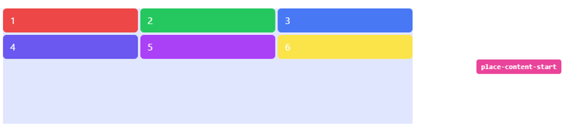
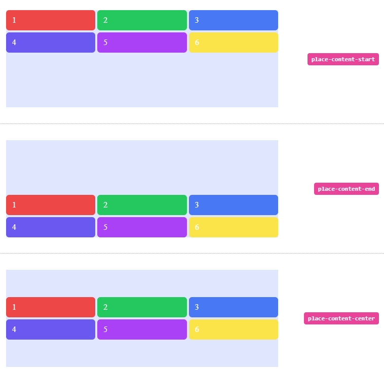
Start
Use place-content-start to pack items against the start of the block axis:
<li class="flex h-64 w-full items-center px-4 py-2">
  <div class="grid h-48 w-full grid-cols-3 place-content-start gap-1 bg-indigo-100">
    <span class="rounded-md bg-red-500 px-3 py-2 text-white">1</span>
    <span class="rounded-md bg-green-500 px-3 py-2 text-white">2</span>
    <span class="rounded-md bg-blue-500 px-3 py-2 text-white">3</span>
    <span class="rounded-md bg-indigo-500 px-3 py-2 text-white">4</span>
    <span class="rounded-md bg-purple-500 px-3 py-2 text-white">5</span>
    <span class="rounded-md bg-yellow-300 px-3 py-2 text-white">6</span>
  </div>
  <div class="ml-5 w-1/3 text-right">
    <div class="rounded-2 inline-block whitespace-nowrap rounded bg-pink-500 px-2 py-1 font-mono text-xs font-semibold text-white">place-content-start</div>
  </div>
</li>
Output:
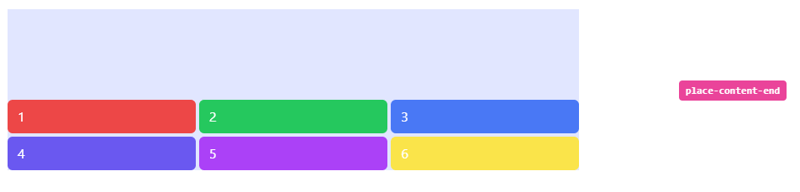
End
Use place-content-end to to pack items against the end of the block axis:
<li class="flex h-64 w-full items-center px-4 py-2">
  <div class="grid h-48 w-full grid-cols-3 place-content-end gap-1 bg-indigo-100">
    <span class="rounded-md bg-red-500 px-3 py-2 text-white">1</span>
    <span class="rounded-md bg-green-500 px-3 py-2 text-white">2</span>
    <span class="rounded-md bg-blue-500 px-3 py-2 text-white">3</span>
    <span class="rounded-md bg-indigo-500 px-3 py-2 text-white">4</span>
    <span class="rounded-md bg-purple-500 px-3 py-2 text-white">5</span>
    <span class="rounded-md bg-yellow-300 px-3 py-2 text-white">6</span>
  </div>
  <div class="ml-5 w-1/3 text-right">
    <div class="rounded-2 inline-block whitespace-nowrap rounded bg-pink-500 px-2 py-1 font-mono text-xs font-semibold text-white">place-content-end</div>
  </div>
</li>
Output
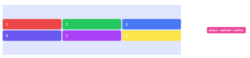
Center
Use place-content-center to pack items in the center of the block axis:
<li class="flex h-64 w-full items-center px-4 py-2">
  <div class="grid h-48 w-full grid-cols-3 place-content-center gap-1 bg-indigo-100">
    <span class="rounded-md bg-red-500 px-3 py-2 text-white">1</span>
    <span class="rounded-md bg-green-500 px-3 py-2 text-white">2</span>
    <span class="rounded-md bg-blue-500 px-3 py-2 text-white">3</span>
    <span class="rounded-md bg-indigo-500 px-3 py-2 text-white">4</span>
    <span class="rounded-md bg-purple-500 px-3 py-2 text-white">5</span>
    <span class="rounded-md bg-yellow-300 px-3 py-2 text-white">6</span>
  </div>
  <div class="ml-5 w-1/3 text-right">
    <div class="rounded-2 inline-block whitespace-nowrap rounded bg-pink-500 px-2 py-1 font-mono text-xs font-semibold text-white">place-content-center</div>
  </div>
</li>
Output:
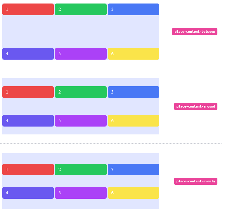
Between
Use place-content-between to distribute grid items along the block axis so that that there is an equal amount of space between each row on the block axis.
<li class="flex h-64 w-full items-center px-4 py-2">
  <div class="grid h-48 w-full grid-cols-3 place-content-between gap-1 bg-indigo-100">
    <span class="rounded-md bg-red-500 px-3 py-2 text-white">1</span>
    <span class="rounded-md bg-green-500 px-3 py-2 text-white">2</span>
    <span class="rounded-md bg-blue-500 px-3 py-2 text-white">3</span>
    <span class="rounded-md bg-indigo-500 px-3 py-2 text-white">4</span>
    <span class="rounded-md bg-purple-500 px-3 py-2 text-white">5</span>
    <span class="rounded-md bg-yellow-300 px-3 py-2 text-white">6</span>
  </div>
  <div class="ml-5 w-1/3 text-right">
    <div class="rounded-2 inline-block whitespace-nowrap rounded bg-pink-500 px-2 py-1 font-mono text-xs font-semibold text-white">place-content-between</div>
  </div>
</li>
Output

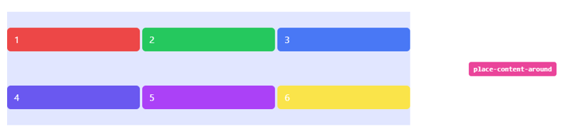
Around
Use place-content-around distribute grid items such that there is an equal amount of space around each row on the block axis:
<li class="flex h-64 w-full items-center px-4 py-2">
  <div class="grid h-48 w-full grid-cols-3 place-content-around gap-1 bg-indigo-100">
    <span class="rounded-md bg-red-500 px-3 py-2 text-white">1</span>
    <span class="rounded-md bg-green-500 px-3 py-2 text-white">2</span>
    <span class="rounded-md bg-blue-500 px-3 py-2 text-white">3</span>
    <span class="rounded-md bg-indigo-500 px-3 py-2 text-white">4</span>
    <span class="rounded-md bg-purple-500 px-3 py-2 text-white">5</span>
    <span class="rounded-md bg-yellow-300 px-3 py-2 text-white">6</span>
  </div>
  <div class="ml-5 w-1/3 text-right">
    <div class="rounded-2 inline-block whitespace-nowrap rounded bg-pink-500 px-2 py-1 font-mono text-xs font-semibold text-white">place-content-around</div>
  </div>
</li>
Output
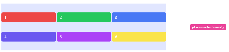
Evenly
Use place-content-evenly to distribute grid items such that they are evenly spaced on the block axis:
<li class="flex h-64 w-full items-center px-4 py-2">
  <div class="grid h-48 w-full grid-cols-3 place-content-evenly gap-1 bg-indigo-100">
    <span class="rounded-md bg-red-500 px-3 py-2 text-white">1</span>
    <span class="rounded-md bg-green-500 px-3 py-2 text-white">2</span>
    <span class="rounded-md bg-blue-500 px-3 py-2 text-white">3</span>
    <span class="rounded-md bg-indigo-500 px-3 py-2 text-white">4</span>
    <span class="rounded-md bg-purple-500 px-3 py-2 text-white">5</span>
    <span class="rounded-md bg-yellow-300 px-3 py-2 text-white">6</span>
  </div>
  <div class="ml-5 w-1/3 text-right">
    <div class="rounded-2 inline-block whitespace-nowrap rounded bg-pink-500 px-2 py-1 font-mono text-xs font-semibold text-white">place-content-evenly</div>
  </div>
</li>
Output
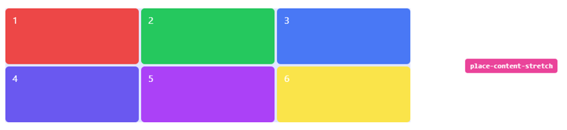
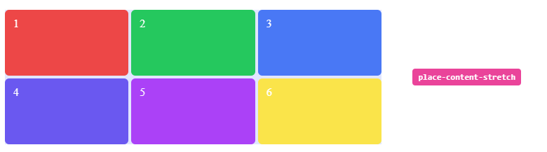
Stretch
Use place-content-stretch to stretch grid items along their grid areas on the block axis:
<li class="flex h-64 w-full items-center px-4 py-2">
  <div class="grid h-48 w-full grid-cols-3 place-content-stretch gap-1 bg-indigo-100">
    <span class="rounded-md bg-red-500 px-3 py-2 text-white">1</span>
    <span class="rounded-md bg-green-500 px-3 py-2 text-white">2</span>
    <span class="rounded-md bg-blue-500 px-3 py-2 text-white">3</span>
    <span class="rounded-md bg-indigo-500 px-3 py-2 text-white">4</span>
    <span class="rounded-md bg-purple-500 px-3 py-2 text-white">5</span>
    <span class="rounded-md bg-yellow-300 px-3 py-2 text-white">6</span>
  </div>
  <div class="ml-5 w-1/3 text-right">
    <div class="rounded-2 inline-block whitespace-nowrap rounded bg-pink-500 px-2 py-1 font-mono text-xs font-semibold text-white">place-content-stretch</div>
  </div>
</li>
Output
Full code:
The overall code will be attached to repo link.
Overall Output
Resources:
tailwind.css
Thank you for reading :), To learn more, check out my blogs on Justify-Content, Responsive Navbar and Justify-Item.
If you liked this article, consider following me on Dev.to for my latest publications. You can reach me on Twitter.
Keep learning! Keep coding!! 💛


Top comments (4)
Great one, Shubhangi!
Thank you Pradumna 👏🏻
Very Well explained Shubhangi... Thanks for sharing!
Thank you Swapnil🙂