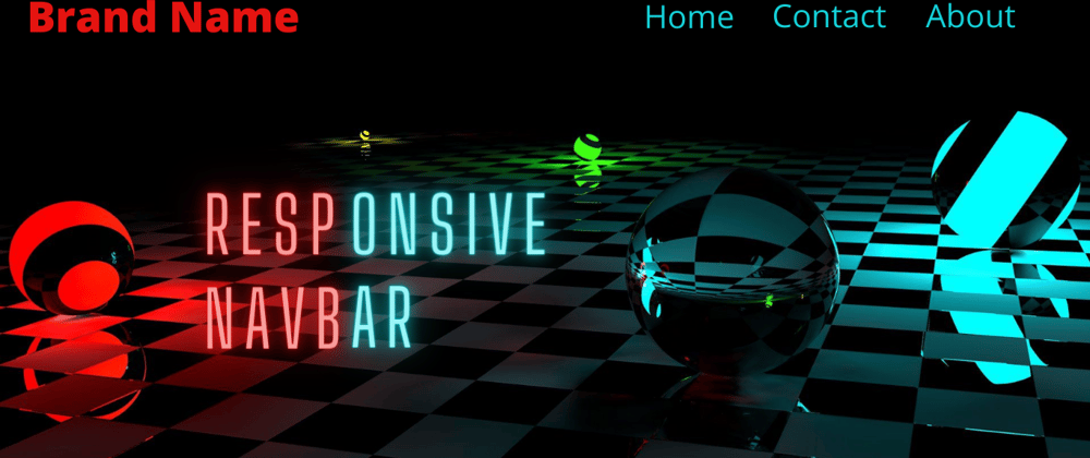
Hello Guys today i will show you how to create a responsive navbar with HTML, CSS and Javascript.
Let's get started...
HTML -
<nav class="navbar">
      <div class="brand-title">Brand Name</div>
      <a href="#" class="toggle-button">
        <span class="bar"></span>
        <span class="bar"></span>
        <span class="bar"></span>
      </a>
      <div class="navbar-links">
        <ul>
            <li>
                <a href="#">Home</a>
            </li>
            <li>
                <a href="#">Contact</a>
            </li>
            <li>
                <a href="#">About</a>
            </li>
        </ul>
      </div>
    </nav>
- We have wrapped everything in nav tag and provided the class of navbar to it.
- Then we have created 1 div for the logo or brand name , 1 anchor tag to use it as a toggle button for small screens or mobile view and inside it we have created 3 span tags to create bars for the hamburger icons, 1 div for the navigation links which contains the links of the navbar.
CSS -
* {
    box-sizing:border-box;
}

body {
    margin: 0;
    padding: 0;
}
- The box-sizing property allows us to include the padding and border in an element's total width and height.
- Removing the default padding and margin of the body.
.navbar{
    display:flex;
    justify-content:space-between;
    align-items:center;
    background-color:#333;
    color:white;
}
- Making the navbar flex , and provide the space between them so , brand name will be on the left at one end and links will be on the right on the other end.
- Align items will align the items vertically.
.brand-title{
    font-size: 1.5rem;
    margin:.5rem
}

.navbar-links ul{
    margin:0;
    padding: 0;
    display:flex;
}

.navbar-links li{
    list-style: none;
}

.navbar-links li a{
    text-decoration: none;
    color: white;
    padding:1rem;
    display:block
}

.navbar-links li:hover{
    background-color:#555;
}
- Styling the brand element and removing the default margin and padding of ul tag and making it display flex.
- Styling the links and anchor tags and removing the default behaviour.
.toggle-button{
    position:absolute;
    top:.75rem;
    right: 1rem;
    display:none;
    flex-direction:column;
    justify-content: space-between;
    width:30px;
    height:21px;
}

.toggle-button .bar{
    height:3px;
    width:100%;
    background-color:white;
    border-radius:10px;
}
- Styling the toggle-button making it vertically columned so the bars inside it will be vertically aligned.
- Position absolute to make it stick to the right top end.
- display: none to hide it on larger screens.
- Styling the bars inside the toggle-button.
@media screen and (max-width:600px) {
    .toggle-button{
        display:flex;
    }
    .navbar-links{
        display:none;
        width: 100%;
    }
}
- Using media queries to target the screens smaller than 600px
- Making the toggle-button flex when the screen size is smaller than 600px.
- Hiding the navbar links when the screen size is smaller than 600px.
@media screen and (max-width:600px) {
.
.
.navbar{
        flex-direction:column;
        align-items: flex-start;
    }
    .navbar-links ul {
        flex-direction:column;
        width: 100%;
    }
    .navbar-links ul li {
        text-align:center;
    }

    .navbar-links li a {
        padding: .7rem 1rem;
    }
}
- Making the Navbar vertically aligned using flex direction.
- Making the links vertically aligned using flex direction and make the element width to 100% to cover the entire row.
- Making the links centered using text-align property to li elements.
@media screen and (max-width:600px) {
.
.
 .navbar-links.active{
        display:flex
   }
}
- Creating this active class styling to toggle it using javascript, when this class is toggled then the navbar on smaller screens will have a dropdown effect.
Complete CSS code -
* {
    box-sizing:border-box;
}

body {
    margin: 0;
    padding: 0;
}

.navbar{
    display:flex;
    justify-content:space-between;
    align-items:center;
    background-color:#333;
    color:white;
}

.brand-title{
    font-size: 1.5rem;
    margin:.5rem
}

.navbar-links ul{
    margin:0;
    padding: 0;
    display:flex;
}

.navbar-links li{
    list-style: none;
}

.navbar-links li a{
    text-decoration: none;
    color: white;
    padding:1rem;
    display:block
}

.navbar-links li:hover{
    background-color:#555;
}

.toggle-button{
    position:absolute;
    top:.75rem;
    right: 1rem;
    display:none;
    flex-direction:column;
    justify-content: space-between;
    width:30px;
    height:21px;
}

.toggle-button .bar{
    height:3px;
    width:100%;
    background-color:white;
    border-radius:10px;
}

@media screen and (max-width:600px) {
    .toggle-button{
        display:flex;
    }
    .navbar-links{
        display:none;
        width: 100%;
    }

    .navbar{
        flex-direction:column;
        align-items: flex-start;
    }
    .navbar-links ul {
        flex-direction:column;
        width: 100%;
    }
    .navbar-links ul li {
        text-align:center;
    }

    .navbar-links li a {
        padding: .7rem 1rem;
    }

    .navbar-links.active{
        display:flex
    }

}
Javascript -
const toggleButton = document.getElementsByClassName("toggle-button")[0];
const navbarLinks = document.getElementsByClassName("navbar-links")[0];

toggleButton.addEventListener("click",() => {
    navbarLinks.classList.toggle("active")
})
- Targeting the toggle-button and navbar-links using DOM.
- Then adding a click event to toggle button and toggling the "active" class using toggle() method.
THANK YOU FOR CHECKING THIS POST
You can contact me on -
Instagram - https://www.instagram.com/supremacism__shubh/
LinkedIn - https://www.linkedin.com/in/shubham-tiwari-b7544b193/
Email - shubhmtiwri00@gmail.com
^^You can help me by some donation at the link below Thank you👇👇 ^^
☕ --> https://www.buymeacoffee.com/waaduheck <--
Also check these posts as well
https://dev.to/shubhamtiwari909/js-push-and-pop-with-arrays-33a2/edit
https://dev.to/shubhamtiwari909/tostring-in-js-27b
https://dev.to/shubhamtiwari909/join-in-javascript-4050
https://dev.to/shubhamtiwari909/going-deep-in-array-sort-js-2n90


Top comments (0)