
The imperative toolkit you should use to display your frontend skills.
You have developed reusable components, functions or the whole UI library, and now the time comes to showcase, then the Storybook is precisely meant for you.
Check the link, How I showcase my work using Storybook
What is a Storybook?
A storybook is a tool for UI development. It makes development faster and easier by isolating components.
The storybook toolkit consists of
Stories- The collection of all the stories and a single account is like a single UI component.
The Storybook provides three basic functionalities- Writing Stories, Writing Docs and Add-ons.
Writing Stories — This is a single independent UI component or function that captures and renders the UI component's state.
Writing Docs — The Storybook provides developers with the inbuilt documentation feature to explain the in-depth application of stories they have created.
Add-ons — The Storybook provides plugins like WordPress, which helps users extend the Storybook's properties, such as documentation, interactive controls, etc.
How to Install
We will use the Next JS repository to install the storybook. Here is the repository => https://github.com/shreyvijayvargiya/iHateReadingLogs/tree/main/TechLogs/MaterialUIInstallationWithNextJS
yarn add @storybook/react
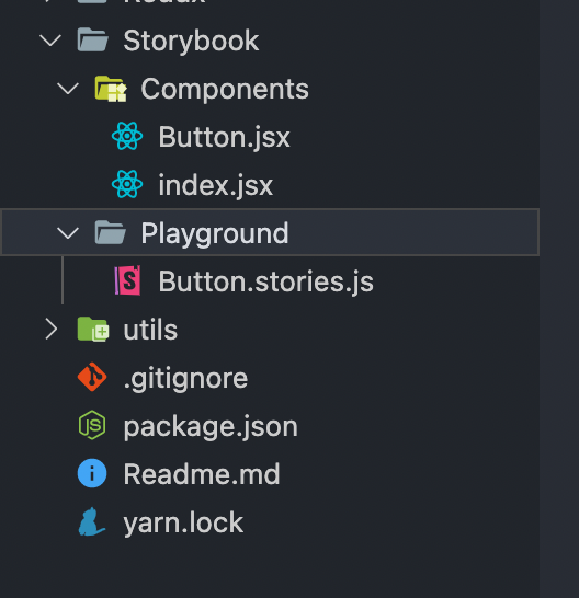
Create a folder called **Storybook** followed by two subfolders, Playground and Components.
Playground — This folder consists of all stories we want to display on the Preview iframe of the storybook.
Components — This folder will consist of the components we will use to create a story.
Every story you want to create should consist of a file ending with the .stories.jsextension. For example, Creating a story to display your custom-made button should end like Button.stories.js. This is because the built-in Storybook configuration automatically detects all the stories with the file with the .stories.js extension. Anytime returned in that file by default will be rendered as a story in the Preview frame. But you can easily change that inbuilt configuration and create your own(I will cover this in some time).
My Playground folder consists of all the stories I want to showcase, and My Components folder consists of all the components my stories will use. To create the account, we will use the “storiesOf” method provided by the @storybook/react npm package. This method takes two arguments, the name of the story and the UI component of the story. After adding the name of the story, you use the sub-method called “add”, which accepts the UI component as an argument to render/return.

In the image, the storiesOf method takes the first argument as the name of the story, i.e. Components, and the second argument is a module followed by calling a process called add, to which we have to add a callback returning a UI component as a Button to render in the story. Inside the render method of add method, you can add whatever UI component you want to return.
My Playground
I am developing a custom button that will accept the props, such as the switch's name and colour; since I am using the material UI library, so the colour prop will be the enums[“primary”, “secondary”, “warning,”].
While creating a Component for a story, you can also declare the propTypes that add the strict prop types checking and helps showcase your component's extended functionality.
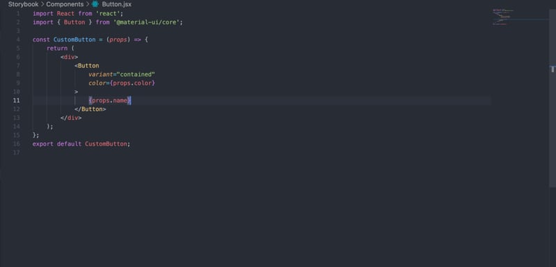
This is my Custom Button inside Components. The next step is to export this Button and render it inside a story of the Storybook.
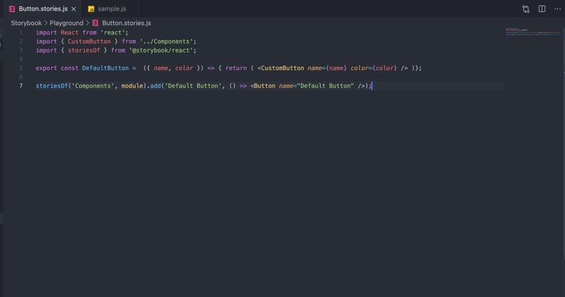
Inside a button story, I have just imported the Custom Button declared in the Components folder and created a story using the add method of the Storybook.
Testing your first Storybook Story
Inside the package.json file, add the Storybook script for running it on the local server.
"storybook": "start-storybook"
Next, We need to tell the storybook CLI(Command Line Interface) to detect all .stories.js files to detect our stories. The Storybook CLI always looks for the “.storybook” folder first to check whether the developer has declared its configuration. The configuration for all stories should be declared inside the config.js file of .storybook.
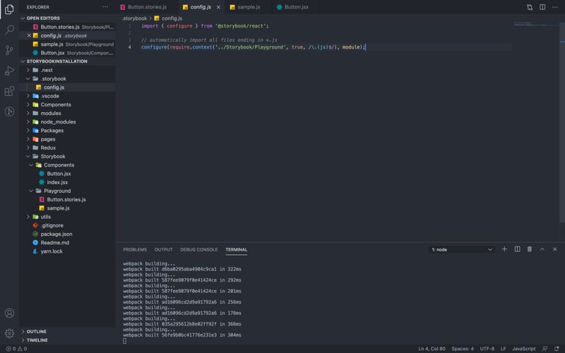
Don't try to change the name of the .storybook file to something else accordingly; the Storybook CLI always look for the .storybook in the root directory. Also, Always put .storybook in the root of the repository where your package.json lies. Otherwise, the Storybook won’t be able to detect it.
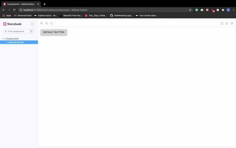
Running Storybook locally
Now, run the command yarn run storybook; this will start the Storybook playground on localhost:51086 by default.
Extending the Story
We can show more buttons inside a single story or create more sub-stories inside a single account. I am using a colour prop to display different controls and levels named according to the colour prop.
Conclusion
This is just the installation part of the Storybook and displays the essential UI components. Treat the story section of the Storybook as a simple UI component and return whatever you want to say. I will cover another article to add a react-live package that helps edit the props passed to the button on the local storybook server. In the next part, I’ll cover the “Docs” feature accorded by the Storybook and How to install it for documentation purposes.
Until Next time, Have a good day, People.
Code
Keep developing
Shrey
iHateReading


Top comments (0)