Hey folks 👋🏻, today we are going to build some squares which are neumorphic in design.
Now you may ask.. What? why are we building squares? believe me, this technique of design can be used anywhere and it will make your website aesthetically pleasing.
Okay, so before we get started let's understand what is neumorphism, it is a design trend which looks very minimal and gives a soft feel to the UI.
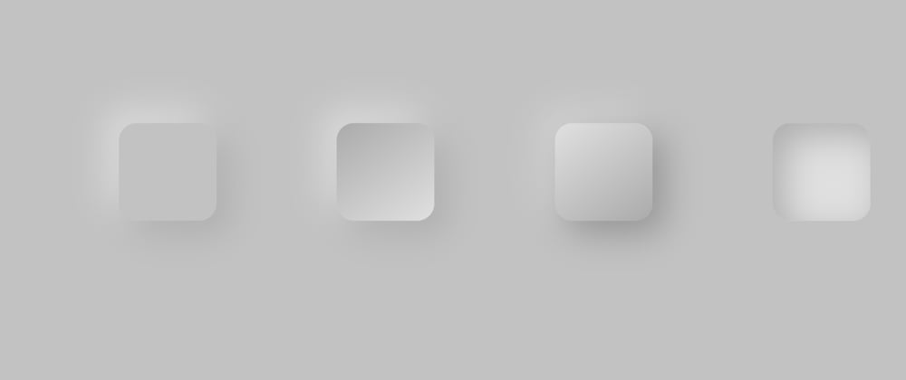
This is how it looks:
👆🏻 This may not look nice in the preview, so please open the results in a new tab.
In this design theme, we just have to play around box-shadow and make a light-source and a dark shadow, now you might not understand this by now but you will, when you see how easy the steps are.
NOTE: Before reading the steps, I have given the reference from the codepen's CSS section. So if you don't understand any property do refer to the CSS or comment down below!
Steps:
- Give the body a
background-colorin this case I have givenrgb(194, 194, 194);. - Make four
divswith different class names. - Apply the same
background-colorto thedivtags as the body, which isrgb(194, 194, 194);. - The first box (from the left), is looking like it is lifted of the screen.
- This is achieved by providing a light source from the
top-leftand making a dark shadow on thebottom-right - The light source has to be a little lighter than the background color, usually a color close to white.
- The
box-shadowisbox-shadow: 20px 20px 60px #8d8d8d71, -20px -20px 60px #e0e0e0;, here the negative values indicate the light-source coming from top-left and the positive values represent the dark-shadow formed at the bottom-right.
- This is achieved by providing a light source from the
- The second box's (from left) corners are lifted and are emerging out of the screen.
- This effect is somewhat the same as the first one, but the only difference is here we are giving a
linear-gradientto the box which is opposite to thebox-shadow. - In simpler terms the top-left corner has a light-source i.e. a light shadow an inside is a dark
background-colorand vice-versa on the opposite corner.
- This effect is somewhat the same as the first one, but the only difference is here we are giving a
- The third box (from-left) looks like it is about to emerge from the screen.
- This is the exact opposite to the previous one. The only difference is the colors of
linear-gradientare sw apped. - The lighter-shadow side (
top-left) has a light color and the darker-shadow side (bottom-right) has a dark color.
- This is the exact opposite to the previous one. The only difference is the colors of
- The fourth box (right-most) is looking like it is pressed inside the screen and is hollow.
- This is done by just
box-shadowbut on the inner side. - We can give
box-shadowon the inner side by using a value calledinsetwhich will help us give the shadow inside.
- This is done by just
That is how easy it was to make these boxes using neumorphism!!
In my upcoming blogs we are going to see the implementation of glassmorphism and neumorphism!! We are going to build a credit-card using these design themes!!
Thank you for reading the whole blog 🎉! If you liked it, do share it with your friends and implement this design in your projects!


Top comments (0)